All Samples
Graphic Design·1 tool · 8 outputs·
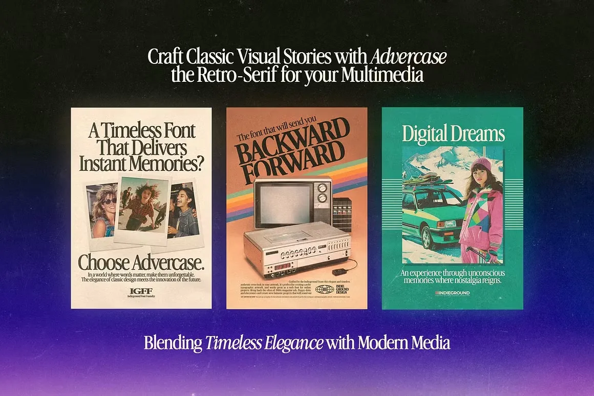
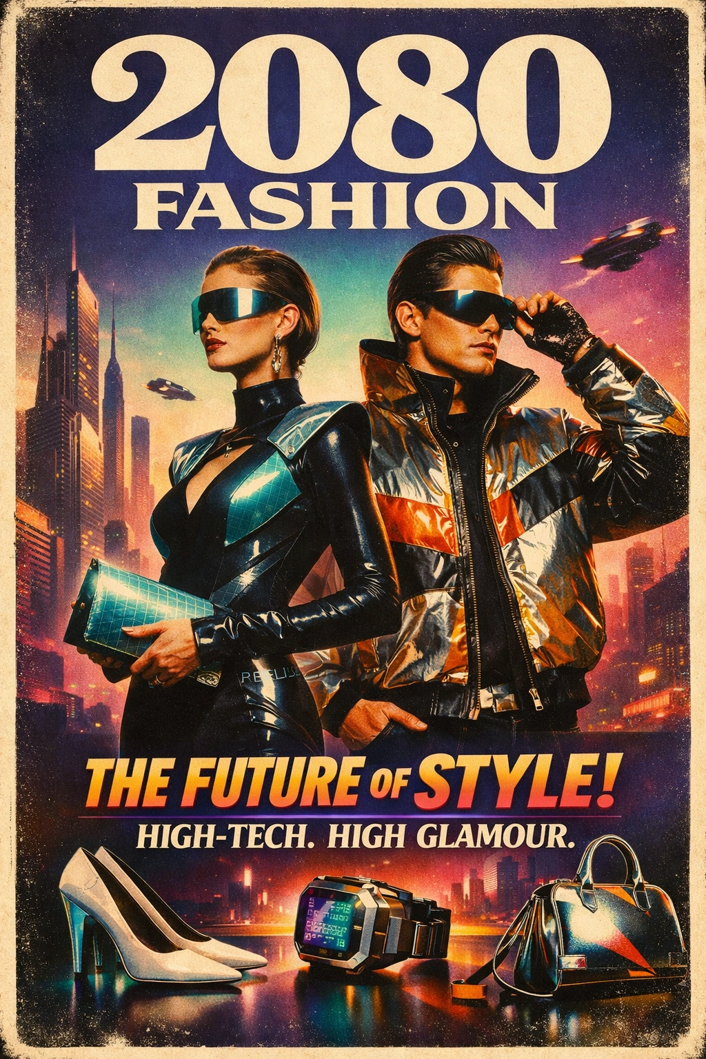
80s-Inspired Poster
Effortlessly generate high-contrast, text-heavy 80s-style posters and magazine covers with precise color grading and authentic film artifact textures.StyleRef encodes the visual or tonal style from the source reference into a structured format — reusable across every prompt, every generation.
This StyleRef is prepended to every prompt shown below — that's what keeps every output consistent.
03 — AI Outputs
Same StyleRef. Different Prompts. Consistent Results.
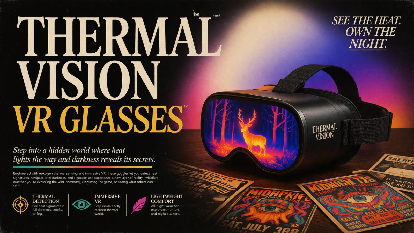
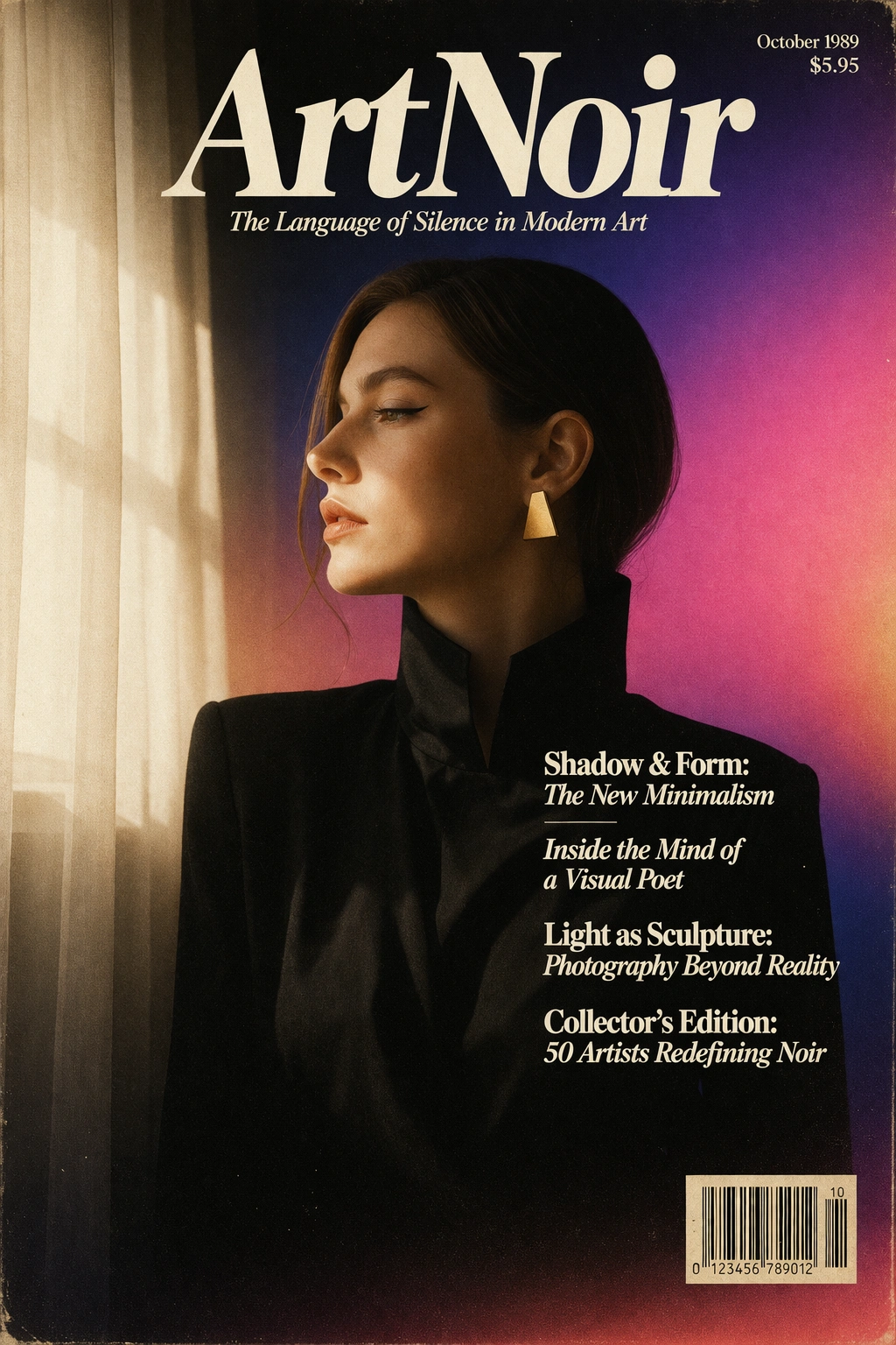
Generated with
ChatGPT
— Image Generation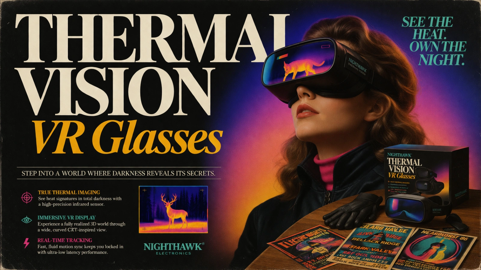
About This Style
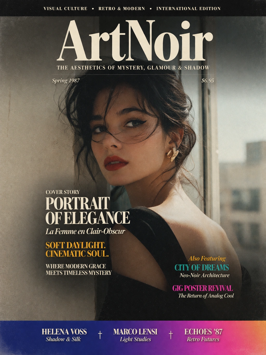
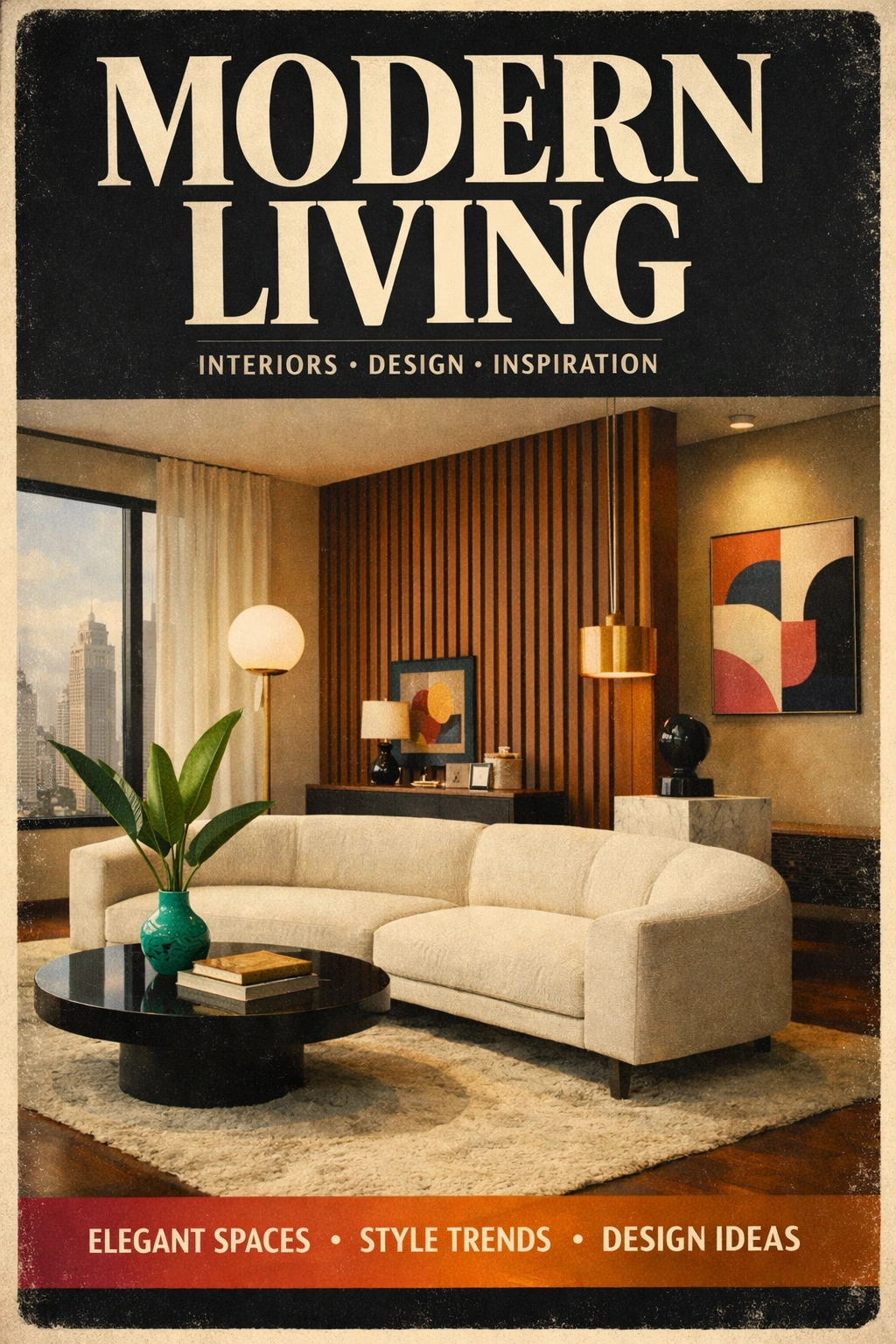
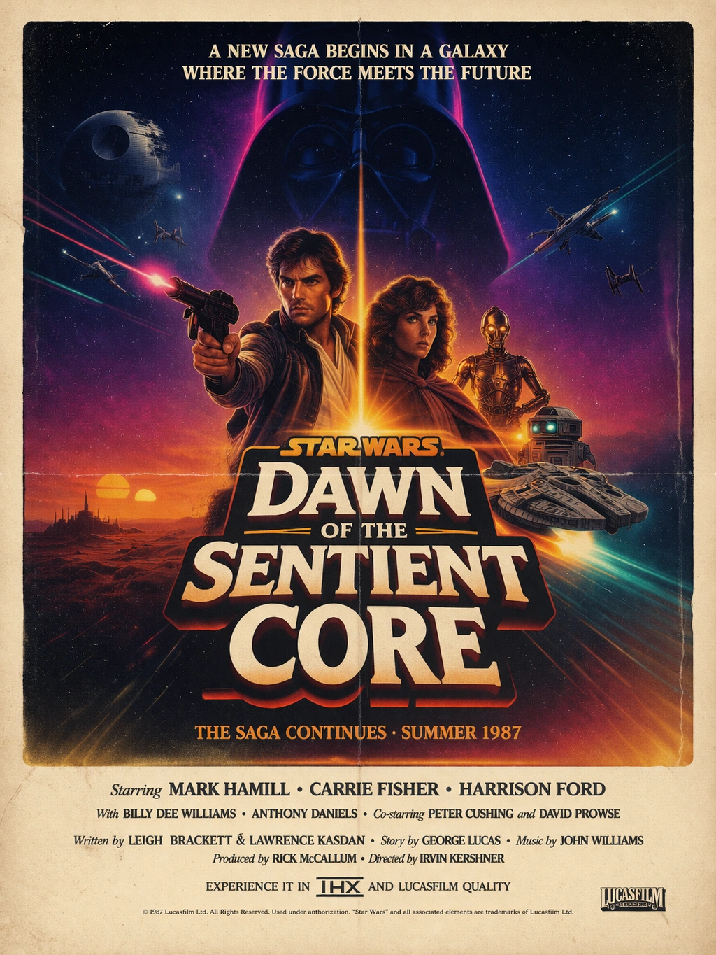
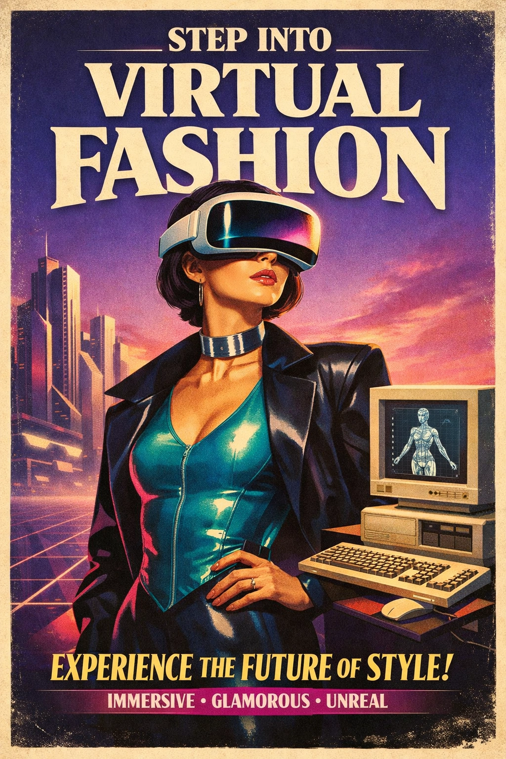
The 80s-Inspired Poster StyleRef demonstrates how complex, mixed-medium typographic layouts can be generated predictably. It captures the essence of classic typography specimen lookbooks and retro advertising, defined by deep sepia backgrounds, film grain textures, and vivid accent color gradients.The core rules encoded within this style—such as oversized serif typography, extreme high contrast, selective gradient glows, and dramatic cinematic lighting—ensure that the generated images never fall flat or look too digital. Instead, they evoke the tactile nature of aged paper and authentic era-accurate artifacts.From editorial fashion covers to edgy sci-fi VR product posters, this style forces AI generators to treat text as the primary visual driver rather than an afterthought, making it an incredibly powerful tool for graphic designers, creative directors, and brand marketers looking to serialize retro-themed campaigns without tedious Photoshop assembly.
Build a StyleRef for your style
Define it once from your references. Paste it into your AI tool. Get consistent results.Create Your StyleRef — FreeNo account needed© 2026 StyleRef. All rights reserved.