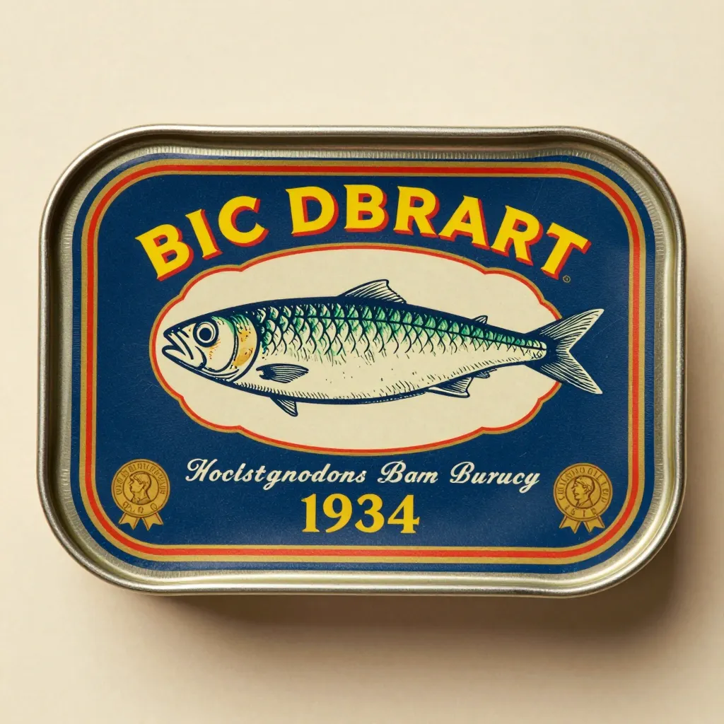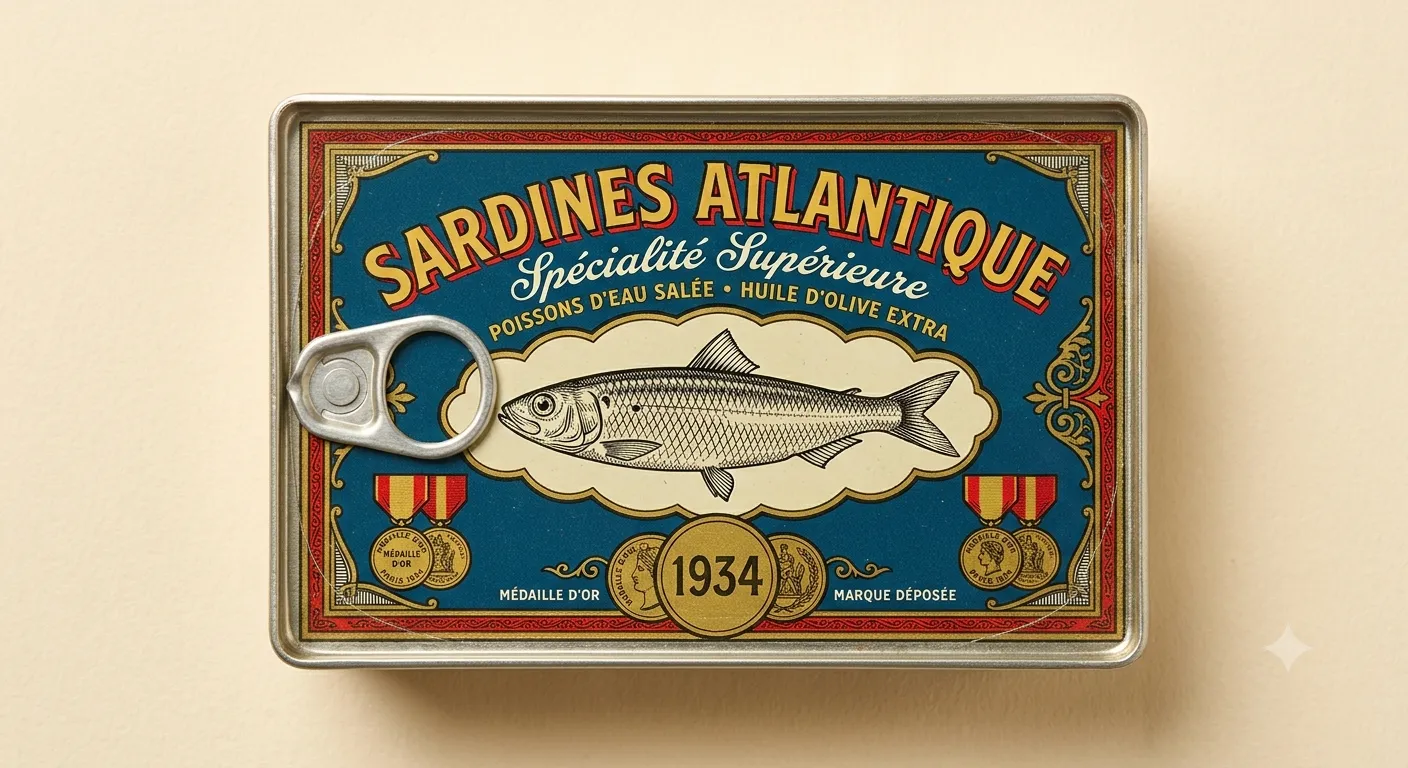
Portuguese Sardine Tin Label

StyleRef·@styleref·
Extract your style to start building your Style Board.

Description

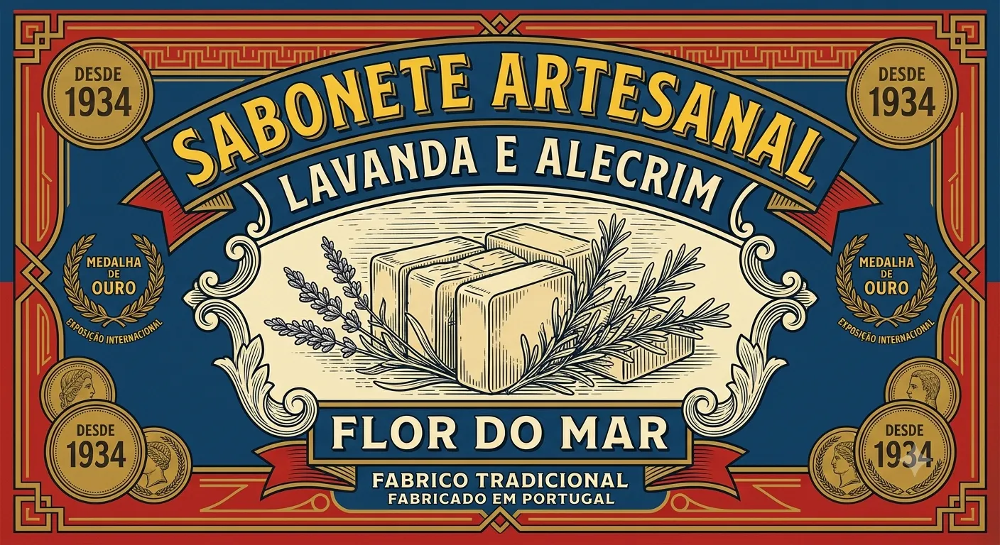
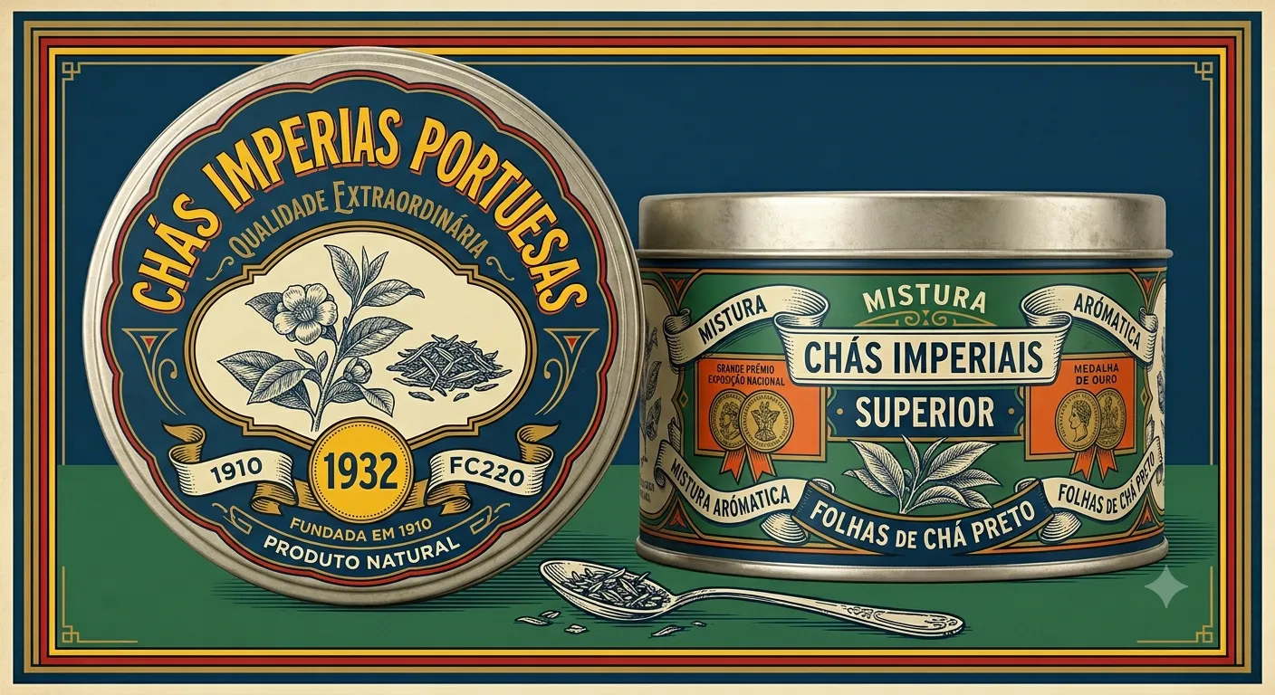
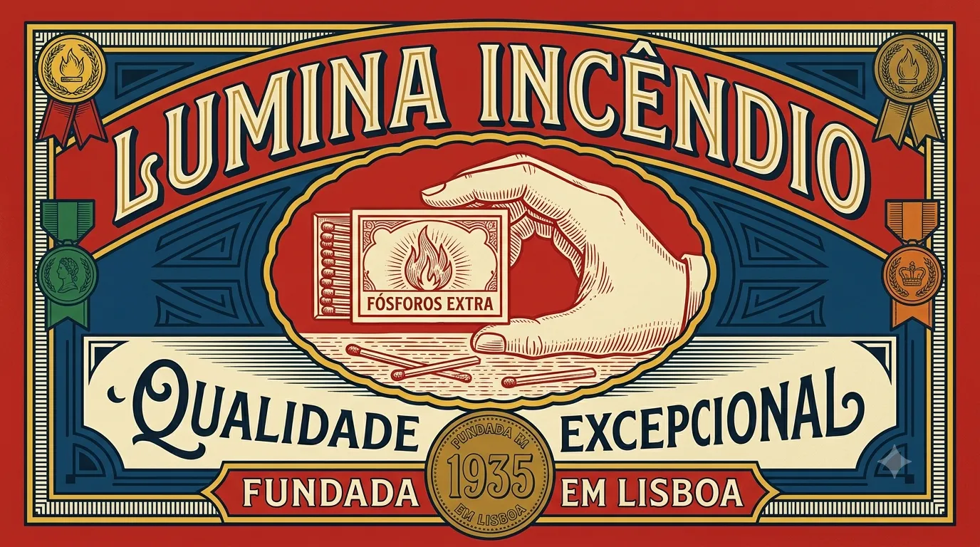
The lithographed look of Portugal's canned-fish tins: a fish drawn side-on, a heavy decorative border around it, and a year set in the corner like a coin. Colour is laid down as flat spot ink straight onto metal — reds, sea blues and mustard yellows next to each other with no blending — and the hand-lettered display type carries most of the design. It suits packaging, labels, matchboxes and small-format print where you want the object to look collected rather than shopped for.

Typography

Bold, Aa, Bb, Typography
Font FamilyDisplay / Decorative
Line HeightTight
Font WeightsBold, Extra Bold
Letter SpacingWide, commemorative numeral spacing; compact supporting caps
Type ScaleModular
Text Case
Mixed
Font Pairing Strategy
Display + Body
Hierarchy
Expressive / Art-directed
Text Presence
Required
Text Visual Role
Primary visual driver
Text Integration
Embedded in shapes

Mood & Personality

Mood & Personality
Nostalgic, Elegant, Sophisticated, Bold, Uplifting
Energy Level
Vibrant
Representation Mode
Literal
Real-world Accuracy
Stylized

Container / Boundary

Container presence
Explicit (shape mask)
Container shape
Framed rectangular label panel with inset cartouche, oval, shield, or scalloped roundel
Corner treatment
Sharp
Container Dominance
Primary visual identity
Padding rules
Tight
Edge behavior
Content fully contained

Spatial Structure & Hierarchy

Perspective Style
Flat
Focal Structure
Primary + secondary
Hierarchy Clarity
Strong
Symmetry
Near symmetry
Balance Type
Center-weighted
Layout Axis
Vertical
Plane Separation Method
Color/value shift, Overlap
Grid System
Manuscript grid
Visual Density
Dense

References

Cultural References
Art Nouveau, Portuguese canned-fish lithography, 1930s commercial label design, exposition prize culture
Temporal Reference
1930s
Reference Brands
Portuguese canned-fish tin tradition; contextual inspiration only, never reproduce company marks, crests, wordmarks, or trade dress.

Output Format

Creative Discipline
Packaging design
Medium
Print
Delivery Mode
Still
Scaling Expectation
Print-scale
Canvas Behavior
Strict frame (nothing escapes)

Inspiration Images

Light & Shadow

Lighting Mood Style
Studio-flat
Key Light Style
Soft
Light Source Type
Artificial
Lighting Direction
Front-lit
Light Source Count
Single
Shadow Type
Soft
Shadow Density
Light
Fill-light Ratio
Even fill
Lighting Presence
Flat within the printed label; only soft, broad frontal object light when rendered on metal.

Shape Language

Shape Basis
Hybrid
Primitive Dominance
Rectangles, Circles, Freeform curves
Edge Sharpness
Razor-sharp
Silhouette Clarity
Recognizable
Curve Consistency
Expressive curves
Negative Space Usage
Minimal
Angle Usage
Limited

Background & Environment

Background Type
Solid color
Background–Subject Relationship
Integrated
Background Complexity
Moderate
Prop / Set Styling
Curated

Guardrails

Common Artifacts to Avoid
AI Gloss / Plastic Smoothing, HDR over-processing, Over-saturation, Stylistic filters
Avoided Visuals
steampunk brass gears; Victorian apothecary motifs; rope borders; ship wheels; anchors; nautical clip art; pastel vector illustration; modern geometric sans; photographic main elements; rendered 3D lettering; distressed grunge overlays; torn-paper texture; gradients
Avoided Colors
muted pastel palettes; neon colors; monochrome gray palettes
Avoided Words
real cannery names; company wordmarks; crests; trademarked medal names; endorsement claims
Avoided Layouts
minimal flat layouts; unframed layouts; loose asymmetric arrangements; floating text over empty fields
Allowed Visuals
invented brand furniture; main product-related engraved element; framed cartouches; coin-like year roundels; faux award medals; ribbon devices; ruled borders; scalloped panels; flat spot-color fills; hand-lettered display type
Legal Constraints
Use invented brand names, crests, medals, and label copy. Do not reproduce or approximate real cannery trade dress, wordmarks, or endorsements.

Colors

#123D6628%Usage: Main field
#C6282818%Usage: Border field
#F2C23016%Usage: Primary lettering
#F4E6BF14%Usage: Main element
#15283B10%Usage: Outline and engraved linework
#26724D7%Usage: Secondary field
#E275284%Usage: Accent details
#B58A323%Usage: Rules medals and year
Palette Size
6–8 colors
Color Temperature
Mediterranean summer: sunlit warm inks balanced by deep sea blue
Saturation Range
Rich
Contrast Strategy
Hue contrast
Hue Relationships
Arbitrary
Gradient Policy
No gradients
Color Dominance
Background-dominant

Surface, Material & Detail

Material Simulation
Metal
Surface Treatment
Satin
Surface Texture Style
Satin lithographic ink with faint metal reflectance, fine print grain, light seam scuffs, and occasional hairline spot-color misregistration
Texture Usage
Subtle noise
Imperfection Level
Used
Abstraction Level
Stylized realism
Micro-detail Allowance
Encouraged
Age of Surface
Aged
Pattern / Motif Usage
Geometric pattern

Line & Stroke System

Stroke Usage
Decorative outlines
Stroke Weight
Variable
Stroke Consistency
Fine engraved hatching for the main element; heavier ornamental outlines and multi-rule borders
Stroke Color
Contrasting accent
Stroke Joins
Round, Miter

Artistic Mediums & Techniques

Physical Medium
Offset lithography aesthetic on satin metal
Illustrative Technique
Engraving
Central Illustration
Use a product-related main element as an engraved specimen: strict side profile or tightly overlapped grouping, with visible linework and flat color fills.

Custom Style Items

Spot Ink Logic
Opaque flat spot colors only; ink fully on or off with no blends, airbrush shading, or photographic tonal modeling.
Variant Palette Rule
Recolor the full label per product variant while retaining the same ornament and composition.
Lettering Construction
Hand-drawn Art Nouveau display caps; arched or banner-set, often outlined, inlined, or offset with a second-color shadow.
Type Hierarchy
Oversized brand lettering; swashed script or italic secondary line; small functional ruled caps; large coin-like year numeral.
Language Treatment
Portuguese or French phrases function as ornament; use invented names only, never real company marks or claims.
Panel Composition
Heavy full-perimeter border; central framed main element; arched headline above; smaller descriptor below; coin roundel, medals, ribbons, and ruled corner ornaments remain boxed and ordered.
© 2026 StyleRef. All rights reserved.