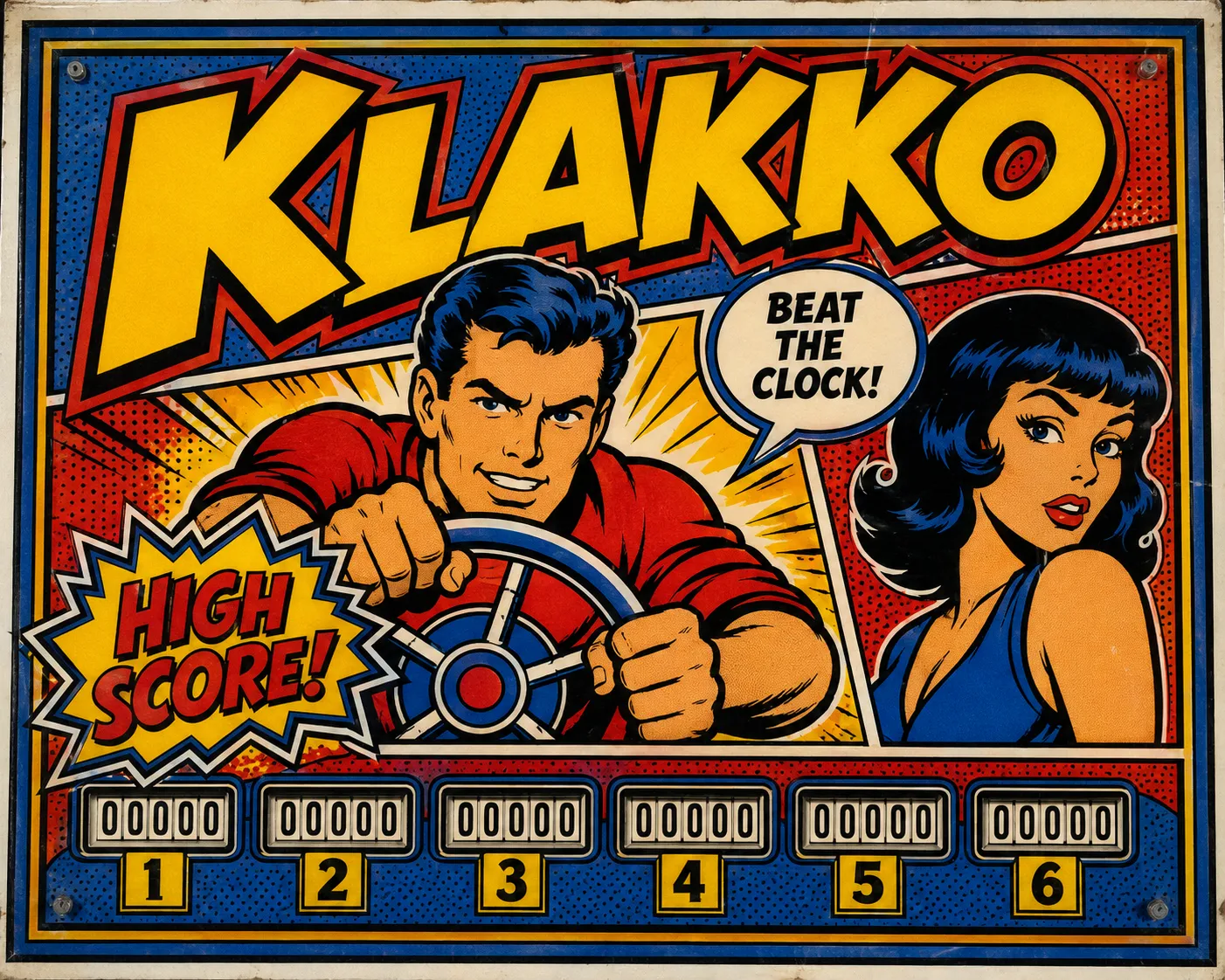
Pop Art Speech Balloon

StyleRef·@styleref·
Extract your style to start building your Style Board.

Description

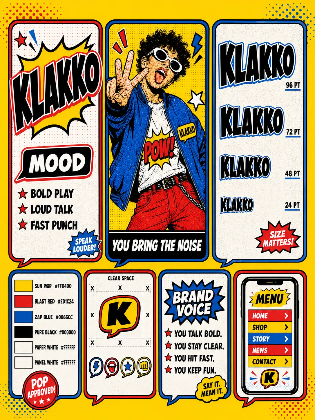
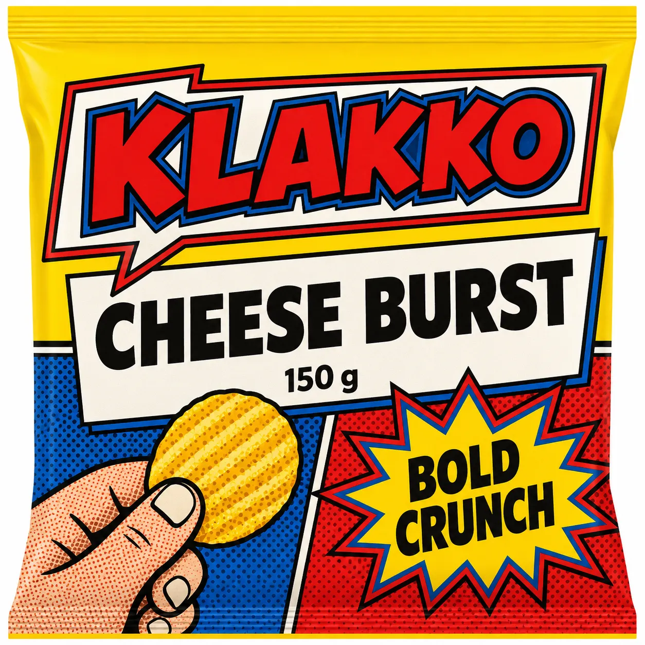
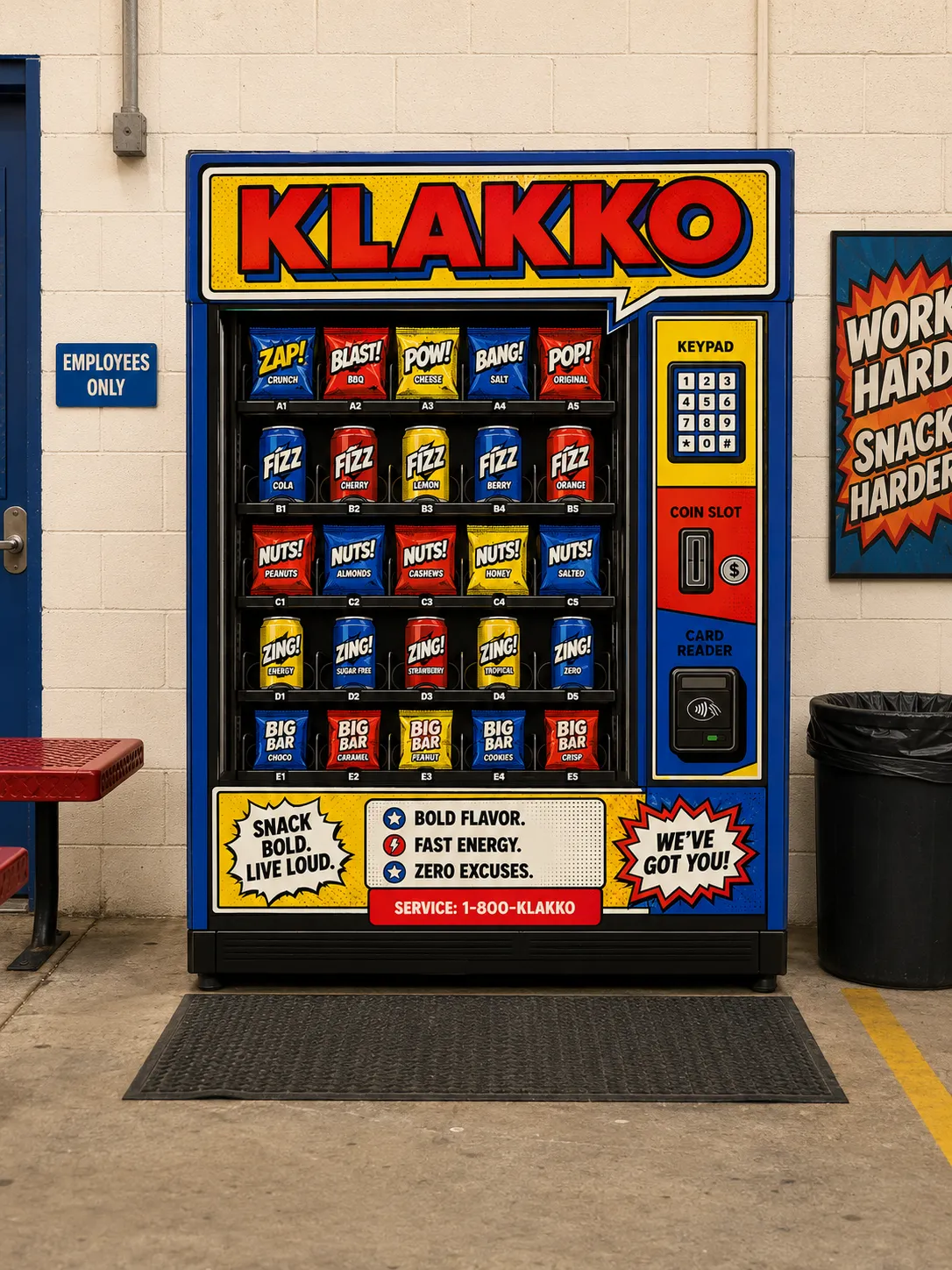
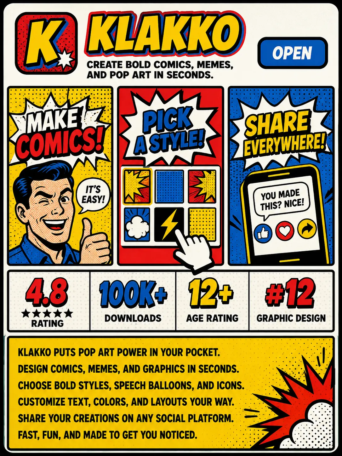
Pop Art Speech Balloon takes the machinery of cheap commercial printing and makes it the identity: an even outline of one heavy weight around everything, flat process yellow, red and blue with no mixing, a regular dot grid used as a colour in its own right, and a shaped balloon carrying one loud line of copy. Everything is drawn as if it were about to be printed badly on newsprint, on purpose. It suits snacks and soft drinks, arcades and cinemas, toys, comics and any consumer brand that has to win an argument on a shelf.

Typography

Aa, Bb, Typography
Font FamilyDisplay / Decorative
Line HeightTight
Font WeightsExtra Bold
Letter SpacingTight for display; normal for body copy
Type ScaleModular
Text Case
ALL CAPS
Font Pairing Strategy
Display + Body
Hierarchy
Strong contrast
Text Visual Role
Primary visual driver
Text Integration
Embedded in shapes
Text Presence
Required

Mood & Personality

Mood & Personality
Bold, Playful, Confident, Rebellious
Energy Level
High-Octane
Emotional Bias
Positive
Tone Register
Performative
Representation Mode
Literal
Real-world Accuracy
Stylized
Humor Usage
Frequent

Voice & Language

Formality
Casual
Vocabulary Level
Simple
Directness
Blunt
Sentence Length
Short
Metaphor Density
Literal
Writing Perspective
Second person (you)
Copy Pacing
Punchy
Jargon / Technical Level
None

Line & Stroke System

Stroke Usage
Decorative outlines
Stroke Weight
Heavy
Stroke Consistency
Uniform, heavy, even-weight outlines around every display letterform, container, icon, and figure
Stroke Joins
Miter
Stroke Color
Contrasting accent

Artistic Mediums & Techniques

Physical Medium
Uncoated newsprint, thin board, flexographic or offset print; screen print where applicable
Illustrative Technique
Flat design, commercial-print illustration, coarse fixed-dot photo conversion

Colors

#FFD40030%Usage: Dominant primary
#ED1C2420%Usage: Primary red
#0066CC20%Usage: Primary blue
#00000010%Usage: Outlines and text
#FFFFFF20%Usage: Paper white
Palette Size
3–5 colors
Color Temperature
Neutral
Saturation Range
Vivid
Contrast Strategy
Hue contrast
Hue Relationships
Triadic
Gradient Policy
No gradients
Black & White Point
Pure black + Pure white
Color Dominance
One dominant process primary per composition; paper white is the second-largest area

Container / Boundary

Container presence
Explicit (shape mask)
Container shape
Speech balloon with tail, pointed burst, rounded plaque, or boxed initial
Container Dominance
Primary visual identity
Edge behavior
Intentional bleed
Padding rules
Clear space: one outline width plus one dot pitch on every side

Surface, Material & Detail

Surface Treatment
Flat process ink; visibly printed dot structure; no premium finishing
Surface Texture Style
Fixed-size regular dot grid; intensity controlled by dot spacing, never dot size
Texture Usage
Patterned
Imperfection Level
Slight authentic print misregistration and real-use scuffs or creases only
Pattern / Motif Usage
Three stated dot pitches used as grounds, container fills, and inner surfaces; never behind body copy

References

Cultural References
Pop Art
Temporal Reference
1960s
Reference Brands
Roy Lichtenstein comic enlargements; Andy Warhol silkscreen mass-production language

Background & Environment

Background Type
Solid color
Background–Subject Relationship
Contrasting
Background Complexity
Simple

Guardrails

Common Artifacts to Avoid
Stylistic filters, Film Grain / Noise
Avoided Visuals
variable-size photographic halftones; distressed comic textures; torn edges; fake ageing; wobbly hand-lettered baselines; shocked-photo balloon pastiche; dark interfaces; premium presentation cues
Avoided Colors
pastels; metallic inks; fifth colors; mixed secondary inks; black backgrounds
Avoided Words
thoughtfully crafted; discerning; artisanal; crafted experience; ingredient sincerity
Allowed Visuals
fixed-size dot grids; flat yellow red blue black inks; paper white; heavy even outlines; rectangular panels; speech balloons; pointed bursts; rounded icon stamps; close crops; one motion mark per composition
Conditional Logic
Use no more than two inks in the logo. At small sizes drop offset outline, then dot fields, then container; use a boxed black initial on one primary at the smallest size. Keep balloon copy to nine words or fewer.

Output Format

Creative Discipline
Brand identity
Medium
Print
Scaling Expectation
Print-scale
Canvas Behavior
Soft frame (visual tension allowed)

UI & Web

Color Theme
Light
Background Tone
Pure white
Accent Strategy
Multi-tonal palette
Semantic Colors
Error + Warning
Border Philosophy
Visible solid border
Button Shape
Rounded (8–16px)
Icon Style
Filled
Icon Weight
Bold (2.5px+)
Surface Layers
Two-layer (page + card)
Elevation Approach
Flat — no elevation
Shadow Technique
Shadow-as-border
Hover Treatment
Background shift

Spatial Structure & Hierarchy

Perspective Style
Flat
Focal Structure
Primary + secondary
Hierarchy Clarity
Strong
Symmetry
Asymmetrical balance
Layout Axis
Horizontal
Grid System
Modular grid
Visual Density
Busy
Plane Separation Method
Color/value shift, Overlap

Shape Language

Shape Basis
Hybrid
Primitive Dominance
Rectangles, Polygons, Freeform curves
Edge Sharpness
Razor-sharp
Silhouette Clarity
Iconic
Curve Consistency
Uniform radius
Negative Space Usage
Minimal
Angle Usage
Frequent

Custom Style Items

Double Outline
Black outline plus offset contrasting primary outline on every display letterform and container; fixed relative weight.
Panel Composition
Two to five unequal rectangular panels with heavy gutters; one idea per panel; subjects crop off edges.
Structural Devices
Balloon tail or burst breaks a panel edge to connect adjacent panels; bursts carry two or three words.
Icon Economy
Outlined flat objects or reactions in rounded stamp containers; maximum four elements; one dot field may provide shading.
Type Discipline
Slightly condensed square-joined display capitals on a flat baseline; body copy is heavy grotesque, flush left with hard rag.
© 2026 StyleRef. All rights reserved.