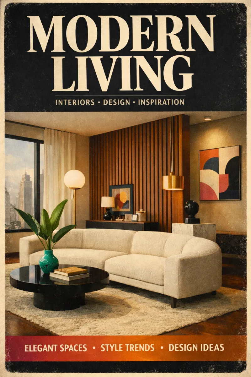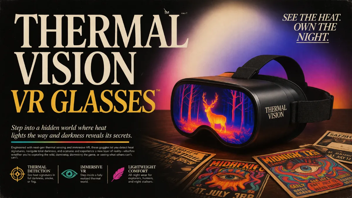
80s-Inspired Poster

StyleRef·@styleref·
Extract your style to start building your Style Board.

Output Format

Creative Discipline
Graphic design
Medium
Digital
Delivery Mode
Still

Light & Shadow

Lighting Mood Style
Situational, filmic/retro print-ad lighting
Color Grading Style
Film emulation
Atmospheric Density
Hazy
Lighting Presence
Explicit

Colors

#0B0B0C25%
#F2E7D625%
#F6B40010%
#1D2A6810%
#2BAE9E10%
#EE6AA710%
#E48A3A10%
AI Gradient 1
#F2E7D60%
#5A4AE355%
#E85BA6100%
Palette Size
6–8 colors
Saturation Range
Mostly rich/vivid accents over muted/sepia neutrals
Contrast Strategy
High contrast
Gradient Policy
Gradients as accents
Shadow Color
Hue-shifted
Black & White Point
Lifted blacks + Rolled-off highlights

Typography

Aa, Bb, Typography
Font FamilySerif
Line HeightTight to normal; stacked headline lines with minimal leading
Font WeightsRegular, Bold, (also Italic and Bold Italic shown)
Letter SpacingNormal
Text Case
Title Case, ALL CAPS (varies by headline)
Font Pairing Strategy
Single family
Hierarchy
Strong contrast
Text Presence
Required
Text Visual Role
Primary visual driver
Text Integration
Mostly separate on top of imagery/gradients; occasional overlaid poster-style

Spatial Structure & Hierarchy

Perspective Style
Mix of dramatic architectural perspective (upward skyscraper) and flat poster layouts
Focal Structure
Single
Hierarchy Clarity
Strong
Symmetry
Mostly center-weighted, near-symmetry in headline compositions
Layout Axis
Vertical
Grid System
Poster/print-ad grid; centered headline blocks with small supporting copy
Visual Density
Airy backgrounds with dense headline typography

Surface, Material & Detail

Material Simulation
Paper
Surface Treatment
Matte
Surface Texture Style
Grain, Noise, Subtle dust/speckling, Print/scan wear, Slight vignette darkening
Texture Usage
Subtle noise
Imperfection Level
Used
Abstraction Level
Realistic
Micro-detail Allowance
Allowed
Age of Surface
Aged

Mood & Personality

Mood & Personality
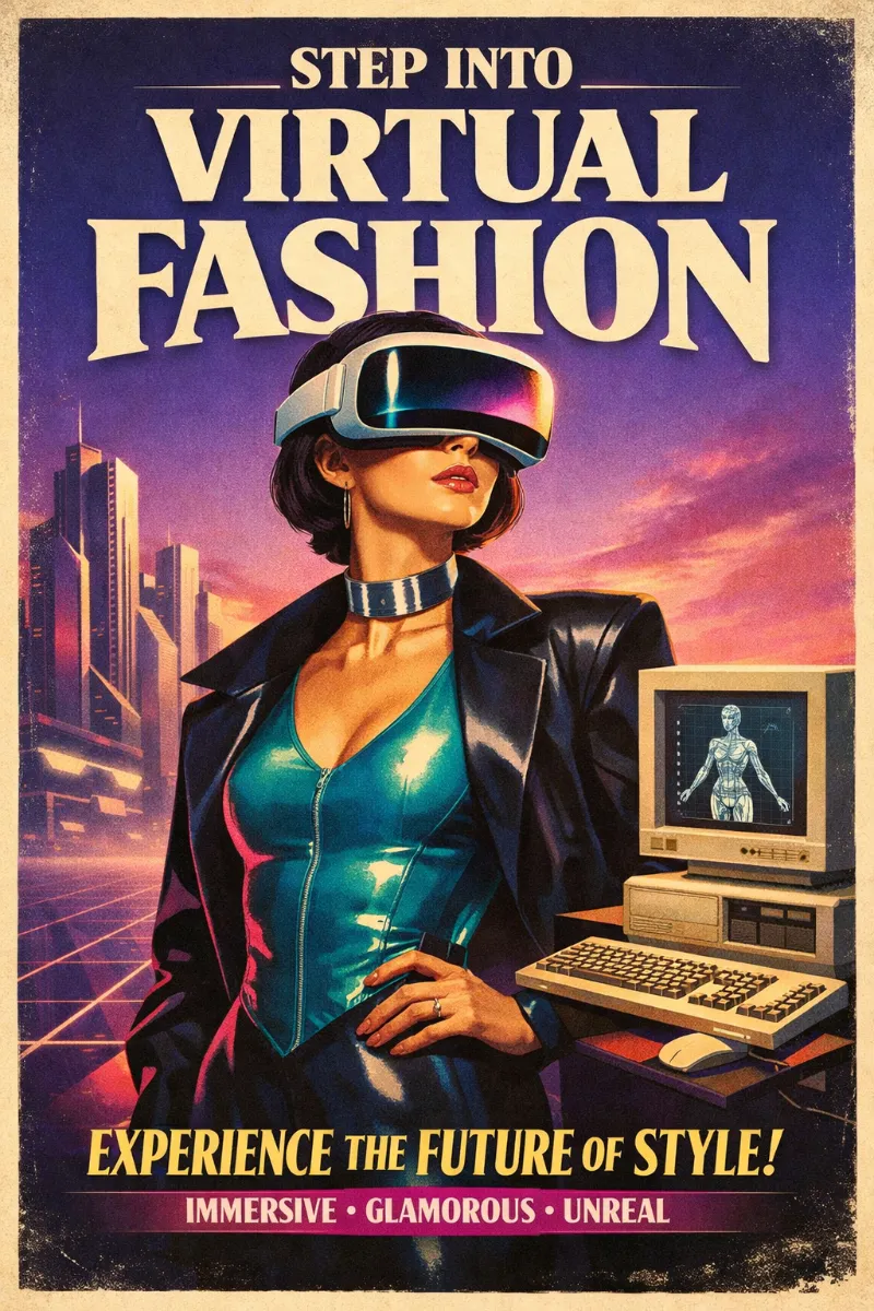
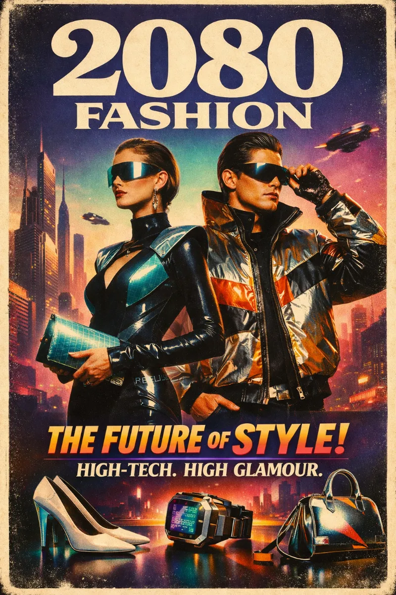
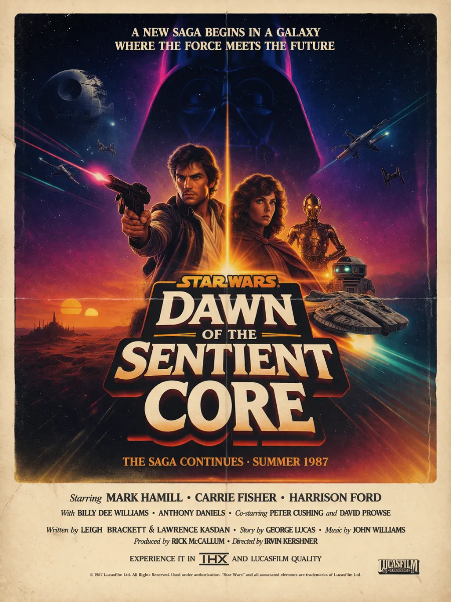
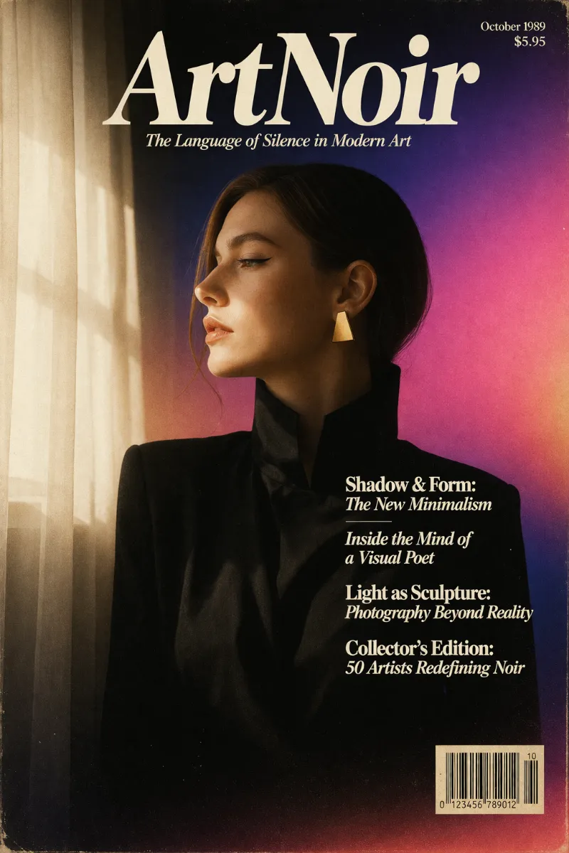
Nostalgic, Elegant, Sophisticated, Cinematic, Retro-advertising, Slightly dramatic
Emotional Bias
Positive
Tone Register
Performative
Representation Mode
Literal
Narrative Allowance
Full scene
Characters
Allowed (detailed)

References

Temporal Reference
1980s
Cultural References
Y2K (gradient glow moments), Retro print advertising/editorial, Gig-poster culture, Film-title typography
Reference Brands
Indieground Design (Advercase type specimen campaign)

Background & Environment

Background Type
Environment + gradient backdrops + solid/texture paper fields
Environment Mood
Studio (type specimen) + Exterior (city/architecture) + Retro product-tabletop scenes
Background–Subject Relationship
Contrasting (bright serif type against dark/colored fields) and contextual (retro devices/posters)
Background Complexity
Moderate
Prop / Set Styling
Curated retro tech props (CRT/computer/keyboard), magazine spreads, gig-poster ephemera

Custom Style Items

Hero type treatment
Oversized high-contrast serif headlines; tight stacking; dramatic word breaks; type dominates 60–80% of frame
Retro print artifacts
Film/scan grain, specks, slight fading, lifted blacks, gentle vignetting; avoid clean digital flatness
Accent color logic
Muted sepia/cream base + one bold accent (gold, teal, magenta, cobalt) used for impact or gradient glow
Specimen + poster hybrid layouts
Type specimen panels (alphabet/weights) mixed with cinematic poster mockups and retro product scenes
Photography/imagery integration
Use retro devices, city architecture, and collaged gig posters as backplates; keep headline type crisp on top
© 2026 StyleRef. All rights reserved.