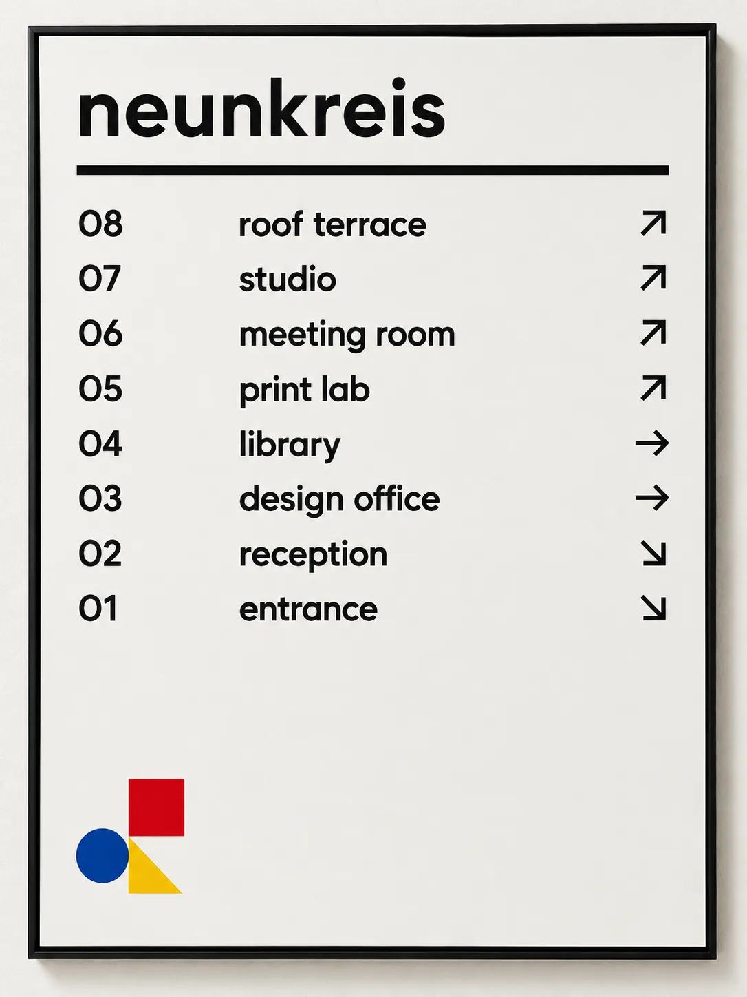
Bauhaus Lowercase Modernism

StyleRef·@styleref·
Extract your style to start building your Style Board.

Description

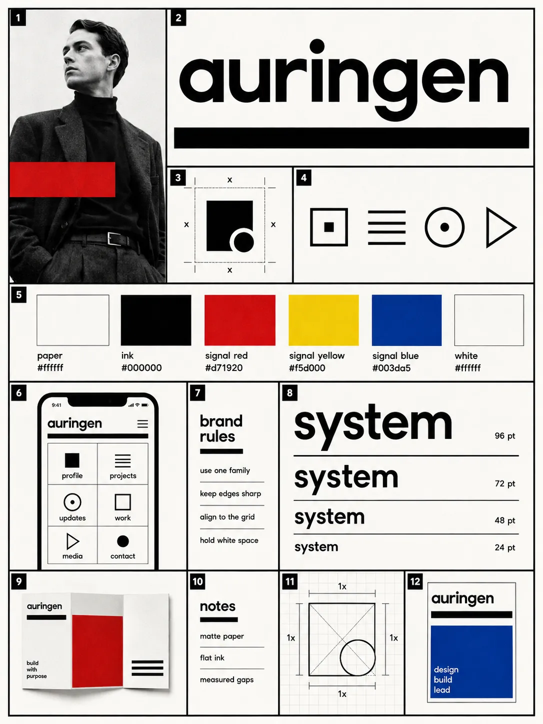
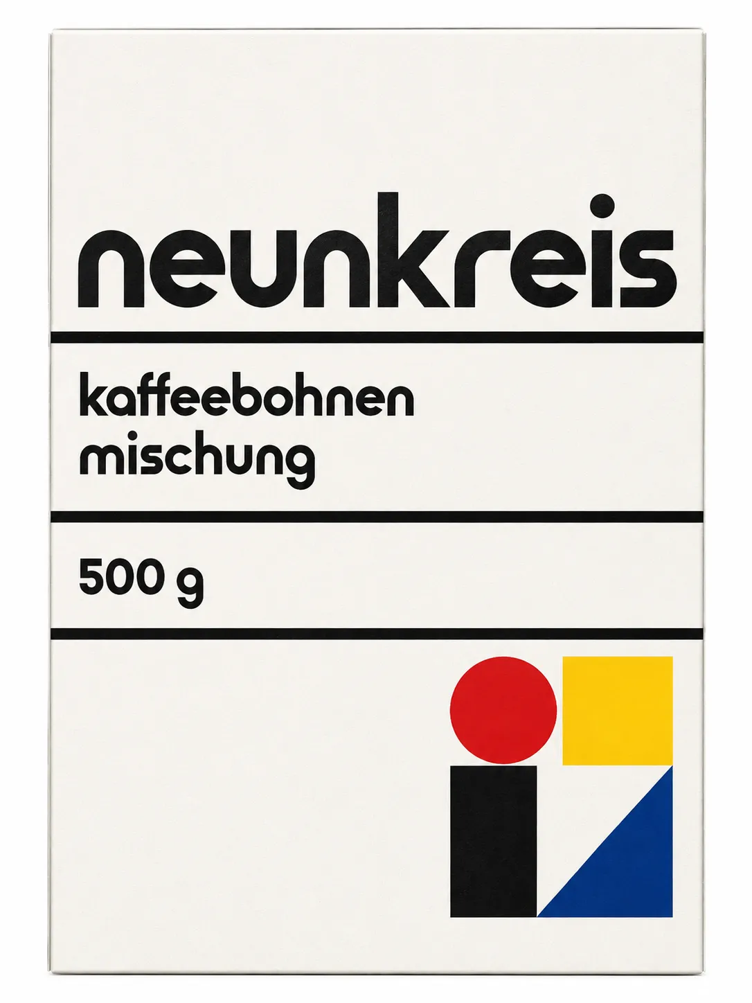
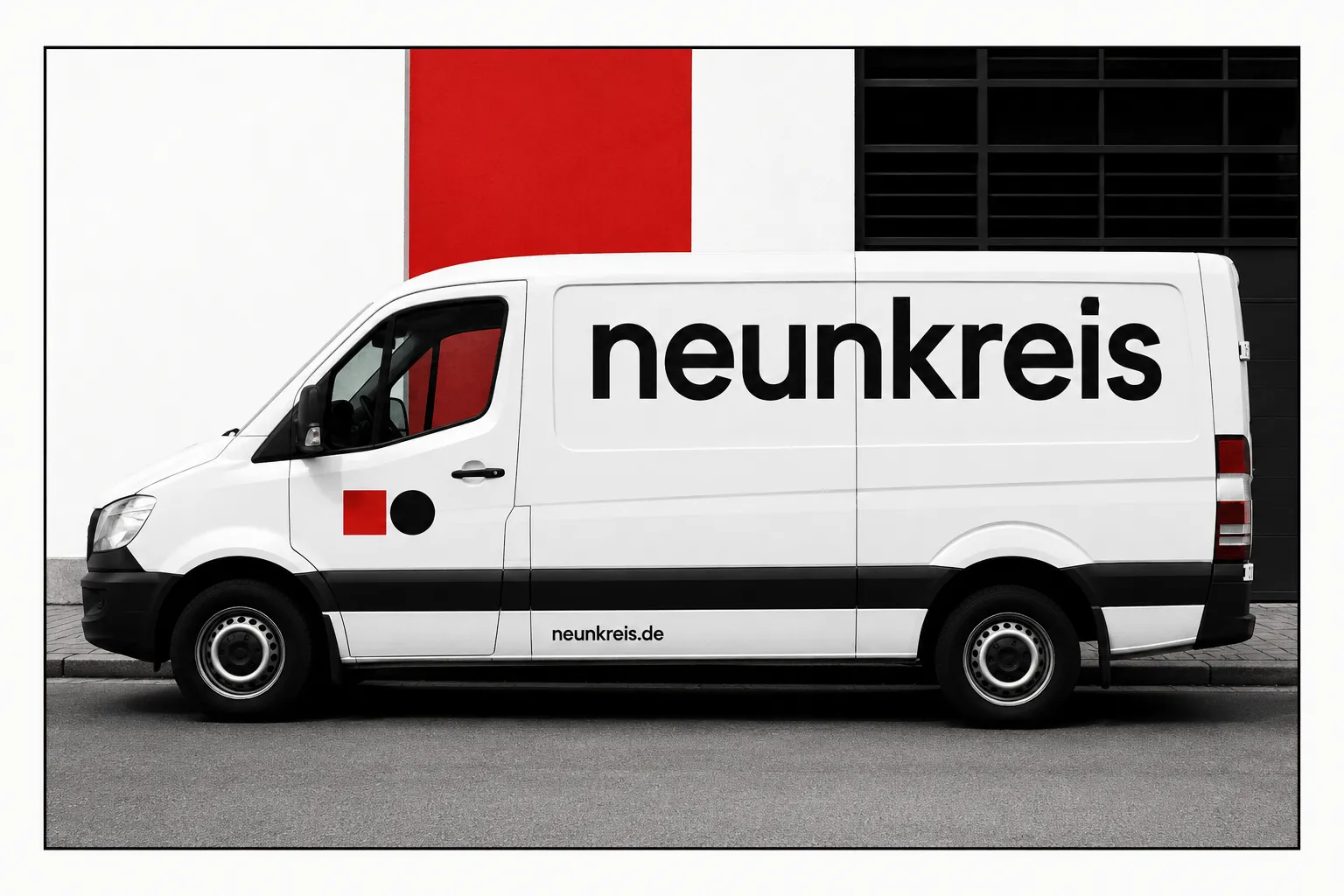
Bauhaus Lowercase Modernism is the printed identity language of the 1919–1933 German school: red, yellow and blue laid down as solid blocks on white, heavy black bars ruling the page, and a lowercase-only geometric sans built from compass and ruler rather than handwriting. Nothing is decorative — every bar, block and rule is doing a job of separation or emphasis. It suits identities for cultural institutions, transit and civic services, design studios and product companies that want to read as rational and built rather than styled.

Mood & Personality

Mood & Personality
Confident, Authoritative, Minimalist, Clean, Serious
Energy Level
Steady
Emotional Bias
Neutral
Tone Register
Detached
Representation Mode
Symbolic

Voice & Language

Formality
Professional
Vocabulary Level
Simple
Directness
Straightforward
Sentence Length
Short
Metaphor Density
Literal
Writing Perspective
Second person for instructions; first person plural for institutional decisions.
Copy Pacing
Punchy
Jargon / Technical Level
Light industry terms

Container / Boundary

Container presence
Implicit (visual edges only)
Corner treatment
Sharp
Padding rules
Generous
Edge behavior
Content fully contained

Spatial Structure & Hierarchy

Perspective Style
Flat
Focal Structure
Primary + secondary
Hierarchy Clarity
Strong
Symmetry
Asymmetrical balance
Balance Type
Tension-based
Layout Axis
Diagonal
Plane Separation Method
Overlap, Color/value shift
Grid System
Modular grid
Visual Density
Airy
Grid System
Visible gutters and measured empty intervals; elements align or butt flush, with a single deliberate diagonal per composition.

Custom Style Items

Logo Construction
Build marks from one or two primitives on a square grid; publishable ratios, arc centres, and angles.
Clear Space
Maintain clear space equal to the lowercase n-height on every side.
Signature Divider
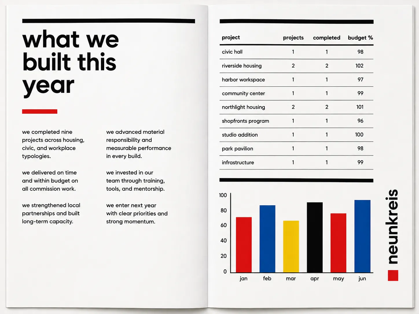
Use a heavy black bar or rule to divide the field, often carrying type.
Block Relationship
Butt primary blocks flush to photographs or other blocks; no soft separation.

Typography

Regular, Aa, Bb, Typography
Font FamilyGeometric sans
Line HeightTight
Font WeightsRegular, Bold
Letter SpacingNormal
Text Case
lowercase
Font Pairing Strategy
Single family
Hierarchy
Strong contrast
Text Presence
Required
Text Visual Role
Primary visual driver
Text Integration
Embedded in shapes
Text Integration
Hard left rag; headlines may sit in bars or run vertically along a rule; never curved, arced, or distorted.

Output Format

Creative Discipline
Brand identity
Medium
Print
Aspect Ratio
3:4 (Portrait)
Canvas Behavior
Strict frame (nothing escapes)
Scaling Expectation
Print-scale

UI & Web

Color Theme
Light
Background Tone
Pure white
Accent Strategy
Multi-tonal palette
Elevation Approach
Flat — no elevation
Border Philosophy
Visible solid border
Button Shape
Sharp rectangle
Icon Style
Flat geometric
Animation Philosophy
Functional only
Transition Speed
Fast (80–150ms)
Focus Ring Style
Solid offset ring

Surface, Material & Detail

Material Simulation
Paper
Surface Treatment
Matte
Surface Texture Style
Grain
Texture Usage
Subtle noise
Imperfection Level
Clean
Age of Surface
New
Surface Treatment
Uncoated paper tooth with flat offset ink; slight ink-density variation and fine two-color misregistration permitted.

Artistic Mediums & Techniques

Physical Medium
Screen Print
Illustrative Technique
Flat design, Vector illustration
Illustrative Technique
Illustration is arranged cut geometry, not expressive drawing.

Post-processing & Render Style

Image Treatment
Duotone
Image Treatment
Straight black-and-white documentary photography; hard rectangular crops, optionally overprinted with a flat primary block.

Colors

#FFFFFF55%Usage: Background
#00000025%Usage: Structural rules and body text
#D719208%Usage: Primary blocks
#F5D0006%Usage: Primary blocks
#003DA56%Usage: Primary blocks
Palette Size
3–5 colors
Saturation Range
Vivid
Contrast Strategy
Hue contrast
Hue Relationships
Triadic
Gradient Policy
No gradients
Color Dominance
Background-dominant
Black & White Point
Pure black + Pure white
Accessibility Level
WCAG AA

Shape Language

Shape Basis
Geometric
Primitive Dominance
Circles, Rectangles, Polygons
Edge Sharpness
Razor-sharp
Silhouette Clarity
Iconic
Curve Consistency
Uniform radius
Negative Space Usage
Dominant
Angle Usage
Limited
Shape Basis
True circles, squares, and triangles only; never stretched or softened.

Line & Stroke System

Stroke Usage
Structural outlines
Stroke Weight
Heavy black bars and rules; icon strokes equal the adjacent type stem width.
Stroke Consistency
Uniform
Stroke Color
Neutral
Stroke Joins
Miter

References

Cultural References
Bauhaus
Temporal Reference
1920s
Reference Brands
Herbert Bayer Universal alphabet; Joost Schmidt Bauhaus print workshop

Background & Environment

Background Type
Solid color
Background–Subject Relationship
Contrasting
Background Complexity
Minimal

Guardrails

Common Artifacts to Avoid
AI Gloss / Plastic Smoothing, Heavy Bokeh / Blur, Lens Flare, Film Grain / Noise, HDR over-processing, Over-saturation, Studio Post-processing, Stylistic filters
Avoided Visuals
rounded bubbly type; confetti shape layouts; decorative crests; uncontrolled photographic backgrounds; curved or distorted type; outline logo versions; rotated logos
Avoided Colors
beige; terracotta; sage; tinted primaries; shaded color; recoloring beyond red, yellow, blue, black
Avoided Layouts
circle-triangle-square lineup; floating elements; soft gaps between blocks; decorative symmetry
Allowed Visuals
true circles; squares; triangles; black bars; hairline rules; modular grids; hard rectangular photo crops; solid primary blocks; measured white space
Conditional Logic
Below minimum readable internal detail, use the symbol alone; progressively remove photograph, secondary primaries, then wordmark.
© 2026 StyleRef. All rights reserved.