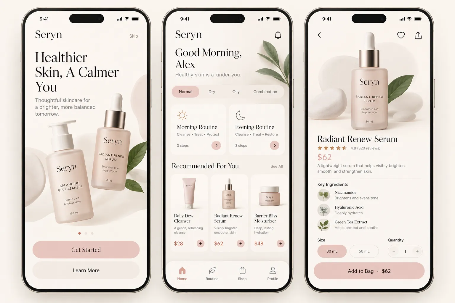
DTC Beauty Storefront

StyleRef·@styleref·
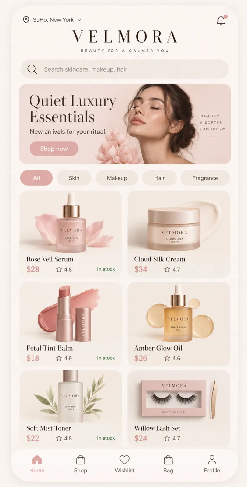
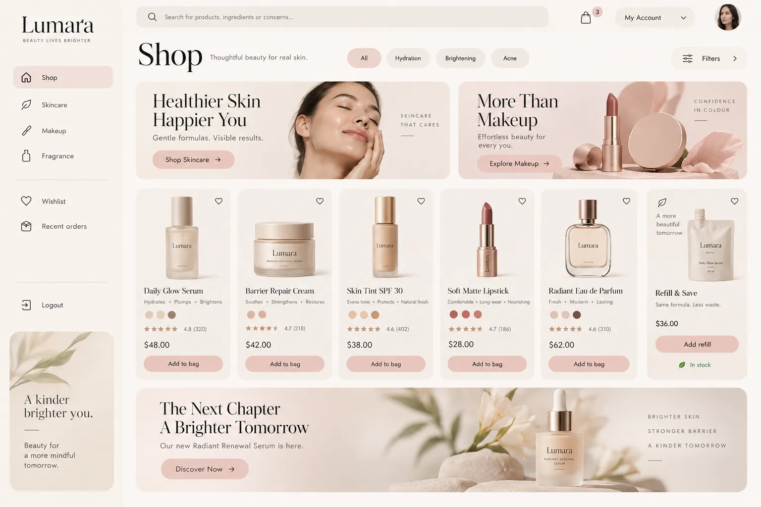
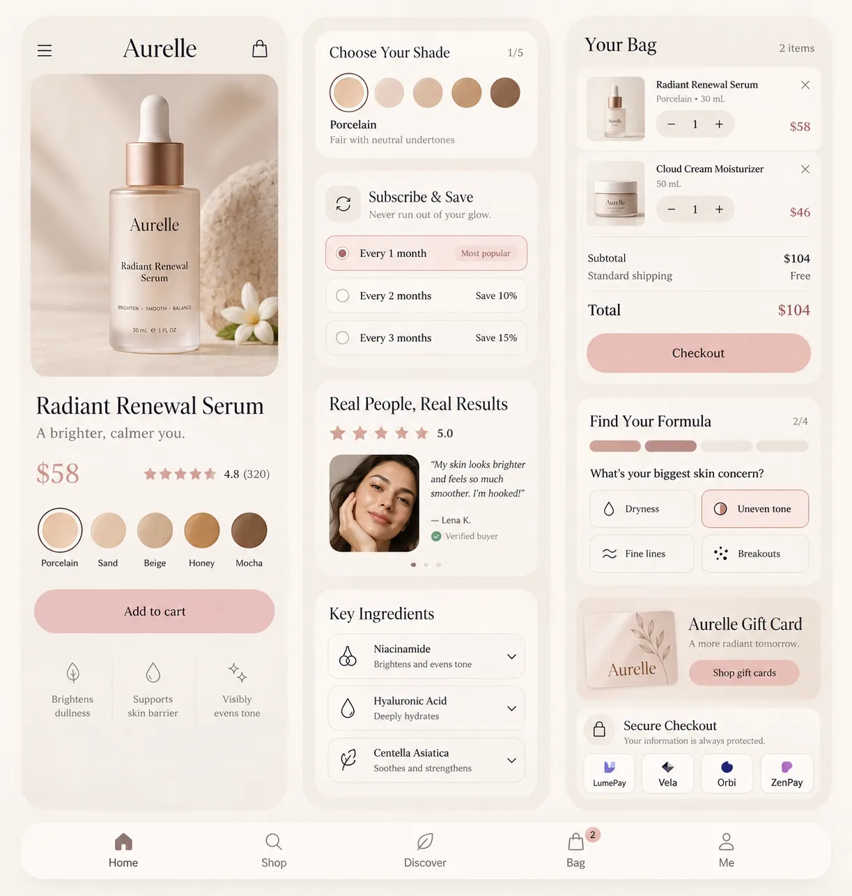
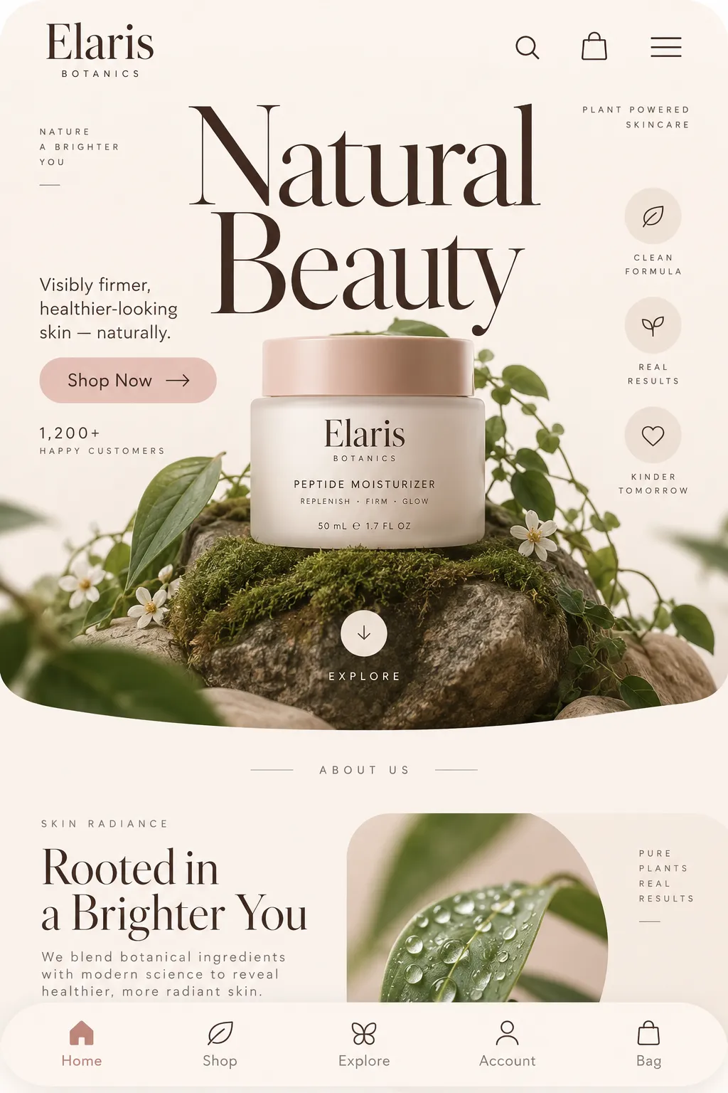
STYLE REFERENCE — HARD CONSTRAINT (HIGHEST PRIORITY) This style must be applied to ALL generated content (text, image, video). If any part of the request conflicts with this style, the style OVERRIDES the request. STYLE DEFINITION (to be operationally enforced): DTC Beauty Storefront • Output Format: Creative discipline: UI/UX; Digital; Mobile. • Container / Boundary: Container: Implicit (visual edges only); Fully rounded Corners; Padding: Generous. • Mood & Personality: Sophisticated, Elegant, Calm, Minimalist, Clean; Energy: Mellow. • Colors: Palette: Solid Colors: [ #FBF6F1 40% (Background), #3A2E2A 18% (Typography), #E9C8C2 15% (Primary action and price emphasis), #EFE4DA 12% (Surface separation), #C4A79A 7% (Supporting accents), #8A7F78 5% (Secondary text), #5E7A63 3% (In-stock state)]; 6–8 colors; Warm temperature; Saturation: Muted; Value contrast; Hue relationships: Analogous; Subtle gradients only; Color dominance: Background-dominant; Black/White point: Lifted blacks + Rolled-off highlights; Accessibility: WCAG AA. • Typography: Didone; Light, Regular, Medium; Text case: Title Case for display; sentence case for UI and body; Font pairing: Display + Body; Hierarchy: Strong contrast; Type scale: Responsive; Relaxed (1.6); Letter spacing: Wide; Text visual role: Secondary visual element. • Light & Shadow: Lighting mood style: Studio-flat; Key light style: Diffused; Shadow type: Diffuse; Shadow density: Faint; Lighting presence: Implied. • Spatial Structure & Hierarchy: Flat perspective; Hierarchy: Moderate; Symmetry: Near symmetry; Balance: Center-weighted; Layout axis: Vertical; Grid system: Column grid; Visual density: Airy. • Surface, Material & Detail: Surface treatment: Matte; Imperfection level: Polished. • Shape Language: Hybrid; Primitive dominance: Rectangles, Freeform curves; Edge sharpness: Fully rounded; Negative space usage: Dominant; Angle usage: None. • UI & Web: Color theme: Light; Background tone: Warm off-white; Accent strategy: Single functional accent; Semantic colors: Error + Warning; Layout archetype: Marketing page; Density: Comfortable; Spacing scale: Loose modular; Surface layers: Two-layer (page + card); Elevation: Background contrast only; floating add-to-bag bar is the sole elevated element; Shadow technique: Single wide soft drop shadow beneath floating add-to-bag bar only; Borders: Borderless; Corner radius scale: Large (16–24px); Card style: Filled tint; Button shape: Full pill; Button hierarchy: Primary + Secondary + Ghost; Icon style: Outline / Stroke; Icon weight: Thin (1px); Navigation: Bottom tab bar; Nav style: Sticky solid; Hover: Opacity change; Focus ring: Solid offset ring; Animation: Functional only; Transition speed: Deliberate (350–500ms). • Guardrails: Avoid Visuals: sale-badge clutter; countdown timers; bordered cards; dense grids; serif body text; glossy surfaces; Avoid Colors: saturated red urgency colour; bright saturated colours; Allowed Visuals: warm tonal surface shifts; large product imagery; soft blush primary action; quiet green in-stock state; spacious two-column product grid; floating add-to-bag bar. • Display Type Rule: Didone only for headings and product names; never use it for UI labels, controls, or body copy., Accent Allocation: Reserve blush for primary actions and price emphasis; use quiet green only for in-stock status., Surface Separation: Separate borderless surfaces through faint warm tonal shifts, never strokes., Product Layout: Two-column product grid with large imagery, comfortable gutters, and generous vertical section gaps.. ENFORCEMENT RULE: Before finalizing the output, internally verify that ALL elements comply with the style definition above. If compliance is uncertain, simplify or soften the output until it fully matches the style. Generated by StyleRef.io

Description

Blush and clay neutrals, a Didone display over a geometric sans, full-pill controls, no borders and unhurried transitions. The direct-to-consumer look, specified tightly enough to build.

Typography

Light, Regular, Aa, Bb, Typography
Font FamilyDidone
Line HeightRelaxed
Font WeightsLight, Regular, Medium
Letter SpacingWide
Type ScaleResponsive
Text Case
Title Case for display; sentence case for UI and body
Font Pairing Strategy
Display + Body
Hierarchy
Strong contrast
Text Visual Role
Secondary visual element

Light & Shadow

Lighting Mood Style
Studio-flat
Key Light Style
Diffused
Shadow Type
Diffuse
Shadow Density
Faint
Lighting Presence
Implied

Container / Boundary

Container presence
Implicit (visual edges only)
Corner treatment
Fully rounded
Padding rules
Generous

Custom Style Items

Display Type Rule
Didone only for headings and product names; never use it for UI labels, controls, or body copy.
Accent Allocation
Reserve blush for primary actions and price emphasis; use quiet green only for in-stock status.
Surface Separation
Separate borderless surfaces through faint warm tonal shifts, never strokes.
Product Layout
Two-column product grid with large imagery, comfortable gutters, and generous vertical section gaps.

UI & Web

Color Theme
Light
Background Tone
Warm off-white
Accent Strategy
Single functional accent
Semantic Colors
Error + Warning
Layout Archetype
Marketing page
Density
Comfortable
Spacing Scale
Loose modular
Surface Layers
Two-layer (page + card)
Elevation Approach
Background contrast only; floating add-to-bag bar is the sole elevated element
Shadow Technique
Single wide soft drop shadow beneath floating add-to-bag bar only
Border Philosophy
Borderless
Corner Radius Scale
Large (16–24px)
Card Style
Filled tint
Button Shape
Full pill
Button Hierarchy
Primary + Secondary + Ghost
Icon Style
Outline / Stroke
Icon Weight
Thin (1px)
Navigation Pattern
Bottom tab bar
Navigation Style
Sticky solid
Hover Treatment
Opacity change
Focus Ring Style
Solid offset ring
Animation Philosophy
Functional only
Transition Speed
Deliberate (350–500ms)

Shape Language

Shape Basis
Hybrid
Primitive Dominance
Rectangles, Freeform curves
Edge Sharpness
Fully rounded
Negative Space Usage
Dominant
Angle Usage
None

Surface, Material & Detail

Surface Treatment
Matte
Imperfection Level
Polished

Colors

#FBF6F140%Usage: Background
#3A2E2A18%Usage: Typography
#E9C8C215%Usage: Primary action and price emphasis
#EFE4DA12%Usage: Surface separation
#C4A79A7%Usage: Supporting accents
#8A7F785%Usage: Secondary text
#5E7A633%Usage: In-stock state
Palette Size
6–8 colors
Color Temperature
Warm
Saturation Range
Muted
Contrast Strategy
Value contrast
Hue Relationships
Analogous
Gradient Policy
Subtle gradients only
Color Dominance
Background-dominant
Black & White Point
Lifted blacks + Rolled-off highlights
Accessibility Level
WCAG AA

Output Format

Creative Discipline
UI/UX
Medium
Digital
Platform
Mobile

Mood & Personality

Mood & Personality
Sophisticated, Elegant, Calm, Minimalist, Clean
Energy Level
Mellow

Spatial Structure & Hierarchy

Perspective Style
Flat
Hierarchy Clarity
Moderate
Symmetry
Near symmetry
Balance Type
Center-weighted
Layout Axis
Vertical
Grid System
Column grid
Visual Density
Airy

Guardrails

Avoided Visuals
sale-badge clutter; countdown timers; bordered cards; dense grids; serif body text; glossy surfaces
Avoided Colors
saturated red urgency colour; bright saturated colours
Allowed Visuals
warm tonal surface shifts; large product imagery; soft blush primary action; quiet green in-stock state; spacious two-column product grid; floating add-to-bag bar
© 2026 StyleRef. All rights reserved.