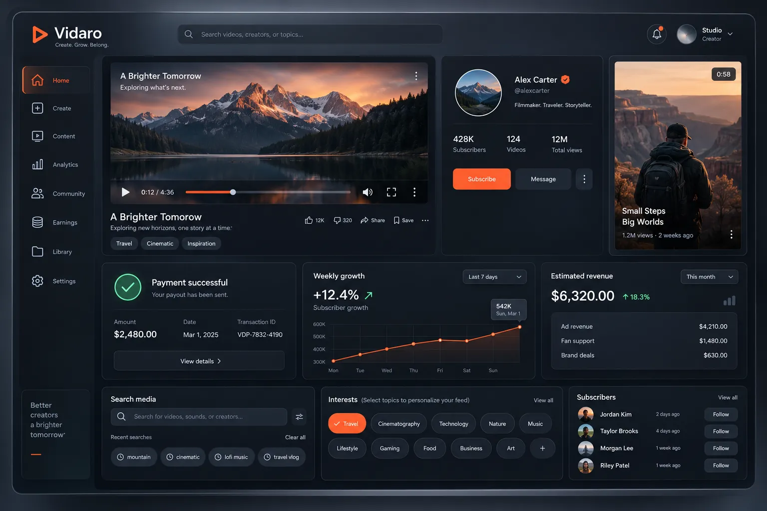
Spatial Depth 3D Interface

StyleRef·@styleref·
Extract your style to start building your Style Board.

Description

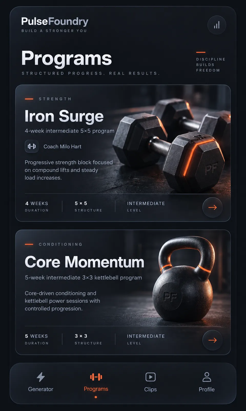
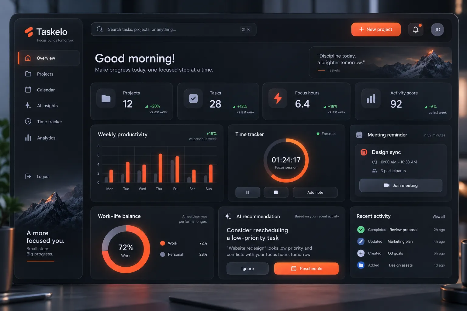
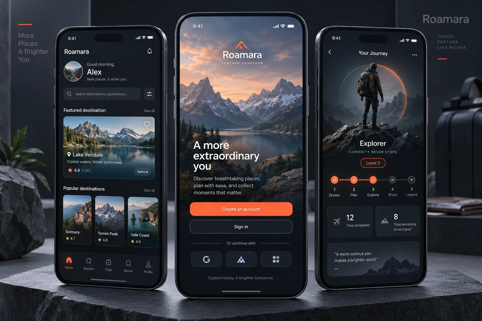
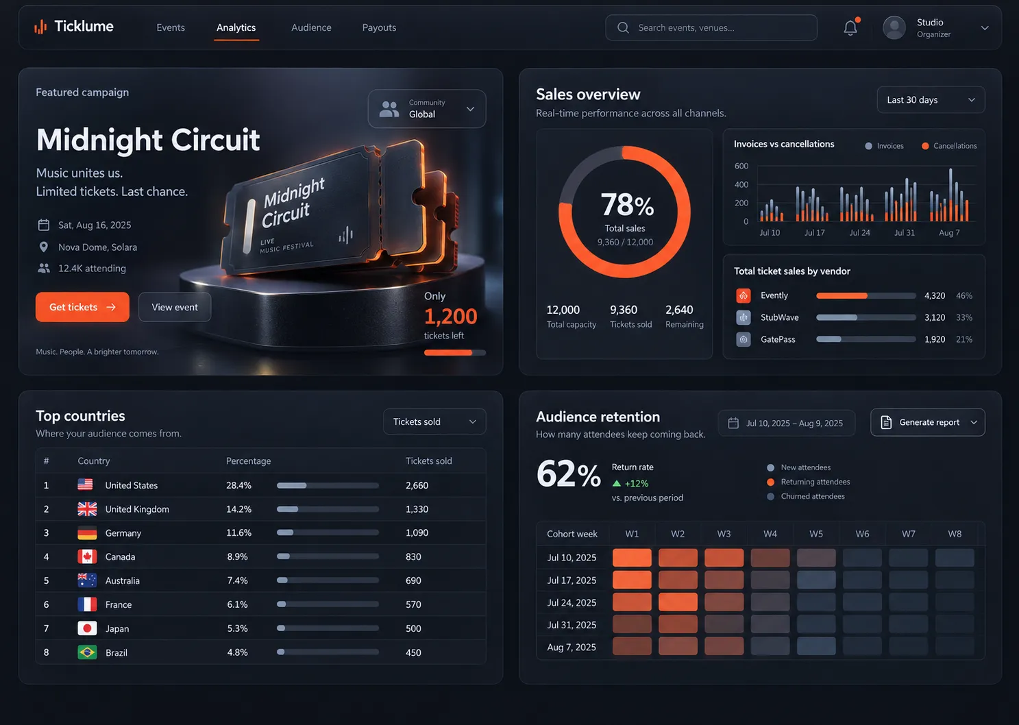
Real objects in a real space: rendered 3D props, depth-ordered layers and perspective cues that place the interface in a scene rather than on a page.

Colors

#12141A45%Usage: Background
#1D212B20%Usage: Panels
#E8EBF215%Usage: Typography
#8B93A67%Usage: Secondary UI
#B9C4D65%Usage: Rendered metal
#FF5B2E5%Usage: Emissive and UI accent
#3C46573%Usage: Edge details
Palette Size
6–8 colors
Color Temperature
Mixed
Saturation Range
Subdued
Contrast Strategy
Value contrast
Hue Relationships
Complementary
Gradient Policy
Subtle gradients only
Color Dominance
Background-dominant
Black & White Point
Pure black + Rolled-off highlights
Accessibility Level
WCAG AA

Output Format

Creative Discipline
UI/UX
Medium
Digital
Delivery Mode
Interactive
Platform
Web
Presentation Context
Raw UI

Light & Shadow

Lighting Mood Style
Low-key
Key Light Style
Soft
Light Source Type
Artificial
Lighting Direction
Soft cool key from upper left; cool fill; warm rim light
Light Source Count
Multiple
Shadow Type
Tight dark contact shadows with visible ambient occlusion
Shadow Density
Deep
Fill-light Ratio
Subtle fill
Lighting Presence
Explicit
Bloom / Glow Usage
Subtle

Camera and Motion

Depth of Field
Shallow focus
Camera Movement
Pointer-driven parallax; slow orbital turntable rotation; panels translate through depth
Motion Intensity
Fluid
Motion Implication
Dynamic
Easing Function
Spring
Animation Duration Feel
Leisurely

Background & Environment

Background Type
Environment
Environment Mood
Studio
Background–Subject Relationship
Integrated
Background Complexity
Simple
Prop / Set Styling
Curated

Custom Style Items

Depth Hierarchy
Hero object at focal centre; panels occupy explicit foreground and background depth bands.
Scene Grounding
Imply a floor or horizon through contact shadows and soft global bounce.
Accent Binding
Use the ember accent identically for primary UI emphasis and emissive scene material.
Typography Plane
All type remains flat, readable, and square to the viewer; never perspective-tilted.

UI & Web

Color Theme
Dark
Background Tone
Near-black
Accent Strategy
Single functional accent
Layout Archetype
Marketing page
Content Width
Wide container (1280–1440px)
Density
Spacious
Surface Layers
Three-layer (page + card + elevated)
Elevation Approach
Physical scene depth and contact shadows; restrained UI elevation
Glass / Blur Effect
Frosted glass (blur)
Border Philosophy
Hairline (0.5–1px, low opacity)
Corner Radius Scale
Medium (8–12px)
Card Style
Glass
Button Shape
Rounded (8–16px)
Button Hierarchy
Primary + Secondary + Ghost
Icon Style
Legible duotone icons; light extrusion permitted
Navigation Pattern
Top bar
Navigation Style
Sticky glass (blur)
UI Imagery
3D renders
Animation Philosophy
Physics-based / Spring
Transition Speed
Deliberate (350–500ms)
Scroll Behavior
Parallax depth
Focus Ring Style
Glow halo

Mood & Personality

Mood & Personality
Futuristic, Sophisticated, Clean, Confident
Emotional Bias
Neutral
Tone Register
Observational
Representation Mode
Literal
Real-world Accuracy
Precise
Characters
Forbidden

Voice & Language

Formality
Professional
Vocabulary Level
Technical
Directness
Clear
Sentence Length
Medium
Metaphor Density
Factual
Writing Perspective
Third person for descriptions; second person for actions
Copy Pacing
Flowing
Jargon / Technical Level
Light industry terms

Guardrails

Common Artifacts to Avoid
AI Gloss / Plastic Smoothing, HDR over-processing, Heavy Bokeh / Blur
Avoided Visuals
tilted UI panels; unsupported floating objects; decorative 3D; flat illustration; blown highlights; drop-shadow depth
Allowed Visuals
viewer-facing flat UI; depth-ordered panels; grounded hero objects; tight contact shadows; abstract geometry; material studies

Typography

Regular, Aa, Bb, Typography
Font FamilyNeo-grotesque
Line HeightNormal
Font WeightsRegular, Medium
Letter SpacingNormal
Type ScaleModular
Text Case
Sentence case
Font Pairing Strategy
Weight contrast
Hierarchy
Clear typographic scale
Text Presence
Required
Text Visual Role
Secondary visual element
Text Integration
Overlaid

Container / Boundary

Container presence
Explicit (shape mask)
Container shape
Rounded square
Corner treatment
Medium radius
Container Dominance
Neutral frame
Padding rules
Generous
Edge behavior
Content fully contained

Spatial Structure & Hierarchy

Perspective Style
2-point
Focal Structure
Single
Hierarchy Clarity
Strong
Symmetry
Near symmetry
Balance Type
Center-weighted
Layout Axis
Vertical
Plane Separation Method
Overlap, scale, value shift, depth-ordered layers
Scale Relationship
Human-scale
Grid System
Column grid
Visual Density
Airy

Shape Language

Shape Basis
Geometric
Primitive Dominance
Rectangles, Polygons
Edge Sharpness
Soft
Silhouette Clarity
Iconic
Curve Consistency
Uniform radius
Negative Space Usage
Dominant

Surface, Material & Detail

Material Simulation
Brushed metal, frosted acrylic, matte rubber, glass
Surface Treatment
Satin rendered objects; frosted or matte panels
Surface Texture Style
Brushed metal grain; subtle roughness variation
Texture Usage
Subtle noise
Optical Finishes
Anodized
Imperfection Level
Polished
Abstraction Level
Photorealistic
Micro-detail Allowance
Allowed

References

Cultural References
Minimalism
Temporal Reference
Near-future
© 2026 StyleRef. All rights reserved.