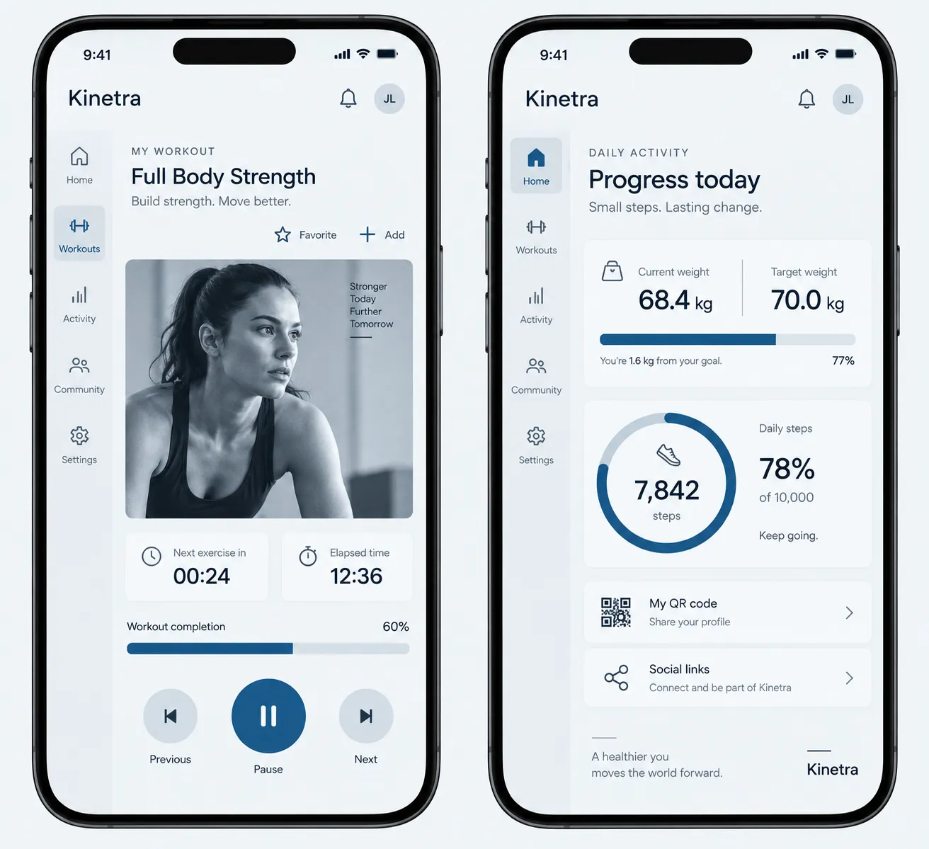
Monochrome Single-Hue Interface

StyleRef·@styleref·
Extract your style to start building your Style Board.

Description

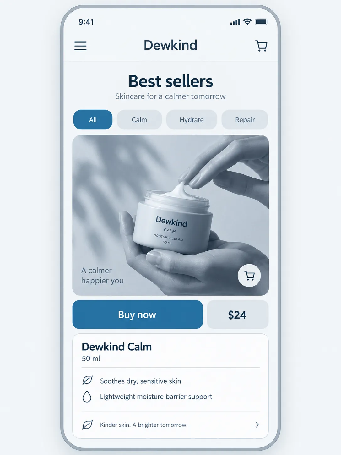
One hue, many values. The entire interface — surfaces, text, charts, icons and imagery — is built from tints and shades of a single color, so hierarchy is carried entirely by lightness.

Colors

#F4F6F830%Usage: Page background
#FFFFFF20%Usage: Light surfaces
#C6D2DC15%Usage: Secondary surfaces
#7A8FA312%Usage: Borders and icons
#2F435812%Usage: Primary type
#12202C6%Usage: Deep contrast
#1C6EA45%Usage: Active accent
Palette Size
Monochrome
Color Temperature
Cool
Saturation Range
Subdued
Contrast Strategy
Value contrast
Gradient Policy
No gradients
Color Dominance
Single dominant color
Black & White Point
Lifted blacks + Pure white
Accessibility Level
AAA

Typography

Regular, Medium, Aa, Bb, Typography
Font FamilyGrotesque
Line HeightNormal
Font WeightsRegular, Medium, Bold
Type ScaleModular
Text Case
Sentence case
Font Pairing Strategy
Weight contrast
Hierarchy
Strong contrast
Text Visual Role
Primary visual driver

Output Format

Creative Discipline
UI/UX
Medium
Digital
Delivery Mode
Interactive
Platform
Web

Light & Shadow

Lighting Presence
None (flat)
Shadow Type
Low-opacity darkest ramp step only
Shadow Density
Faint

References

Cultural References
Swiss/International Style, Minimalism
Temporal Reference
Timeless

Guardrails

Avoided Visuals
second hues; muddy mid-values; warm-cool grayscale drift; full-color photography; gloss; material simulation
Allowed Visuals
single-hue nine-step ramp; crisp value-separated surfaces; ramp-end duotone photography; icon-and-label semantic states; large flat section fields
Avoided Words
emphatic adjectives; decorative emphasis language

UI & Web

Color Theme
Light
Background Tone
Cool light gray
Accent Strategy
Single functional accent
Semantic Colors
None
Layout Archetype
Dashboard
Content Width
Wide container (1280–1440px)
Surface Layers
Two-layer (page + card)
Elevation Approach
Background contrast only
Border Philosophy
Hairline (0.5–1px, low opacity)
Corner Radius Scale
Small (2–6px)
Button Shape
Softly rounded (4–8px)
Button Hierarchy
Primary + Secondary + Ghost
Icon Style
Outline / Stroke
Icon Weight
Regular (1.5px)
Navigation Pattern
Sidebar
Navigation Style
Sticky solid
Data Display Style
Comfortable table
Data Visualization Style
Minimal (no gridlines)
UI Imagery
Photography
Hover Treatment
Shift the element exactly one ramp step
Focus Ring Style
Solid offset ring in the darkest ramp step
Animation Philosophy
Functional only
Transition Speed
Fast (80–150ms)

Mood & Personality

Mood & Personality
Elegant, Clean, Confident, Minimalist
Emotional Bias
Neutral
Tone Register
Observational
Representation Mode
Literal
Real-world Accuracy
Precise

Container / Boundary

Container presence
Implicit (visual edges only)
Corner treatment
Slight radius
Container Dominance
Neutral frame

Line & Stroke System

Stroke Usage
Structural outlines
Stroke Weight
Thin
Stroke Consistency
Uniform
Stroke Color
Derived from fill

Post-processing & Render Style

Image Treatment
Duotone
Color Grading Style
Monochrome

Voice & Language

Formality
Professional
Vocabulary Level
Advanced
Directness
Clear
Sentence Length
Medium
Metaphor Density
Factual
Writing Perspective
Third person for descriptions; second person for actions
Copy Pacing
Flowing
Jargon / Technical Level
Light industry terms

Spatial Structure & Hierarchy

Grid System
Column grid
Hierarchy Clarity
Strong
Layout Axis
Vertical
Symmetry
Asymmetrical balance
Plane Separation Method
Color/value shift
Visual Density
Comfortable

Shape Language

Shape Basis
Geometric
Primitive Dominance
Rectangles
Edge Sharpness
Soft
Curve Consistency
Uniform radius
Negative Space Usage
Balanced

Surface, Material & Detail

Surface Treatment
Matte
Surface Texture Style
Grain only on the largest flat fields; subtle enough to prevent banding
Texture Usage
Subtle noise

Background & Environment

Background Type
Solid color
Environment Mood
Abstract
Background Complexity
Minimal

Custom Style Items

Value Ramp
Use a single hue as a nine-step near-white-to-near-black ramp; reserve one saturated step for active accents.
Hierarchy Rule
Establish hierarchy through lightness, type size, weight, and spacing—never through a second hue.
Semantic States
Signal errors, warnings, success, and information with icon and label; do not introduce semantic colors.
Imagery Integration
Map photography to the lightest and darkest ends of the same ramp; use single-hue line illustration with ramp-step fills.
Section Structure
Separate major sections with large uninterrupted flat fields of distinct ramp steps.
© 2026 StyleRef. All rights reserved.