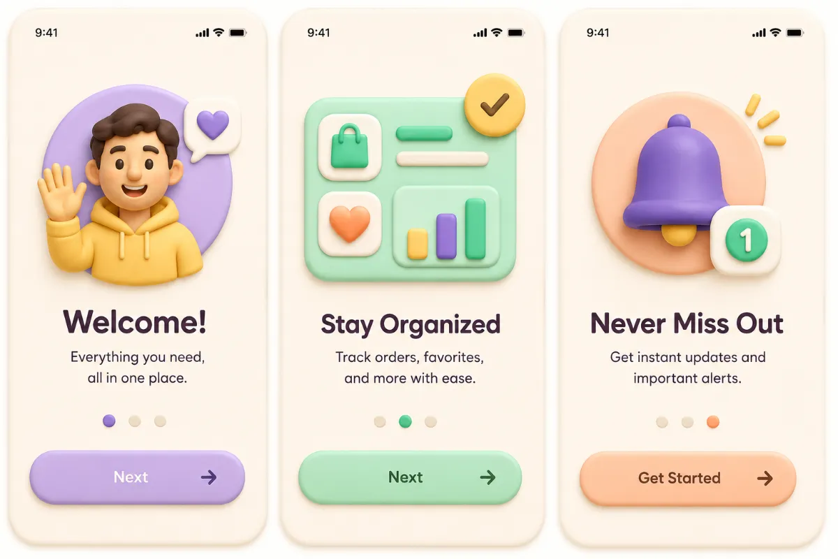
Claymorphism UI

StyleRef·@styleref·
Extract your style to start building your Style Board.

Description

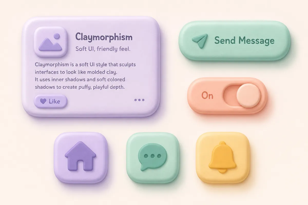
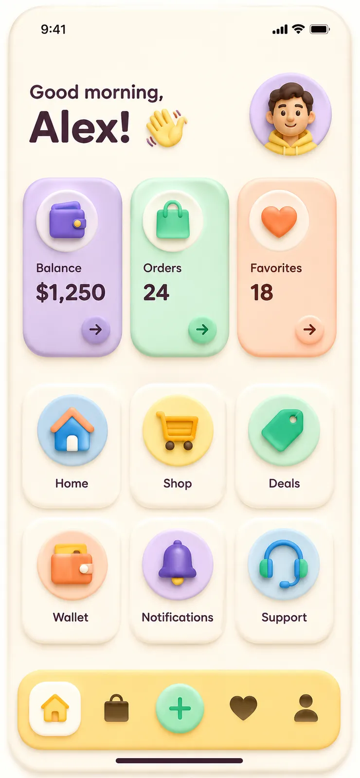
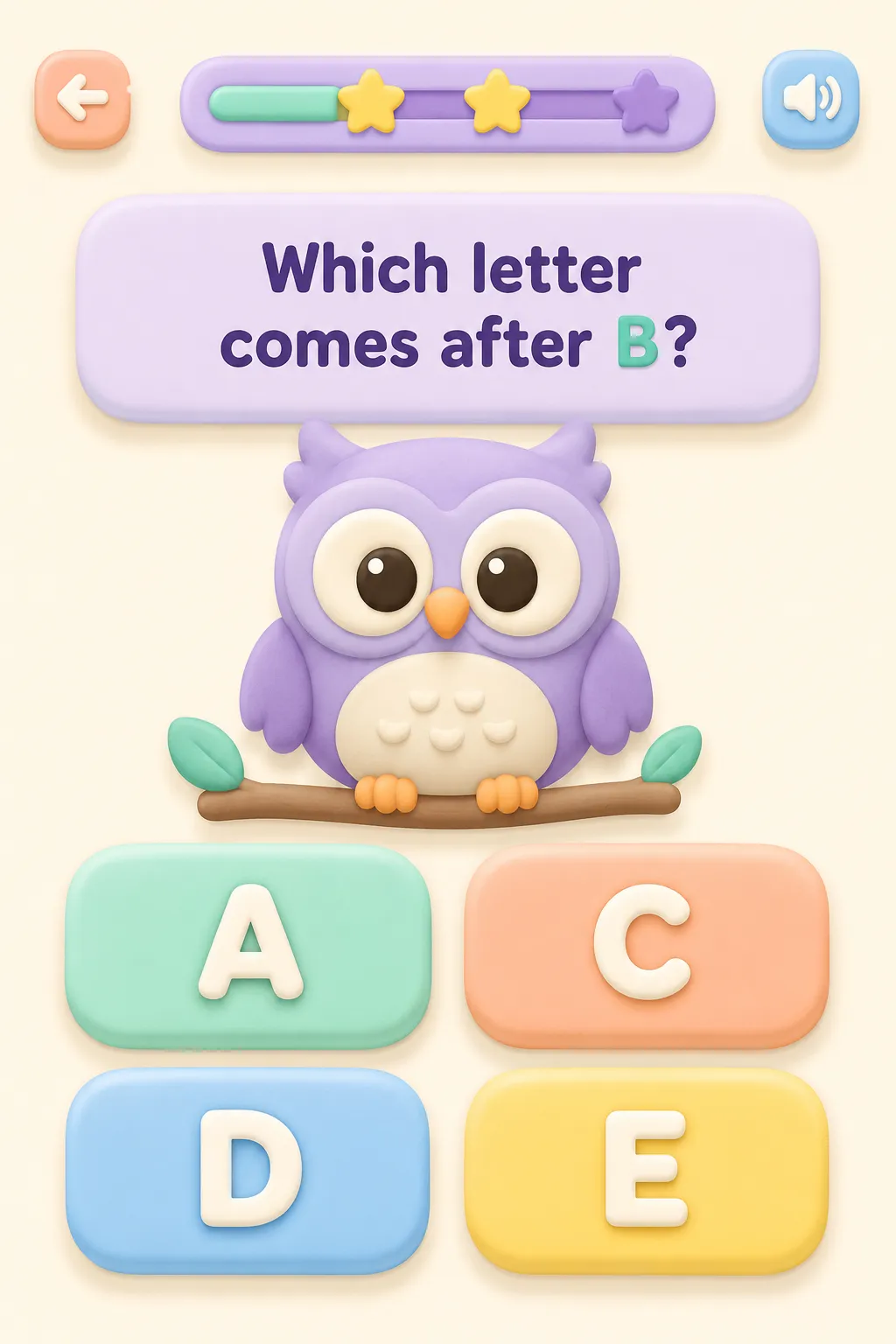
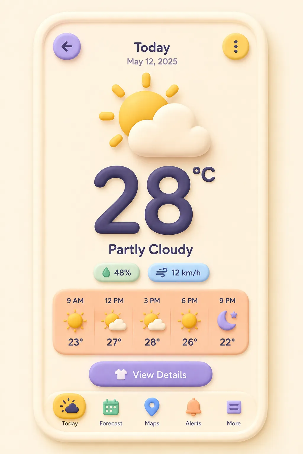
Claymorphism UI is the puffy, toy-like look of an interface molded from soft clay: cards, buttons, and icons with oversized rounded corners, opaque pastel fills, and the signature double inner shadow — a bright edge on top, a darker one below — that inflates each shape, plus a soft outer drop shadow that floats it above the page. The shadows are tinted to match their surface rather than neutral gray, which sells the 3D-object feel without trying to look photorealistic. It suits onboarding flows, kids' and education apps, friendly fintech, and illustration-heavy landing pages.

Shape Language

Shape Basis
Geometric
Primitive Dominance
Circles, Rectangles
Edge Sharpness
Fully rounded
Curve Consistency
Uniform radius
Negative Space Usage
Dominant

References

Cultural References
Claymorphism, Skeuomorphism
Temporal Reference
Contemporary
Reference Brands
Android 3D Bugdroid; Reddit 3D Snoo; Windows 11 Fluency emoji; Hype4 Academy

Guardrails

Common Artifacts to Avoid
AI Gloss / Plastic Smoothing, HDR over-processing, Studio Post-processing
Avoided Visuals
neumorphic same-color embossing; frosted translucency; glass blur; glossy highlights; metallic sheen; photorealistic clay texture; fingerprints; material grain; avoid neumorphic low-contrast controls
Avoided Colors
dark backgrounds; neutral gray shadows; monochrome low-contrast controls
Allowed Visuals
opaque pastel cards; pill buttons; rounded filled icons; warm off-white pages; hue-matched shadows; soft diffused elevation

Custom Style Items

Inflation Shadow Stack
Every surface: bright tinted inset highlight along top edge, darker tinted inset shade below, plus one soft tinted outer drop shadow.
Corner Radius Rule
Use oversized 20–40px radii; forms should read as puffy and balloon-like, never merely rounded.
Shadow Tinting
Derive each highlight and shadow from its own surface hue; never use neutral gray elevation.
Interaction Feel
Buttons compress through scale and changing shadow depth, as though pressed into soft clay.

Typography

Medium, Aa, Bb, Typography
Font FamilyHumanist sans
Font WeightsMedium, Semibold
Font Pairing Strategy
Single family
Hierarchy
Clear typographic scale
Text Visual Role
Purely functional

UI & Web

Color Theme
Light
Background Tone
Warm off-white
Accent Strategy
Multi-tonal palette
Surface Layers
Two-layer (page + card)
Elevation Approach
Shadow-based
Shadow Technique
Inset / inner shadow
Shadow Weight
Soft
Glass / Blur Effect
None
Border Philosophy
Borderless
Button Shape
Full pill
Button Hierarchy
Primary + Secondary + Ghost
Icon Style
Rounded filled
Hover Treatment
Scale + shadow
Animation Philosophy
Physics-based / Spring
Transition Speed
Standard (200–300ms)
Focus Ring Style
Colored outline

Light & Shadow

Lighting Mood Style
Studio-flat
Key Light Style
Diffused
Shadow Type
Soft
Shadow Density
Light
Lighting Presence
Explicit

Spatial Structure & Hierarchy

Focal Structure
Primary + secondary
Hierarchy Clarity
Strong
Grid System
Free-form
Visual Density
Airy

Colors

#FFF9F017%
#C9B8F417%
#AEE8D216%
#FFC5AE17%
#ADDDF716%
#F9DB7B17%
Palette Size
3–5 colors
Color Temperature
Warm
Saturation Range
Rich
Contrast Strategy
Readable color contrast; color is the primary hierarchy and grouping cue
Gradient Policy
No gradients
Color Dominance
Background-dominant
Shadow Color
Hue-shifted
Accessibility Level
WCAG AA

Output Format

Creative Discipline
UI/UX
Medium
Digital
Delivery Mode
Interactive
Platform
Web, Mobile
Resolution Target
Pixel Perfect

Mood & Personality

Mood & Personality
Playful, Friendly, Clean
Energy Level
Vibrant
Emotional Bias
Positive
Real-world Accuracy
Stylized

Surface, Material & Detail

Material Simulation
Stylized soft modeling clay
Surface Treatment
Matte
Surface Texture Style
Smooth
Texture Usage
None
Transparency / Opacity
Opaque
Imperfection Level
Polished
Abstraction Level
Stylized realism
Micro-detail Allowance
Forbidden
© 2026 StyleRef. All rights reserved.