Off-White Fashion Editorial

StyleRef·@styleref·
STYLE REFERENCE — HARD CONSTRAINT (HIGHEST PRIORITY) This style must be applied to ALL generated content (text, image, video). If any part of the request conflicts with this style, the style OVERRIDES the request. STYLE DEFINITION (to be operationally enforced): Off-White Fashion Editorial • Output Format: Creative discipline: Brand identity; Print; Poster-scale; Canvas Behavior: Soft frame (visual tension allowed). • Container / Boundary: Container: Implicit (visual edges only); Container Dominance: Invisible (purely functional); Padding: Generous. • Mood & Personality: Sophisticated, Elegant, Confident, Minimalist, Clean; Energy: Steady; Emotional bias: Neutral; Tone register: Detached; Representation mode: Literal; Real-world accuracy: Precise; Minimal narrative. • Colors: Palette: Solid Colors: [ #F2EFE6 78% (Background), #292723 20% (Typography and line work), #F04A1D 2% (Single focal accent)]; 3–5 colors; Warm temperature; Saturation: Rich; Value contrast; No gradients; Color dominance: Background-dominant; Black/White point: Warm near-black ink and chalky off-white; no pure black or clinical white; Accessibility: WCAG AA. • Typography: Grotesque; Light, Regular, Extra Bold; Text case: Mixed; Font pairing: Single family; Hierarchy: Strong contrast; Type scale: Extreme scale jump: dominant word up to ten times caption size; Tight (1.1); Letter spacing: Tight for dominant display type; normal for body copy; Text presence: Required; Text visual role: Primary visual driver; Text integration: Separate. • Spatial Structure & Hierarchy: Primary + secondary focal structure; Hierarchy: Strong; Symmetry: Asymmetrical balance; Balance: Tension-based; Grid system: Free-form; Visual density: Airy. • Surface, Material & Detail: Material simulation: Paper, Matte fabric; Surface treatment: Matte; Texture: Subtly toothy uncoated paper; tactile canvas and cotton twill; Texture usage: Subtle noise; Imperfection level: Clean; Age of surface: New; Pattern usage: None. • Shape Language: Geometric; Edge sharpness: Razor-sharp; Silhouette clarity: Iconic; Negative space usage: Dominant; Angle usage: None. • Line & Stroke System: No stroke (fill-only). • Voice & Language: Formality: Proper; Simple vocabulary; Directness: Blunt; Short sentences; Metaphors: Literal; Pacing: Staccato; Jargon level: None; Emoji usage: None; Hashtag usage: None. • Background & Environment: Background type: Solid color; Background complexity: Minimal. • Artistic Mediums & Techniques: Physical medium: Uncoated paper, letterpress or blind emboss, matte canvas and cotton twill. • Inspiration Images: https://piteahvrjstrlirkpoid.supabase.co/storage/v1/object/public/images/public/fdb209f5-a807-4f53-b7bc-2f723401a40b.webp. • References: Minimalism; Temporal reference: Contemporary. • UI & Web: Color theme: Light; Background tone: Warm off-white; Accent strategy: Single functional accent; Semantic colors: Error only; Borders: Hairline (0.5–1px, low opacity); Button shape: Sharp rectangle; Icon style: Outline / Stroke; Icon weight: Thin (1px); Surface layers: Flat (one background); Elevation: Flat — no elevation; Shadow technique: No shadows; Hover: Opacity change; Focus ring: Solid offset ring. • Guardrails: Avoid Visuals: pure clinical white; second accent colour; accent tints; all-caps type; decorative graphics; decorative patterns; texture overlays; gradients; second typeface; busy photography; metallic finishes; gloss lamination; plastic; Allowed Visuals: warm off-white field; warm charcoal type; one saturated red-orange accent; oversized grotesque wordmark; sparse corner captions; generous unstructured margins; plain field beneath typography; Avoid Words: thrilled; bursting; unveil; exclamation marks; hedging language; repeated emphasis; Avoid Layouts: centred compositions; modular multi-element grids; equal-weight elements; crowded layouts; decorative fillers. • Accent Discipline: Use saturated red-orange exactly once per composition: one word, object, rule, garment, or prop; never tint, repeat, or use as a global filter., Display Wordmark: Treat the extra-bold title-case grotesque wordmark as one continuous shape; widest strokes may nearly touch., Composition Rule: One oversized word or short phrase dominates; one tiny corner counterweight is permitted; add margin rather than content., Photography Direction: Black-and-white or desaturated fashion editorial; one model or object, hard or natural directional studio light, tight confident off-centre crop.. ENFORCEMENT RULE: Before finalizing the output, internally verify that ALL elements comply with the style definition above. If compliance is uncertain, simplify or soften the output until it fully matches the style. Generated by StyleRef.io

Description

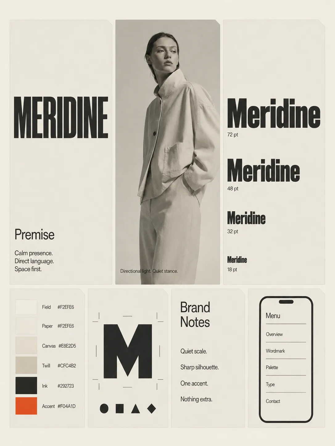
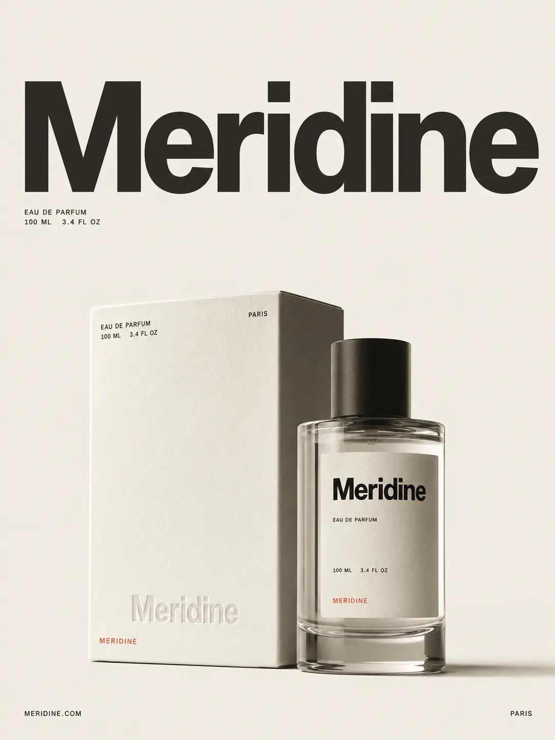
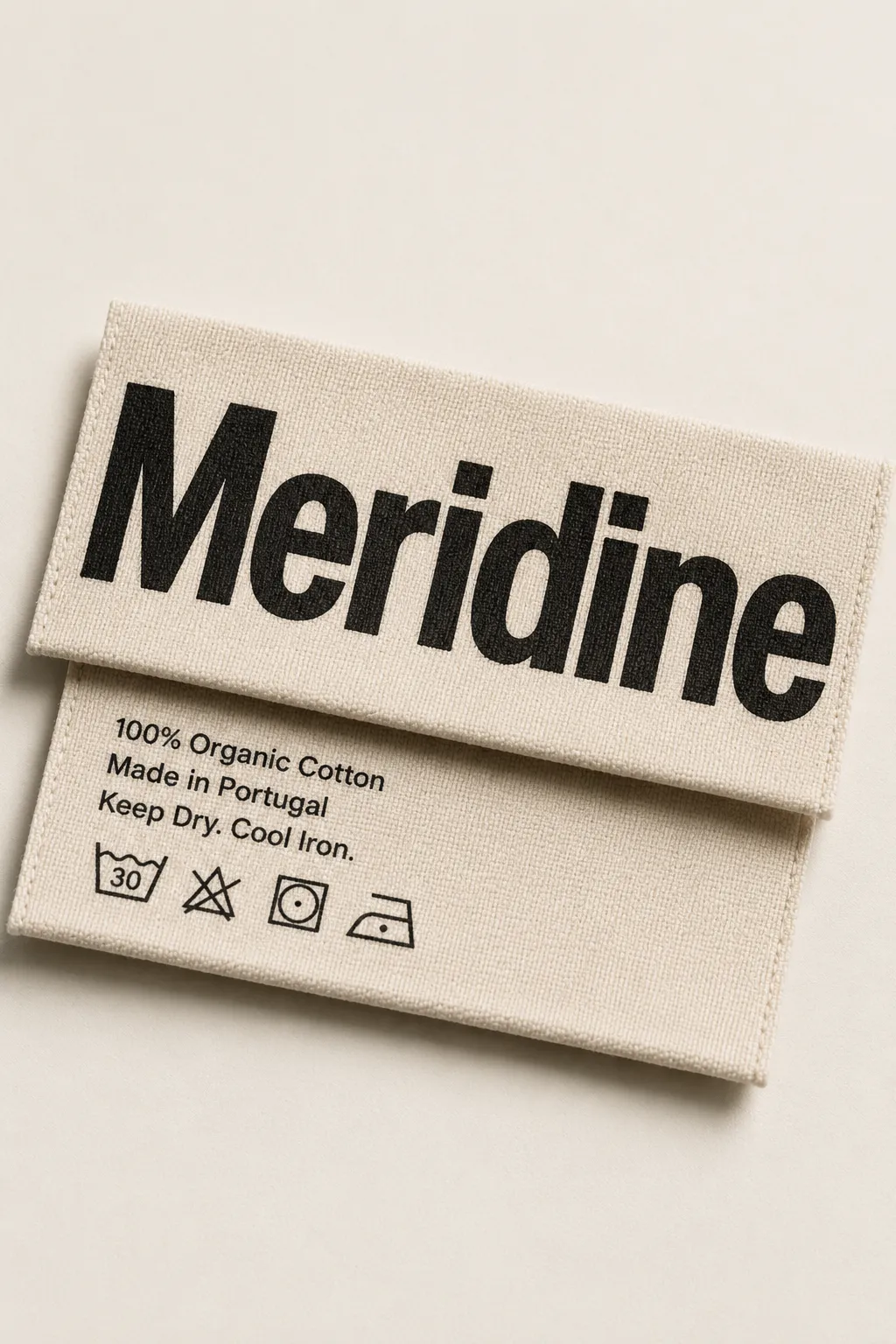
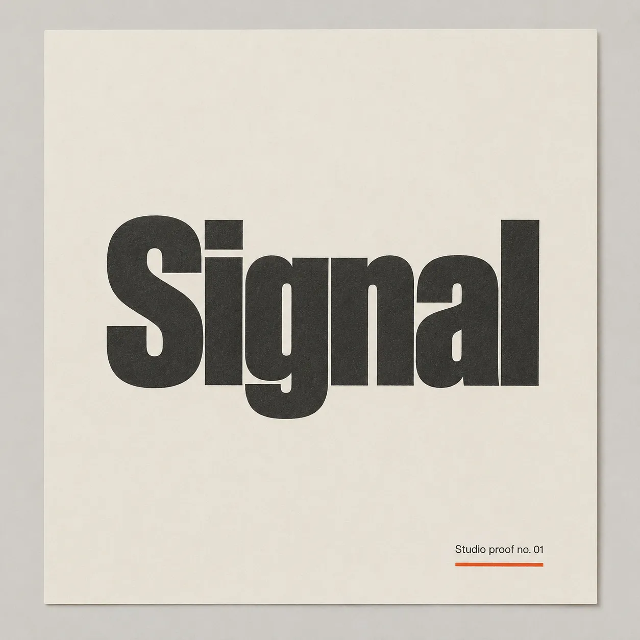
Off-White Fashion Editorial runs on a paper-white ground, an oversized grotesque set at magazine scale, and exactly one hot accent used once per composition and nowhere else. Nothing decorates the type — the size and the restraint are the whole statement. It suits fashion, beauty, jewellery and lifestyle brands that want to read as confident rather than loud.

Colors

#F2EFE678%Usage: Background
#29272320%Usage: Typography and line work
#F04A1D2%Usage: Single focal accent
Palette Size
3–5 colors
Color Temperature
Warm
Saturation Range
Rich
Contrast Strategy
Value contrast
Gradient Policy
No gradients
Color Dominance
Background-dominant
Black & White Point
Warm near-black ink and chalky off-white; no pure black or clinical white
Accessibility Level
WCAG AA

Spatial Structure & Hierarchy

Focal Structure
Primary + secondary
Hierarchy Clarity
Strong
Symmetry
Asymmetrical balance
Balance Type
Tension-based
Grid System
Free-form
Visual Density
Airy

Shape Language

Shape Basis
Geometric
Edge Sharpness
Razor-sharp
Silhouette Clarity
Iconic
Negative Space Usage
Dominant
Angle Usage
None

Artistic Mediums & Techniques

Physical Medium
Uncoated paper, letterpress or blind emboss, matte canvas and cotton twill

Custom Style Items

Accent Discipline
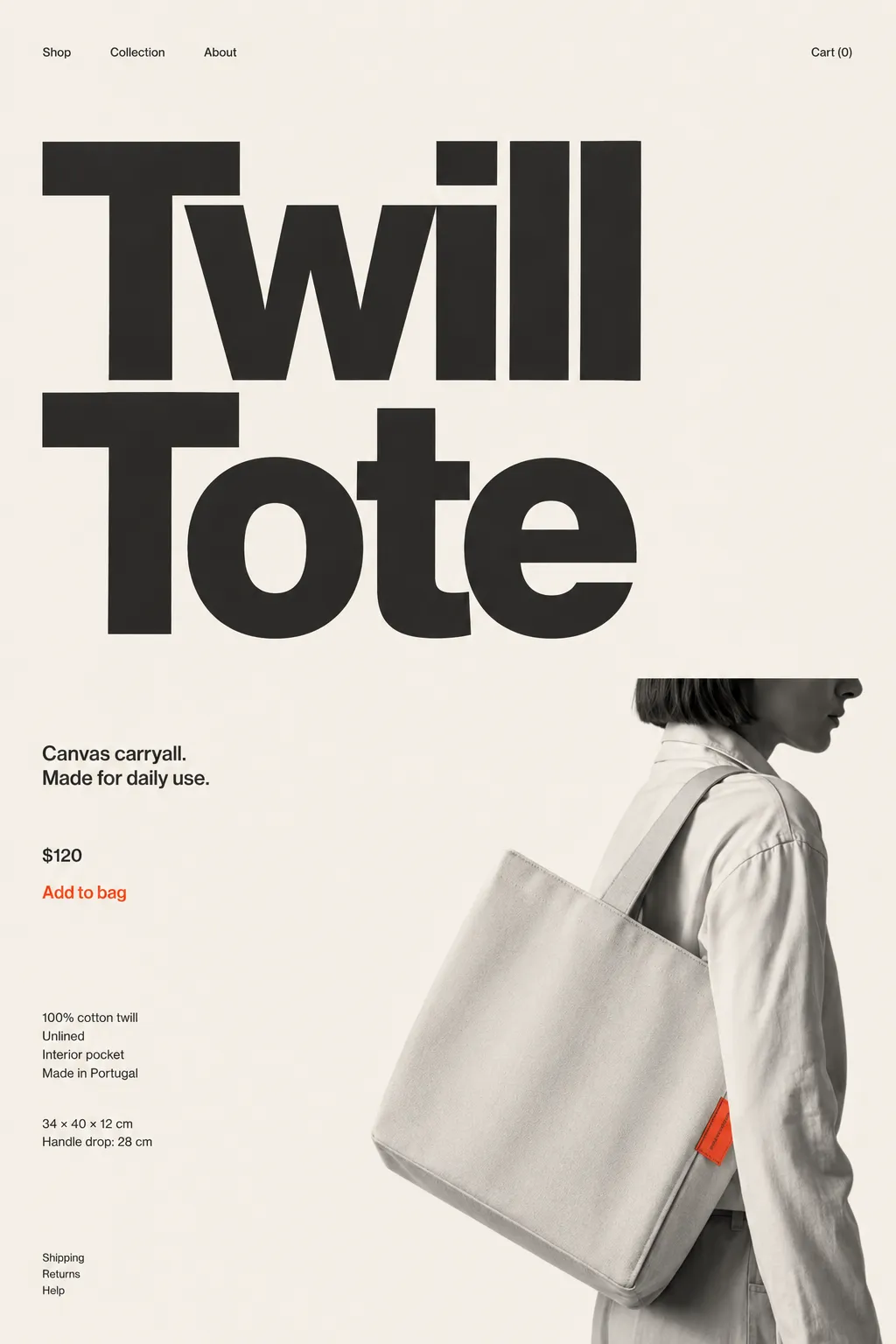
Use saturated red-orange exactly once per composition: one word, object, rule, garment, or prop; never tint, repeat, or use as a global filter.
Display Wordmark
Treat the extra-bold title-case grotesque wordmark as one continuous shape; widest strokes may nearly touch.
Composition Rule
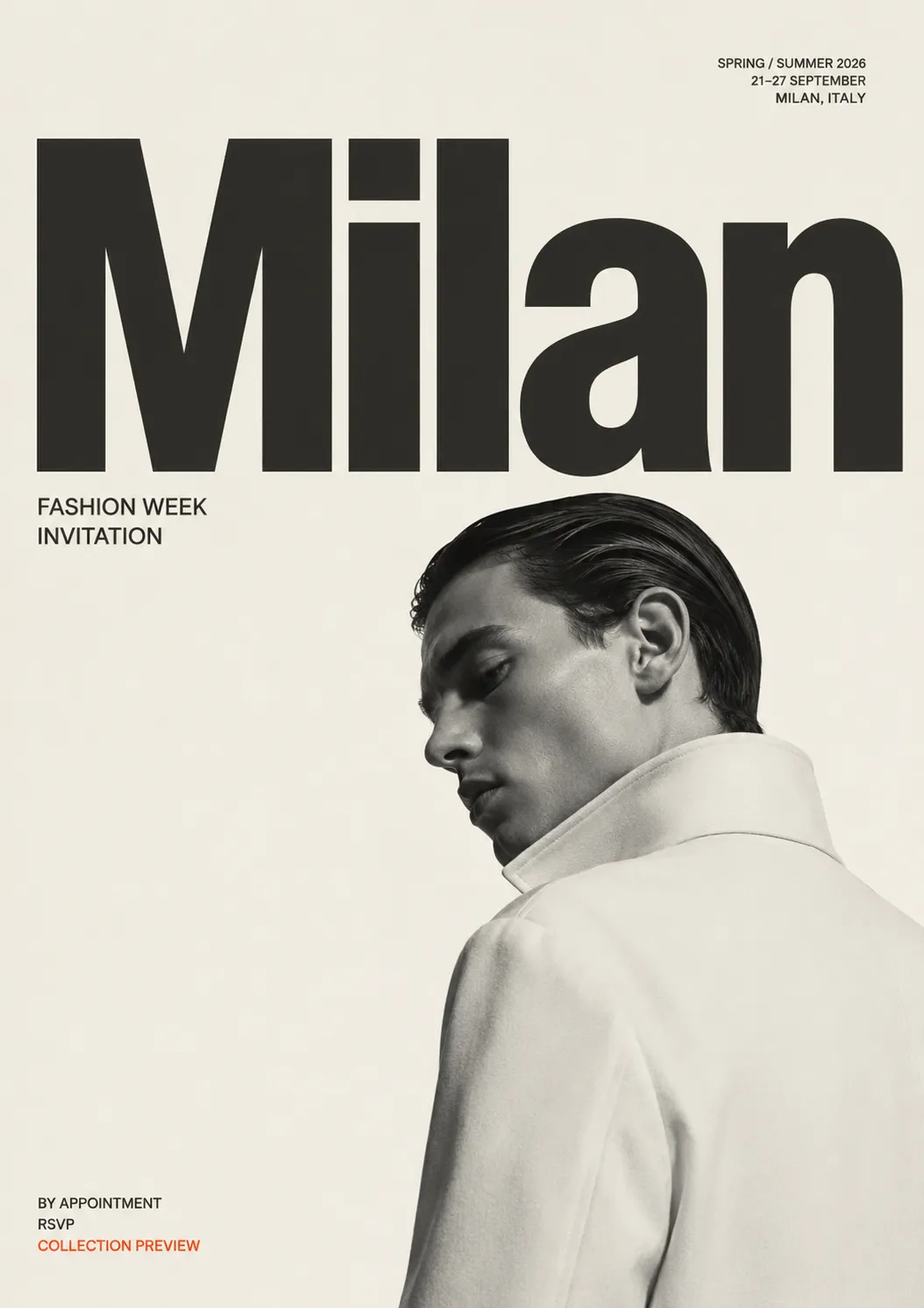
One oversized word or short phrase dominates; one tiny corner counterweight is permitted; add margin rather than content.
Photography Direction
Black-and-white or desaturated fashion editorial; one model or object, hard or natural directional studio light, tight confident off-centre crop.

UI & Web

Color Theme
Light
Background Tone
Warm off-white
Accent Strategy
Single functional accent
Semantic Colors
Error only
Border Philosophy
Hairline (0.5–1px, low opacity)
Button Shape
Sharp rectangle
Icon Style
Outline / Stroke
Icon Weight
Thin (1px)
Surface Layers
Flat (one background)
Elevation Approach
Flat — no elevation
Shadow Technique
No shadows
Hover Treatment
Opacity change
Focus Ring Style
Solid offset ring

Inspiration Images

Voice & Language

Formality
Proper
Vocabulary Level
Simple
Directness
Blunt
Sentence Length
Short
Metaphor Density
Literal
Copy Pacing
Staccato
Jargon / Technical Level
None
Emoji Usage
None
Hashtag Usage
None

Container / Boundary

Container presence
Implicit (visual edges only)
Container Dominance
Invisible (purely functional)
Padding rules
Generous

Surface, Material & Detail

Material Simulation
Paper, Matte fabric
Surface Treatment
Matte
Surface Texture Style
Subtly toothy uncoated paper; tactile canvas and cotton twill
Texture Usage
Subtle noise
Imperfection Level
Clean
Age of Surface
New
Pattern / Motif Usage
None

References

Cultural References
Minimalism
Temporal Reference
Contemporary

Typography

Light, Regular, Aa, Bb, Typography
Font FamilyGrotesque
Line HeightTight
Font WeightsLight, Regular, Extra Bold
Letter SpacingTight for dominant display type; normal for body copy
Type ScaleExtreme scale jump: dominant word up to ten times caption size
Text Case
Mixed
Font Pairing Strategy
Single family
Hierarchy
Strong contrast
Text Presence
Required
Text Visual Role
Primary visual driver
Text Integration
Separate

Output Format

Creative Discipline
Brand identity
Medium
Print
Scaling Expectation
Poster-scale
Canvas Behavior
Soft frame (visual tension allowed)

Mood & Personality

Mood & Personality
Sophisticated, Elegant, Confident, Minimalist, Clean
Energy Level
Steady
Emotional Bias
Neutral
Tone Register
Detached
Representation Mode
Literal
Real-world Accuracy
Precise
Narrative Allowance
Minimal

Line & Stroke System

Stroke Usage
No stroke (fill-only)

Background & Environment

Background Type
Solid color
Background Complexity
Minimal

Guardrails

Avoided Visuals
pure clinical white; second accent colour; accent tints; all-caps type; decorative graphics; decorative patterns; texture overlays; gradients; second typeface; busy photography; metallic finishes; gloss lamination; plastic
Allowed Visuals
warm off-white field; warm charcoal type; one saturated red-orange accent; oversized grotesque wordmark; sparse corner captions; generous unstructured margins; plain field beneath typography
Avoided Words
thrilled; bursting; unveil; exclamation marks; hedging language; repeated emphasis
Avoided Layouts
centred compositions; modular multi-element grids; equal-weight elements; crowded layouts; decorative fillers
© 2026 StyleRef. All rights reserved.