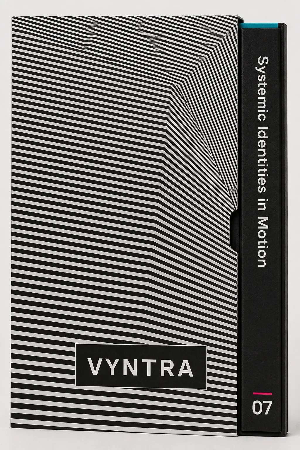
Op Art Moiré Grid

StyleRef·@styleref·
STYLE REFERENCE — HARD CONSTRAINT (HIGHEST PRIORITY) This style must be applied to ALL generated content (text, image, video). If any part of the request conflicts with this style, the style OVERRIDES the request. STYLE DEFINITION (to be operationally enforced): Op Art Moiré Grid • Output Format: Creative discipline: Brand identity; Print; Delivery mode: Still; Canvas Behavior: Open field (elements may escape); Poster-scale. • Container / Boundary: Container: Explicit (shape mask); Container shape: Rectangle; Sharp Corners; Container Dominance: Visual element; Padding: Clear space equals twice the master field’s widest line pitch on all sides; Edge Behavior: Intentional bleed. • Mood & Personality: Experimental, Confident, Tense, Clean; Energy: Kinetic; Emotional bias: Tense; Tone register: Detached; Representation mode: Symbolic; Real-world accuracy: Stylized; Humor: None. • Colors: Palette: Solid Colors: [ #000000 45% (Field black), #FFFFFF 45% (Field white), #808080 4% (Rule color), #E6007E 3% (Signal accent), #00A6A6 3% (Signal accent)]; 3–5 colors; Neutral temperature; Saturation: Achromatic; High contrast; Hue relationships: Complementary; No gradients; Color dominance: Balanced; Black/White point: Pure black + Pure white; Accessibility: WCAG AA; Palette: . • Typography: Grotesque; Medium; Text case: Sentence case; Font pairing: Single family; Hierarchy: Strong contrast; Type scale: Two sizes only: display and text, separated by a hard scale jump; Normal-to-generous leading; prevent text lines interfering with the field; Letter spacing: Normal; Text visual role: Purely functional; Text integration: Embedded in shapes. • Spatial Structure & Hierarchy: Flat perspective; Single focal structure; Hierarchy: Strong; Symmetry: Near symmetry; Balance: Center-weighted; Layout axis: Horizontal; Grid system: Modular grid; Visual density: Packed. • Surface, Material & Detail: Material simulation: Paper; Surface treatment: Matte; Texture: Smooth; Texture usage: Patterned; Imperfection level: Flawless; Age of surface: Timeless; Pattern usage: Abstract pattern; Surface treatment: Flat, hard, non-specular surfaces; dense even ink and exact edge reproduction. • Shape Language: Geometric; Primitive dominance: Rectangles, Polygons; Edge sharpness: Razor-sharp; Silhouette clarity: Iconic; Curve consistency: Variable radius; Negative space usage: Minimal; Angle usage: Frequent. • Line & Stroke System: Structural outlines; Hairline; Uniform consistency; Stroke Color: Neutral; Stroke joins: Miter. • Voice & Language: Formality: Professional; Technical vocabulary; Directness: Clear; Short sentences; Metaphors: Clinical; Perspective: Third person for the work; second person for reader actions; Pacing: Punchy; Jargon level: Light industry terms; Emoji usage: None; Hashtag usage: None. • Background & Environment: Background type: Texture; Environment mood: Abstract; Background–Subject: Integrated; Background complexity: Moderate. • Artistic Mediums & Techniques: Physical medium: Screen Print; Illustrative technique: Vector illustration; Illustrative technique: Fine parallel line fields; continuous pitch and angle variation; line-density depth without tonal shading. • References: Op Art, Victor Vasarely, Bridget Riley, Le Mouvement, The Responsive Eye; Temporal reference: 1960s. • UI & Web: Color theme: Light; Accent strategy: Dual accent; Elevation: Flat — no elevation; Shadow technique: No shadows; Borders: Borderless; Button shape: Sharp rectangle; Icon style: Flat geometric; Icon weight: Thin (1px); Animation: Functional only; Transition speed: Deliberate (350–500ms); Focus ring: Solid offset ring. • Guardrails: Avoid: Film Grain / Noise, Lens Flare, Stylistic filters, AI symmetry artifacts; Avoid Visuals: black-and-white spirals; checkerboard mod pastiche; warped photographs; distorted logos; rainbow fields; airbrushed shading; strobing; flicker; Avoid Colors: full-spectrum rainbow palettes; equal-value magenta and teal combinations; Avoid Layouts: text over line fields; patterned letterforms; more than one overlaid field; dense type-heavy interfaces; optically active safety surfaces; Allowed Visuals: fine parallel lines; off-centre bends; single 3–8 degree overlay field; solid knockout rectangles; square field crops; straight photo-to-field edges; Avoid Words: mesmerising; mind-bending; tricks; experience; Logic: Use one master field cropped at stated coordinates. Overlay at most one identical field, offset 3–8 degrees. Reduce line count rather than scaling; below six visible lines, use solid ground and wordmark alone. Animate only as slow drift; never strobe, flicker, or use high-frequency movement. Never use active fields for safety or medical information.. • Master Field System: Every asset is a different crop of one master field; preserve coordinate-based continuity across applications., Optical Depth: Create swell, recession, and apparent movement through line pitch and angle only—never gradients, shading, or distortion filters., Moiré Overlay: When used, overlay a second identical field at 3–8 degrees to produce a legible moiré., Wordmark Rule: Set the neutral grotesque wordmark tightly in a plain solid knockout rectangle; never place it directly on the field., Icon Construction: Build icons as square crops where parallel lines bend into abstract forms; use one stroke weight equal to the finest field pitch., Textile Reproduction: Redraw line pitch to thread count for woven or knitted applications; never scale the master field into weave.. ENFORCEMENT RULE: Before finalizing the output, internally verify that ALL elements comply with the style definition above. If compliance is uncertain, simplify or soften the output until it fully matches the style. Generated by StyleRef.io

Description

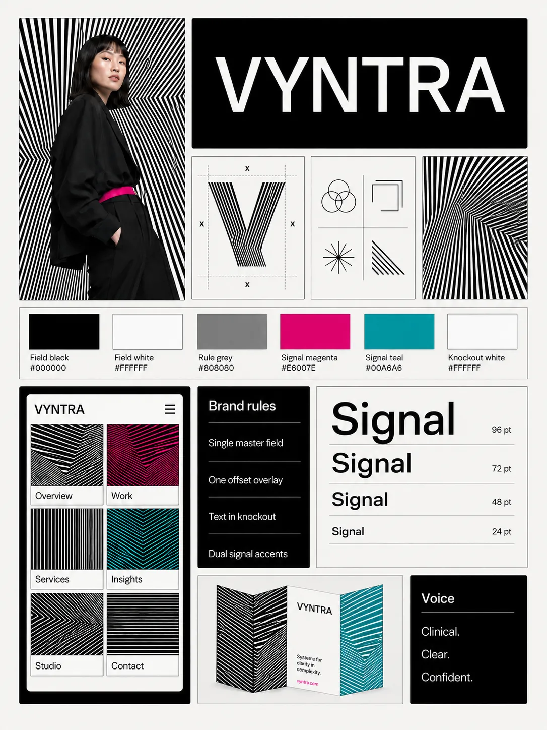
Op Art Moiré Grid builds the whole identity out of one repeated line, varied only in spacing and angle: a field of fine parallels that bends through a composition until the flat surface appears to swell, and a second field laid over it at a few degrees to produce a moiré that is not in either layer. Black and white carry it, with one complementary pair used sparingly. Everything the brand owns is a different crop of the same field. It suits galleries and festivals, textiles and eyewear, audio and fitness brands, and anyone who wants a system that looks like it is moving.

Typography

Aa, Bb, Typography
Font FamilyGrotesque
Line HeightNormal-to-generous leading; prevent text lines interfering with the field
Font WeightsMedium
Letter SpacingNormal
Type ScaleTwo sizes only: display and text, separated by a hard scale jump
Text Case
Sentence case
Font Pairing Strategy
Single family
Hierarchy
Strong contrast
Text Visual Role
Purely functional
Text Integration
Embedded in shapes

Output Format

Creative Discipline
Brand identity
Medium
Print
Delivery Mode
Still
Canvas Behavior
Open field (elements may escape)
Scaling Expectation
Poster-scale

Voice & Language

Formality
Professional
Vocabulary Level
Technical
Directness
Clear
Sentence Length
Short
Metaphor Density
Clinical
Writing Perspective
Third person for the work; second person for reader actions
Copy Pacing
Punchy
Jargon / Technical Level
Light industry terms
Emoji Usage
None
Hashtag Usage
None

Spatial Structure & Hierarchy

Perspective Style
Flat
Focal Structure
Single
Hierarchy Clarity
Strong
Symmetry
Near symmetry
Balance Type
Center-weighted
Layout Axis
Horizontal
Grid System
Modular grid
Visual Density
Packed

Artistic Mediums & Techniques

Physical Medium
Screen Print
Illustrative Technique
Vector illustration
Illustrative Technique
Fine parallel line fields; continuous pitch and angle variation; line-density depth without tonal shading

UI & Web

Color Theme
Light
Accent Strategy
Dual accent
Elevation Approach
Flat — no elevation
Shadow Technique
No shadows
Border Philosophy
Borderless
Button Shape
Sharp rectangle
Icon Style
Flat geometric
Icon Weight
Thin (1px)
Animation Philosophy
Functional only
Transition Speed
Deliberate (350–500ms)
Focus Ring Style
Solid offset ring

Mood & Personality

Mood & Personality
Experimental, Confident, Tense, Clean
Energy Level
Kinetic
Emotional Bias
Tense
Tone Register
Detached
Representation Mode
Symbolic
Real-world Accuracy
Stylized
Humor Usage
None

Container / Boundary

Container presence
Explicit (shape mask)
Container shape
Rectangle
Corner treatment
Sharp
Container Dominance
Visual element
Padding rules
Clear space equals twice the master field’s widest line pitch on all sides
Edge behavior
Intentional bleed

Background & Environment

Background Type
Texture
Environment Mood
Abstract
Background–Subject Relationship
Integrated
Background Complexity
Moderate

Guardrails

Common Artifacts to Avoid
Film Grain / Noise, Lens Flare, Stylistic filters, AI symmetry artifacts
Avoided Visuals
black-and-white spirals; checkerboard mod pastiche; warped photographs; distorted logos; rainbow fields; airbrushed shading; strobing; flicker
Avoided Colors
full-spectrum rainbow palettes; equal-value magenta and teal combinations
Avoided Layouts
text over line fields; patterned letterforms; more than one overlaid field; dense type-heavy interfaces; optically active safety surfaces
Allowed Visuals
fine parallel lines; off-centre bends; single 3–8 degree overlay field; solid knockout rectangles; square field crops; straight photo-to-field edges
Avoided Words
mesmerising; mind-bending; tricks; experience
Conditional Logic
Use one master field cropped at stated coordinates. Overlay at most one identical field, offset 3–8 degrees. Reduce line count rather than scaling; below six visible lines, use solid ground and wordmark alone. Animate only as slow drift; never strobe, flicker, or use high-frequency movement. Never use active fields for safety or medical information.

Colors

#00000045%Usage: Field black
#FFFFFF45%Usage: Field white
#8080804%Usage: Rule color
#E6007E3%Usage: Signal accent
#00A6A63%Usage: Signal accent
Palette Size
3–5 colors
Color Temperature
Neutral
Saturation Range
Achromatic
Contrast Strategy
High contrast
Hue Relationships
Complementary
Gradient Policy
No gradients
Color Dominance
Balanced
Black & White Point
Pure black + Pure white
Accessibility Level
WCAG AA

Shape Language

Shape Basis
Geometric
Primitive Dominance
Rectangles, Polygons
Edge Sharpness
Razor-sharp
Silhouette Clarity
Iconic
Curve Consistency
Variable radius
Negative Space Usage
Minimal
Angle Usage
Frequent

Surface, Material & Detail

Material Simulation
Paper
Surface Treatment
Matte
Surface Texture Style
Smooth
Texture Usage
Patterned
Imperfection Level
Flawless
Age of Surface
Timeless
Pattern / Motif Usage
Abstract pattern
Surface Treatment
Flat, hard, non-specular surfaces; dense even ink and exact edge reproduction

Line & Stroke System

Stroke Usage
Structural outlines
Stroke Weight
Hairline
Stroke Consistency
Uniform
Stroke Color
Neutral
Stroke Joins
Miter

References

Cultural References
Op Art, Victor Vasarely, Bridget Riley, Le Mouvement, The Responsive Eye
Temporal Reference
1960s

Custom Style Items

Master Field System
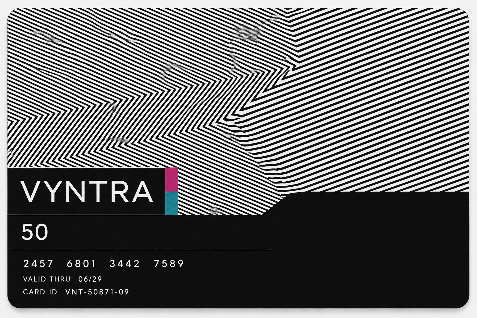
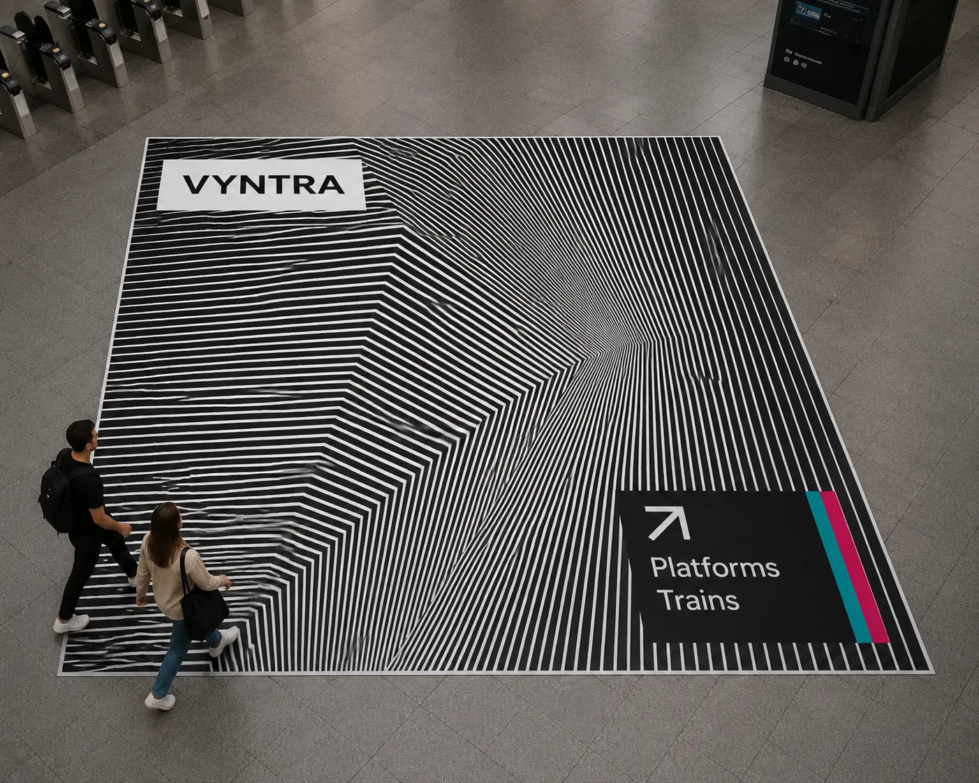
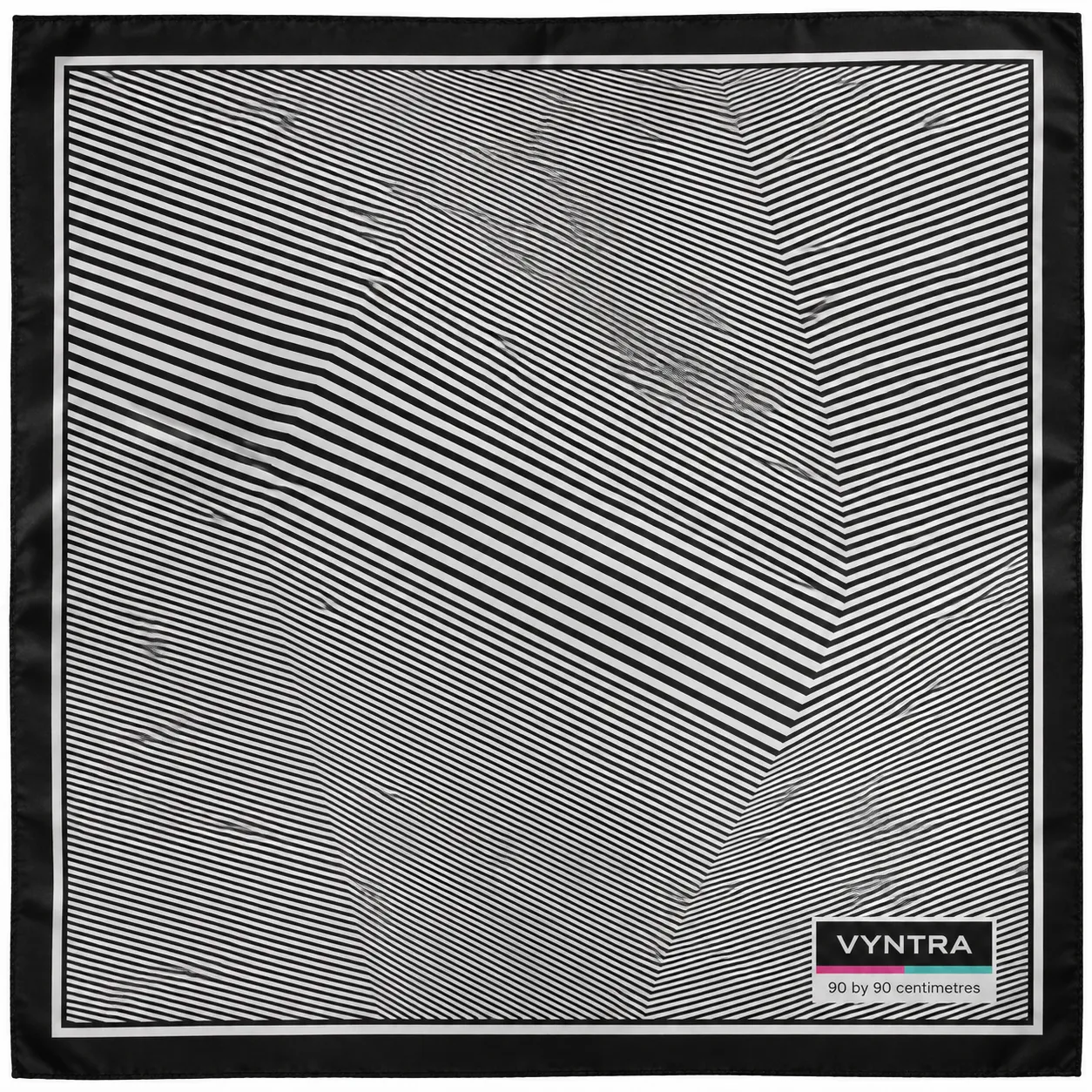
Every asset is a different crop of one master field; preserve coordinate-based continuity across applications.
Optical Depth
Create swell, recession, and apparent movement through line pitch and angle only—never gradients, shading, or distortion filters.
Moiré Overlay
When used, overlay a second identical field at 3–8 degrees to produce a legible moiré.
Wordmark Rule
Set the neutral grotesque wordmark tightly in a plain solid knockout rectangle; never place it directly on the field.
Icon Construction
Build icons as square crops where parallel lines bend into abstract forms; use one stroke weight equal to the finest field pitch.
Textile Reproduction
Redraw line pitch to thread count for woven or knitted applications; never scale the master field into weave.
© 2026 StyleRef. All rights reserved.