Grainy Editorial Illustration

StyleRef·@styleref·
Extract your style to start building your Style Board.

Description

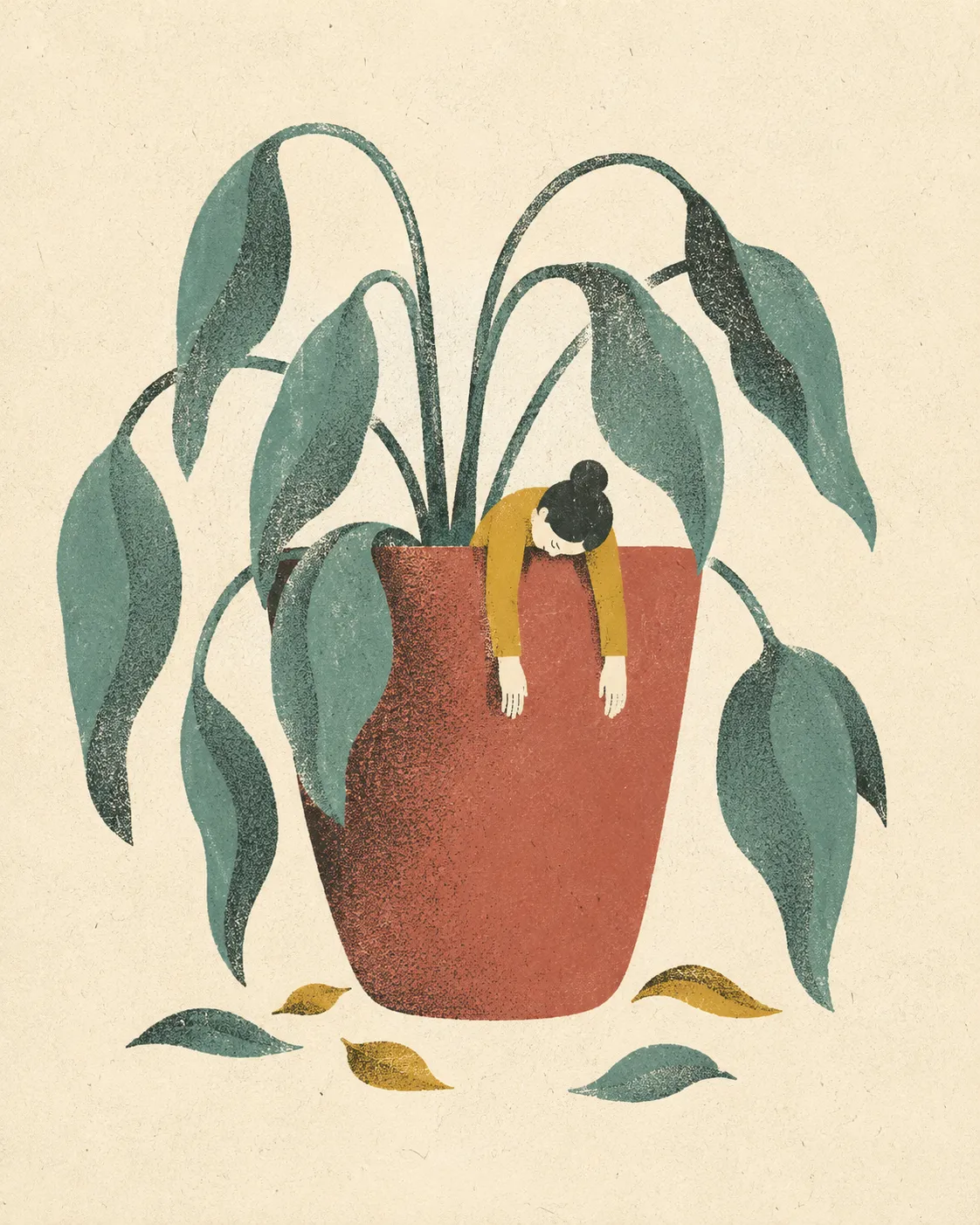
The texture-forward look of current editorial and tech illustration: clean flat shapes shaded not with gradients but with heavy stippled grain, in a limited, muted palette. It reads as a printed page rather than a screen, and suits conceptual pieces where one considered image has to carry an idea.

Colors

#F4EFE335%Usage: Paper ground
#B96F5B18%Usage: Primary shapes
#C89B3C16%Usage: Accent shapes
#5F989316%Usage: Secondary shapes
#80617615%Usage: Contrast shapes
Palette Size
3–5 colors
Color Temperature
Mixed
Saturation Range
Muted
Contrast Strategy
Value contrast
Gradient Policy
No gradients
Color Dominance
Balanced

Typography

Regular, Aa, Bb, Typography
Font FamilyGeometric sans
Font WeightsRegular, Medium
Font Pairing Strategy
Single family
Hierarchy
Subtle contrast
Text Presence
Optional
Text Visual Role
Purely functional

Output Format

Creative Discipline
Illustration
Medium
Digital
Delivery Mode
Still
Scaling Expectation
Poster-scale

References

Cultural References
Mid-Century Modern, Risograph revival, Google Design “salt and pepper” texturing, Olimpia Zagnoli
Temporal Reference
Contemporary

Artistic Mediums & Techniques

Physical Medium
Risograph
Illustrative Technique
Flat design

Mood & Personality

Mood & Personality
Clean, Nostalgic, Sophisticated, Everyday authenticity
Energy Level
Gentle
Representation Mode
Metaphorical
Real-world Accuracy
Stylized
Narrative Allowance
Minimal

Light & Shadow

Lighting Presence
Implied
Lighting Mood Style
Value stepping and stipple density imply light; no literal source
Shadow Type
None

Surface, Material & Detail

Material Simulation
Paper
Surface Treatment
Matte
Surface Texture Style
Grain, Stippled, printed-paper tooth
Texture Usage
Subtle noise, Patterned
Imperfection Level
Organic
Abstraction Level
Semi-representational

Post-processing & Render Style

Grain Character
Stylized
Image Treatment
Flat ink fills with press-like overprint mixing

Custom Style Items

Grain-As-Shading
Use dense salt-and-pepper stippling in shadow zones; progressively sparse grain toward lit areas; never use tonal gradients.
Overprint Logic
Overlapping ink shapes create a third mixed hue with multiply-like, pressed-ink character.
Concept Economy
One clear visual metaphor per image; simplified figures and objects; generous breathing room around the focal idea.
Detail Distribution
Keep silhouettes clean and readable; reserve texture, stippling, and small imperfections for modeled areas and overlaps.

Spatial Structure & Hierarchy

Focal Structure
Single
Hierarchy Clarity
Strong
Symmetry
Asymmetrical balance
Balance Type
Center-weighted
Grid System
Free-form
Visual Density
Airy

Shape Language

Shape Basis
Hybrid
Primitive Dominance
Circles, Freeform curves
Edge Sharpness
Crisp flat silhouettes softened by organic contours
Silhouette Clarity
Iconic
Curve Consistency
Expressive curves
Negative Space Usage
Dominant

Background & Environment

Background Type
Texture
Environment Mood
Abstract
Background–Subject Relationship
Integrated
Background Complexity
Minimal

Guardrails

Common Artifacts to Avoid
AI Gloss / Plastic Smoothing, Over-saturation, Studio Post-processing, Stylistic filters
Avoided Visuals
smooth vector gradients; glossy bevels; 3D rendering; cast shadows; drop shadows; Corporate Memphis blob people; busy maximalism
Avoided Colors
neon colors; candy palettes; unlimited palettes
Allowed Visuals
flat iconic shapes; organic curves; sparse conceptual compositions; stippled shadow bands; matte paper grain; overprint overlaps
© 2026 StyleRef. All rights reserved.