
Ethereal Liquid Glass
Made with this StyleRef
Same style, different prompts.


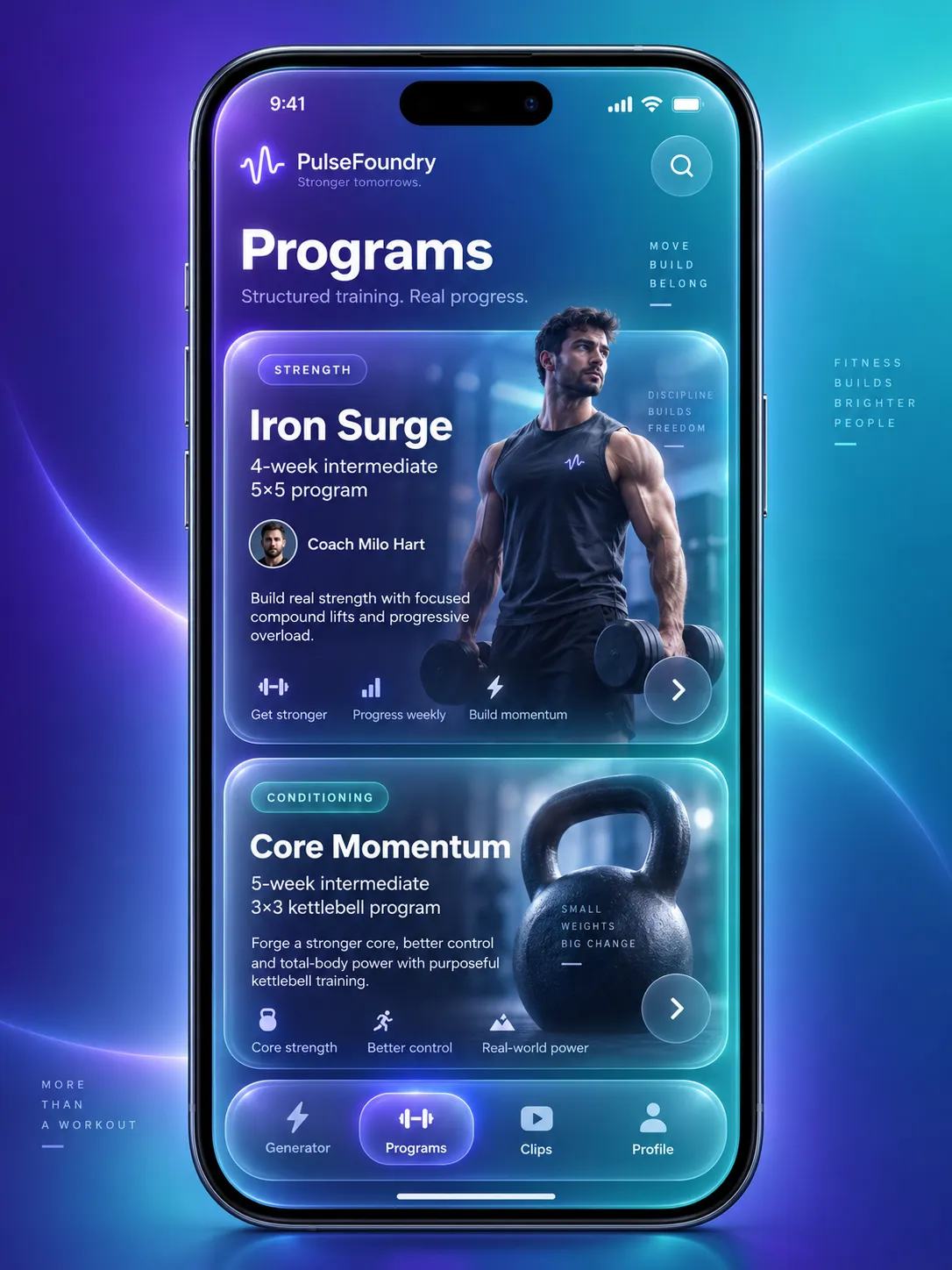
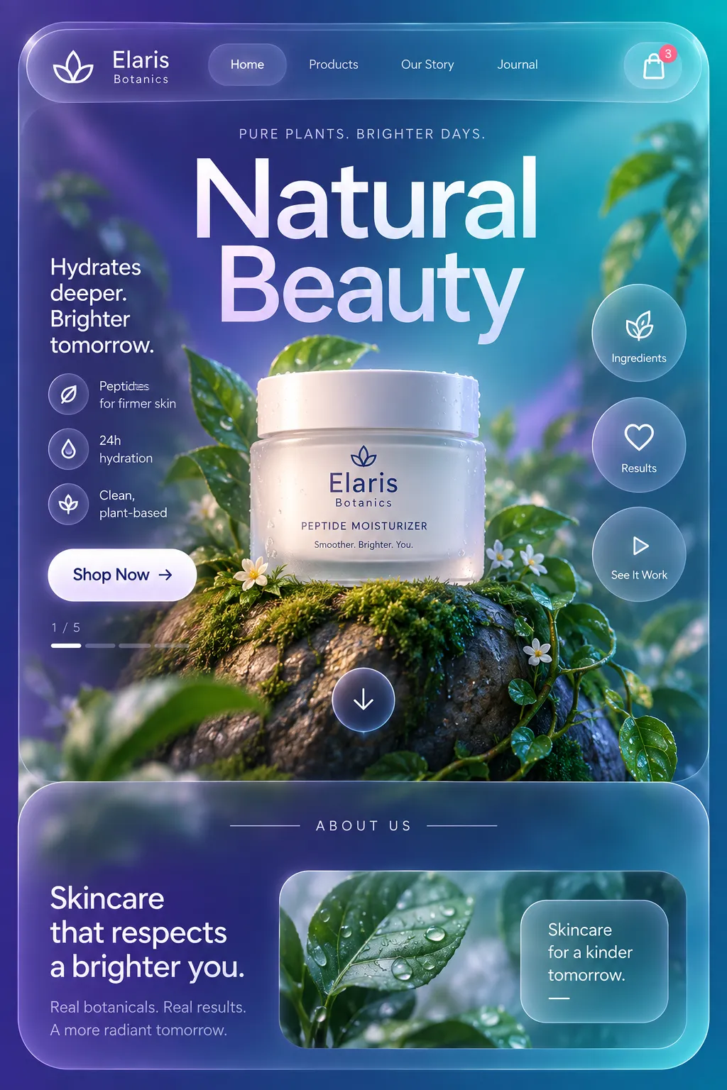
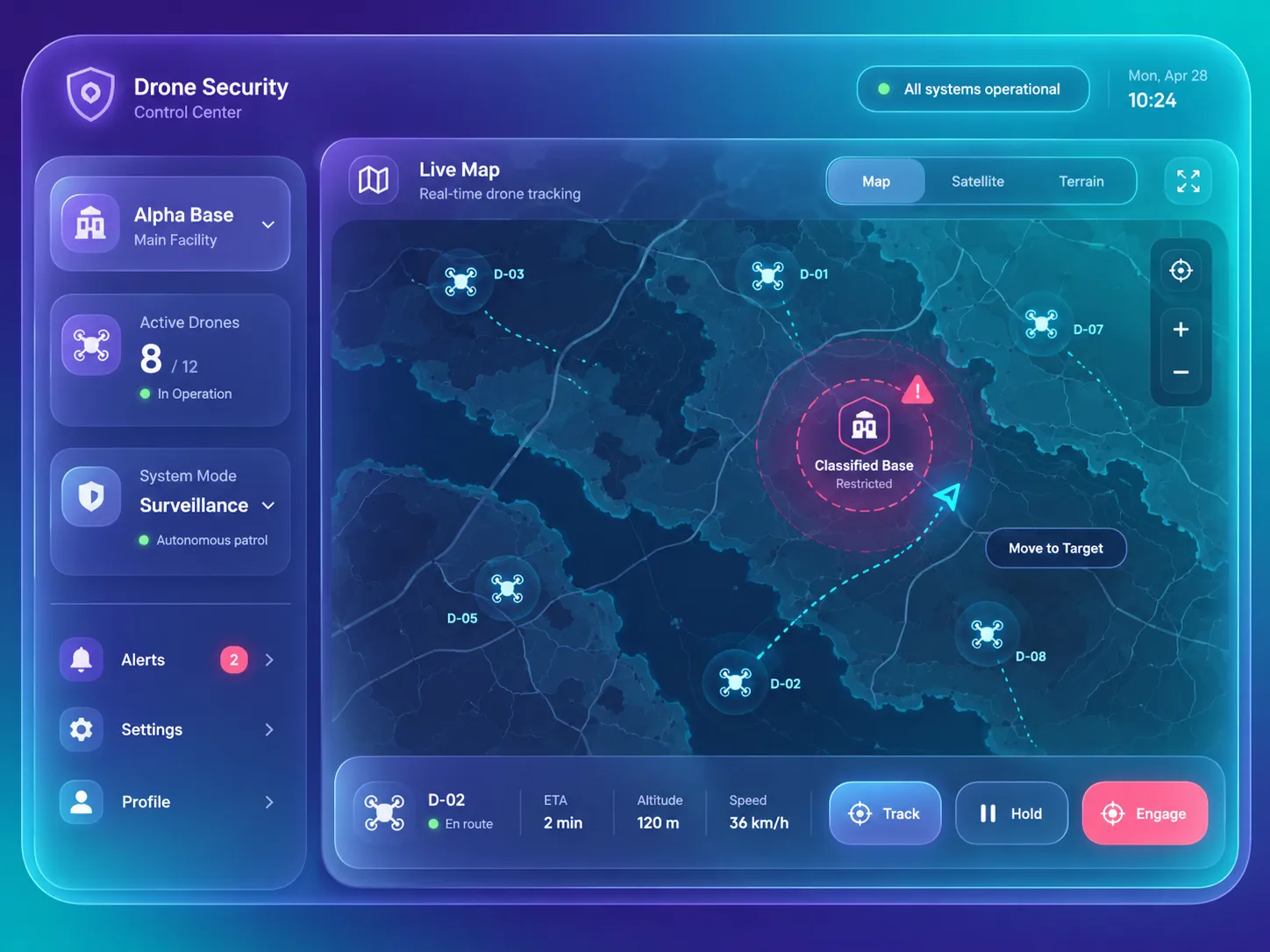
Description
Colors
#2B1B6B35%Usage: Background
#0E9FA830%Usage: Background
#FFFFFF12%Usage: Glass panels
#F7F8FF12%Usage: Typography
#B9A8FF5%Usage: Accent glow
#0A06204%Usage: Text scrim
#FF6B8A2%Usage: Status accent
AI Gradient 1
#2B1B6B0%
#0E9FA8100%
Palette Size
Color Temperature
Saturation Range
Contrast Strategy
Hue Relationships
Gradient Policy
Color Dominance
Black & White Point
Accessibility Level
Output Format
Creative Discipline
Medium
Delivery Mode
Platform
Presentation Context
Mood & Personality
Mood & Personality
Energy Level
Emotional Bias
Tone Register
Representation Mode
Real-world Accuracy
Surface, Material & Detail
Material Simulation
Surface Treatment
Surface Texture Style
Optical Finishes
Transparency / Opacity
Imperfection Level
Abstraction Level
Background & Environment
Background Type
Environment Mood
Background–Subject Relationship
Background Complexity
Prop / Set Styling
Custom Style Items
Glass Opacity
Edge Refraction
Panel Highlighting
Layered Blur
Content Legibility
Press Response
UI & Web
Color Theme
Background Tone
Accent Strategy
Semantic Colors
Layout Archetype
Content Width
Density
Surface Layers
Elevation Approach
Shadow Technique
Shadow Weight
Glass / Blur Effect
Border Philosophy
Corner Radius Scale
Card Style
Button Shape
Button Hierarchy
Input Field Style
Icon Style
Icon Weight
Navigation Pattern
Navigation Style
UI Imagery
Hover Treatment
Focus Ring Style
Animation Philosophy
Transition Speed
Scroll Behavior
Light & Shadow
Lighting Presence
Lighting Mood Style
Key Light Style
Lighting Direction
Shadow Type
Shadow Density
Bloom / Glow Usage
Line & Stroke System
Stroke Usage
Stroke Weight
Stroke Consistency
Stroke Color
Stroke Joins
Guardrails
Common Artifacts to Avoid
Avoided Visuals
Allowed Visuals
Typography
Regular, Medium, Aa, Bb, Typography
Font FamilyGeometric sans
Line HeightNormal
Font WeightsRegular, Medium, Semibold
Letter SpacingNormal
Type ScaleModular
Text Case
Font Pairing Strategy
Hierarchy
Text Presence
Text Visual Role
Text Integration
Voice & Language
Formality
Vocabulary Level
Directness
Sentence Length
Metaphor Density
Writing Perspective
Copy Pacing
Jargon / Technical Level
Emoji Usage
Container / Boundary
Container presence
Container shape
Corner treatment
Container Dominance
Padding rules
Edge behavior
Spatial Structure & Hierarchy
Perspective Style
Focal Structure
Hierarchy Clarity
Symmetry
Balance Type
Layout Axis
Plane Separation Method
Scale Relationship
Grid System
Visual Density
Shape Language
Shape Basis
Primitive Dominance
Edge Sharpness
Curve Consistency
Negative Space Usage
References
Cultural References
Temporal Reference
© 2026 StyleRef. All rights reserved.