Skeuomorphic Material Interface

StyleRef·@styleref·
STYLE REFERENCE — HARD CONSTRAINT (HIGHEST PRIORITY) This style must be applied to ALL generated content (text, image, video). If any part of the request conflicts with this style, the style OVERRIDES the request. STYLE DEFINITION (to be operationally enforced): Skeuomorphic Material Interface • Output Format: Creative discipline: UI/UX; Digital; Delivery mode: Interactive; Desktop. • Container / Boundary: Container shape: Rounded square; Medium radius Corners; Container Dominance: Primary visual identity; Padding: Tight; Edge Behavior: Content fully contained. • Mood & Personality: Rugged, Serious, Confident, Precise; Tone register: Detached; Representation mode: Literal; Real-world accuracy: Precise; Characters: Forbidden. • Colors: Palette: Solid Colors: [ #3A3129 22% (Leather panels), #9EA2A6 20% (Aluminium hardware), #1C1E20 20% (Bakelite controls), #E8E4DA 14% (Silkscreen labels), #2F5D4A 12% (Felt inserts), #E8A33D 7% (Illuminated states), #C2352B 5% (Recording and destructive states)]; 6–8 colors; Tungsten temperature; Saturation: Subdued; Value contrast; Hue relationships: Analogous; Gradients as primary fills; Black/White point: Lifted blacks + Rolled-off highlights; Accessibility: WCAG AA. • Typography: Humanist sans; Medium, Semibold, Bold; Text case: Small Caps; Font pairing: Monospace accent; Hierarchy: Subtle contrast; Letter spacing: Wide; Text presence: Required; Text integration: Embedded in shapes; Text visual role: Purely functional. • Light & Shadow: Lighting mood style: Naturalistic; Key light style: Soft; Artificial; Lighting direction: Upper-left, top-biased key light; Light source count: Single; Shadow type: Soft; Shadow density: Deep; Fill-light ratio: Subtle fill. • Spatial Structure & Hierarchy: Grid system: Modular grid; Visual density: Dense; Symmetry: Near symmetry; Balance: Center-weighted; Layout axis: Horizontal; Distributed focal structure; Plane separation: Shadow. • Surface, Material & Detail: Material simulation: Brushed aluminium, stitched leather, woven felt, glossy display glass, bakelite, and knurled plastic; Surface treatment: Material-simulated; Texture: Directional brushed-metal grain, visible leather stitching, woven felt, knurled plastic; Texture usage: Photographic; Transparency: Opaque; Imperfection level: Used; Photorealistic; Micro-detail allowance: Encouraged; Pattern usage: Textile pattern. • Shape Language: Primitive dominance: Rectangles, Circles; Edge sharpness: Soft; Curve consistency: Uniform radius; Negative space usage: Minimal. • Line & Stroke System: Structural outlines; Thin; Uniform consistency; Stroke Color: Derived from fill. • Voice & Language: Technical vocabulary; Directness: Explicit; Short sentences; Metaphors: Clinical; Perspective: Third person; Pacing: Staccato; Jargon level: Heavy jargon. • References: Mid-Century Modern; Temporal reference: 2000s. • UI & Web: Background tone: Mid gray; Accent strategy: Dual accent; Semantic colors: Error + Warning; Layout archetype: Dashboard; Content width: Full-bleed; Density: Compact; Spacing scale: 4pt grid; Surface layers: Three-layer (page + card + elevated); Elevation: Shadow-based; Shadow technique: Inset / inner shadow; Shadow weight: Strong; Borders: Mixed; Corner radius scale: Medium (8–12px); Button shape: Rounded (8–16px); Button hierarchy: Full system (+ Destructive); Input field style: Filled / tinted; Icon style: Miniature rendered physical objects with independent light and shadow; Animation: Physics-based / Spring; Transition speed: Fast (80–150ms); Focus ring: Colored outline. • Guardrails: Avoid: AI Gloss / Plastic Smoothing, Over-saturation, Stylistic filters; Avoid Visuals: flat vector graphics; uniform plastic gloss; visibly repeating textures; unreadable labels; decorative metaphors without functional payoff; Allowed Visuals: tactile material controls; readable silkscreen labels; physical affordance cues; functional hardware metaphors; varied non-repeating material textures. • Engraved Labels: Small-caps labels engraved with a one-pixel dark line and one-pixel light line beneath., Device-Face Layout: Fixed full-frame panel; grouped inset controls, central display area, and primary control row along the bottom bezel., Machined Seams: Materials meet at precise machined seams; avoid visibly repeating texture tiles., Tactile Relief: Raised controls: top bevel highlight, bottom inner shadow, short cast shadow; recessed controls invert the relief., Control Interaction: Presses invert bevels and shorten shadows; switches visibly travel; short weighted spring return.. ENFORCEMENT RULE: Before finalizing the output, internally verify that ALL elements comply with the style definition above. If compliance is uncertain, simplify or soften the output until it fully matches the style. Generated by StyleRef.io

Description

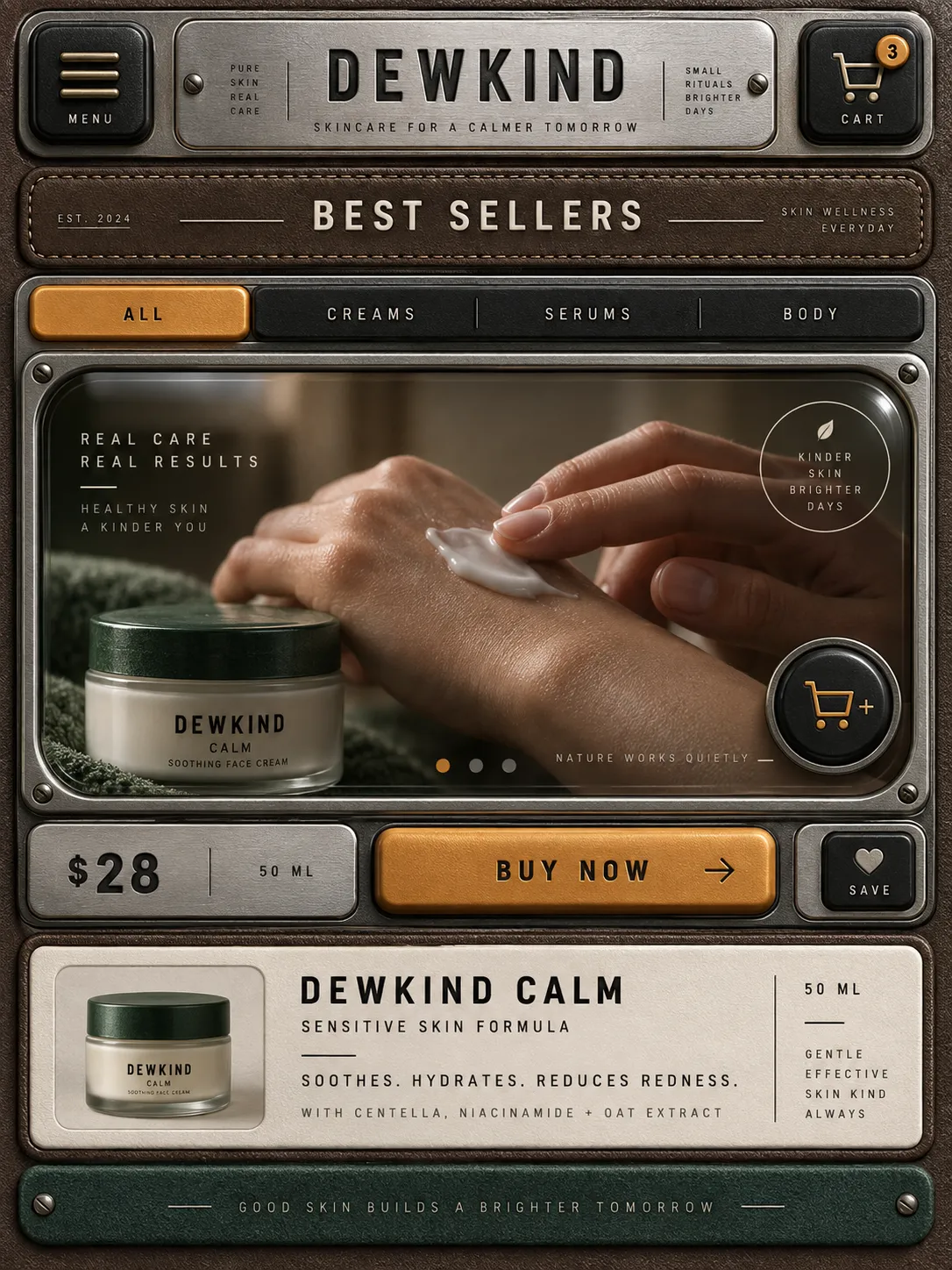
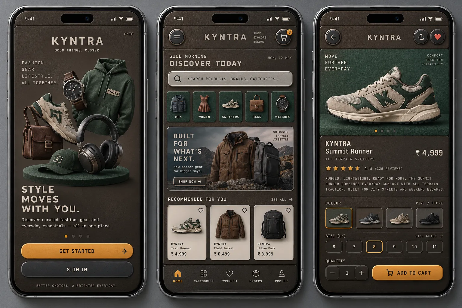
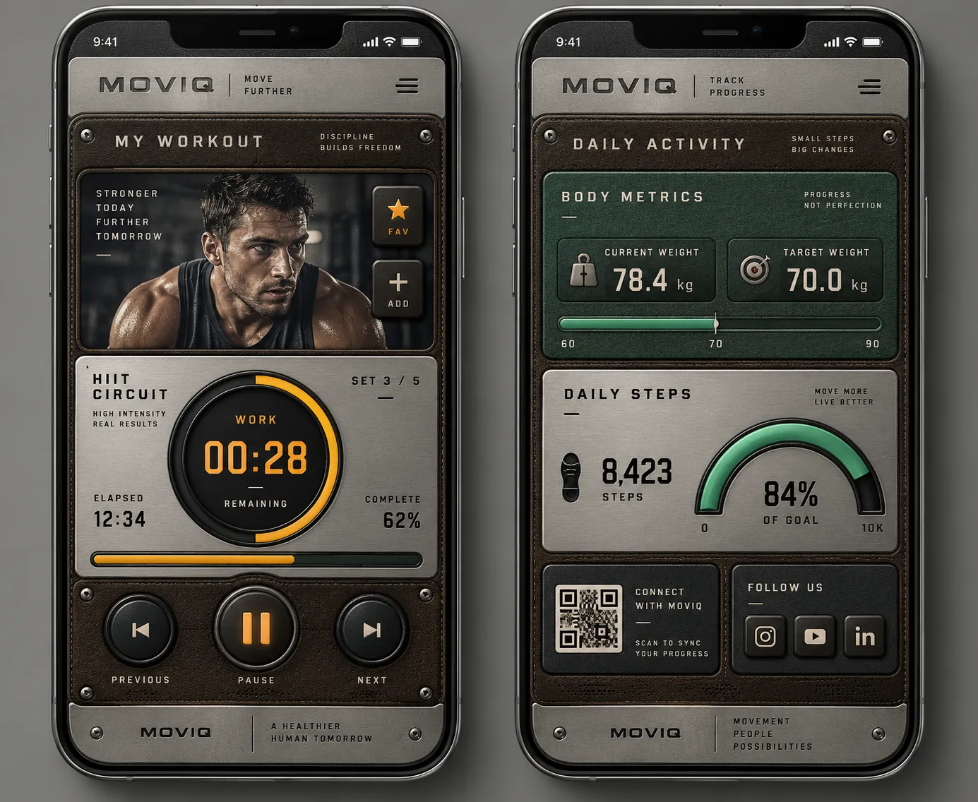
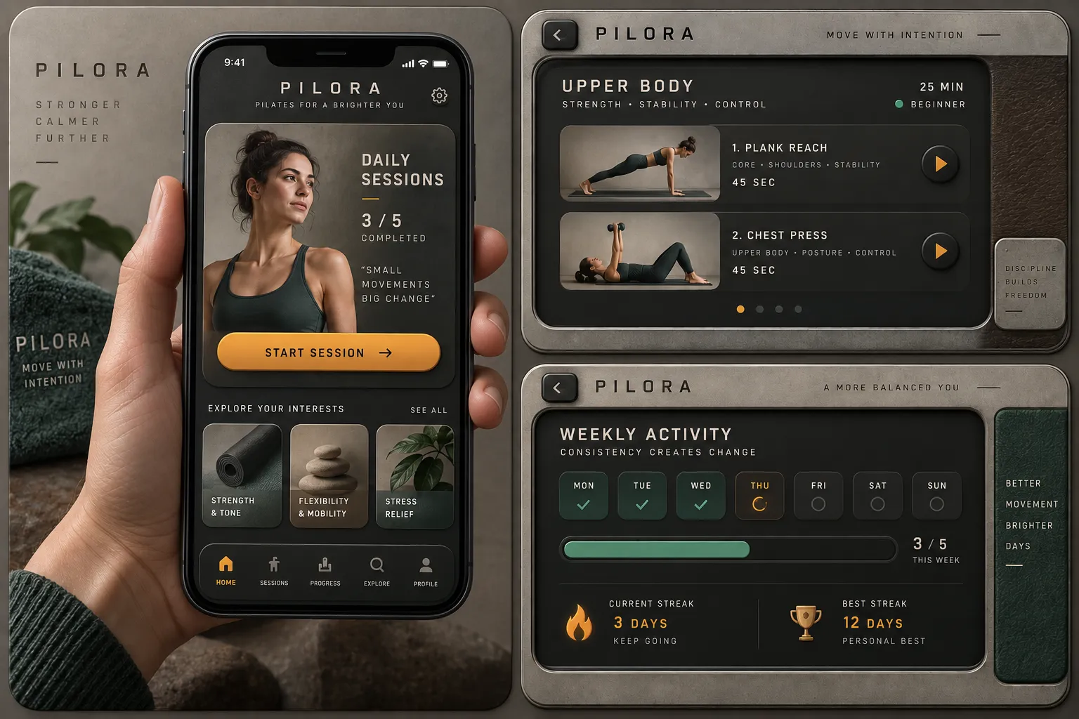
Controls that look like objects: brushed metal, stitched leather, felt and glass, with real light falling across them. Every switch, dial and edge behaves like something you could put a thumb on.

Colors

#3A312922%Usage: Leather panels
#9EA2A620%Usage: Aluminium hardware
#1C1E2020%Usage: Bakelite controls
#E8E4DA14%Usage: Silkscreen labels
#2F5D4A12%Usage: Felt inserts
#E8A33D7%Usage: Illuminated states
#C2352B5%Usage: Recording and destructive states
Palette Size
6–8 colors
Color Temperature
Tungsten
Saturation Range
Subdued
Contrast Strategy
Value contrast
Hue Relationships
Analogous
Gradient Policy
Gradients as primary fills
Black & White Point
Lifted blacks + Rolled-off highlights
Accessibility Level
WCAG AA

Typography

Medium, Semibold, Aa, Bb, Typography
Font FamilyHumanist sans
Font WeightsMedium, Semibold, Bold
Letter SpacingWide
Text Case
Small Caps
Font Pairing Strategy
Monospace accent
Hierarchy
Subtle contrast
Text Presence
Required
Text Integration
Embedded in shapes
Text Visual Role
Purely functional

Container / Boundary

Container shape
Rounded square
Corner treatment
Medium radius
Container Dominance
Primary visual identity
Padding rules
Tight
Edge behavior
Content fully contained

Spatial Structure & Hierarchy

Grid System
Modular grid
Visual Density
Dense
Symmetry
Near symmetry
Balance Type
Center-weighted
Layout Axis
Horizontal
Focal Structure
Distributed
Plane Separation Method
Shadow

Line & Stroke System

Stroke Usage
Structural outlines
Stroke Weight
Thin
Stroke Consistency
Uniform
Stroke Color
Derived from fill

UI & Web

Background Tone
Mid gray
Accent Strategy
Dual accent
Semantic Colors
Error + Warning
Layout Archetype
Dashboard
Content Width
Full-bleed
Density
Compact
Spacing Scale
4pt grid
Surface Layers
Three-layer (page + card + elevated)
Elevation Approach
Shadow-based
Shadow Technique
Inset / inner shadow
Shadow Weight
Strong
Border Philosophy
Mixed
Corner Radius Scale
Medium (8–12px)
Button Shape
Rounded (8–16px)
Button Hierarchy
Full system (+ Destructive)
Input Field Style
Filled / tinted
Icon Style
Miniature rendered physical objects with independent light and shadow
Animation Philosophy
Physics-based / Spring
Transition Speed
Fast (80–150ms)
Focus Ring Style
Colored outline

Voice & Language

Vocabulary Level
Technical
Directness
Explicit
Sentence Length
Short
Metaphor Density
Clinical
Writing Perspective
Third person
Copy Pacing
Staccato
Jargon / Technical Level
Heavy jargon

Shape Language

Primitive Dominance
Rectangles, Circles
Edge Sharpness
Soft
Curve Consistency
Uniform radius
Negative Space Usage
Minimal

Guardrails

Common Artifacts to Avoid
AI Gloss / Plastic Smoothing, Over-saturation, Stylistic filters
Avoided Visuals
flat vector graphics; uniform plastic gloss; visibly repeating textures; unreadable labels; decorative metaphors without functional payoff
Allowed Visuals
tactile material controls; readable silkscreen labels; physical affordance cues; functional hardware metaphors; varied non-repeating material textures

Output Format

Creative Discipline
UI/UX
Medium
Digital
Delivery Mode
Interactive
Platform
Desktop

Mood & Personality

Mood & Personality
Rugged, Serious, Confident, Precise
Tone Register
Detached
Representation Mode
Literal
Real-world Accuracy
Precise
Characters
Forbidden

Light & Shadow

Lighting Mood Style
Naturalistic
Key Light Style
Soft
Light Source Type
Artificial
Lighting Direction
Upper-left, top-biased key light
Light Source Count
Single
Shadow Type
Soft
Shadow Density
Deep
Fill-light Ratio
Subtle fill

Surface, Material & Detail

Material Simulation
Brushed aluminium, stitched leather, woven felt, glossy display glass, bakelite, and knurled plastic
Surface Treatment
Material-simulated
Surface Texture Style
Directional brushed-metal grain, visible leather stitching, woven felt, knurled plastic
Texture Usage
Photographic
Transparency / Opacity
Opaque
Imperfection Level
Used
Abstraction Level
Photorealistic
Micro-detail Allowance
Encouraged
Pattern / Motif Usage
Textile pattern

References

Cultural References
Mid-Century Modern
Temporal Reference
2000s

Custom Style Items

Engraved Labels
Small-caps labels engraved with a one-pixel dark line and one-pixel light line beneath.
Device-Face Layout
Fixed full-frame panel; grouped inset controls, central display area, and primary control row along the bottom bezel.
Machined Seams
Materials meet at precise machined seams; avoid visibly repeating texture tiles.
Tactile Relief
Raised controls: top bevel highlight, bottom inner shadow, short cast shadow; recessed controls invert the relief.
Control Interaction
Presses invert bevels and shorten shadows; switches visibly travel; short weighted spring return.
© 2026 StyleRef. All rights reserved.