Risograph Print

StyleRef·@styleref·
Extract your style to start building your Style Board.

Description

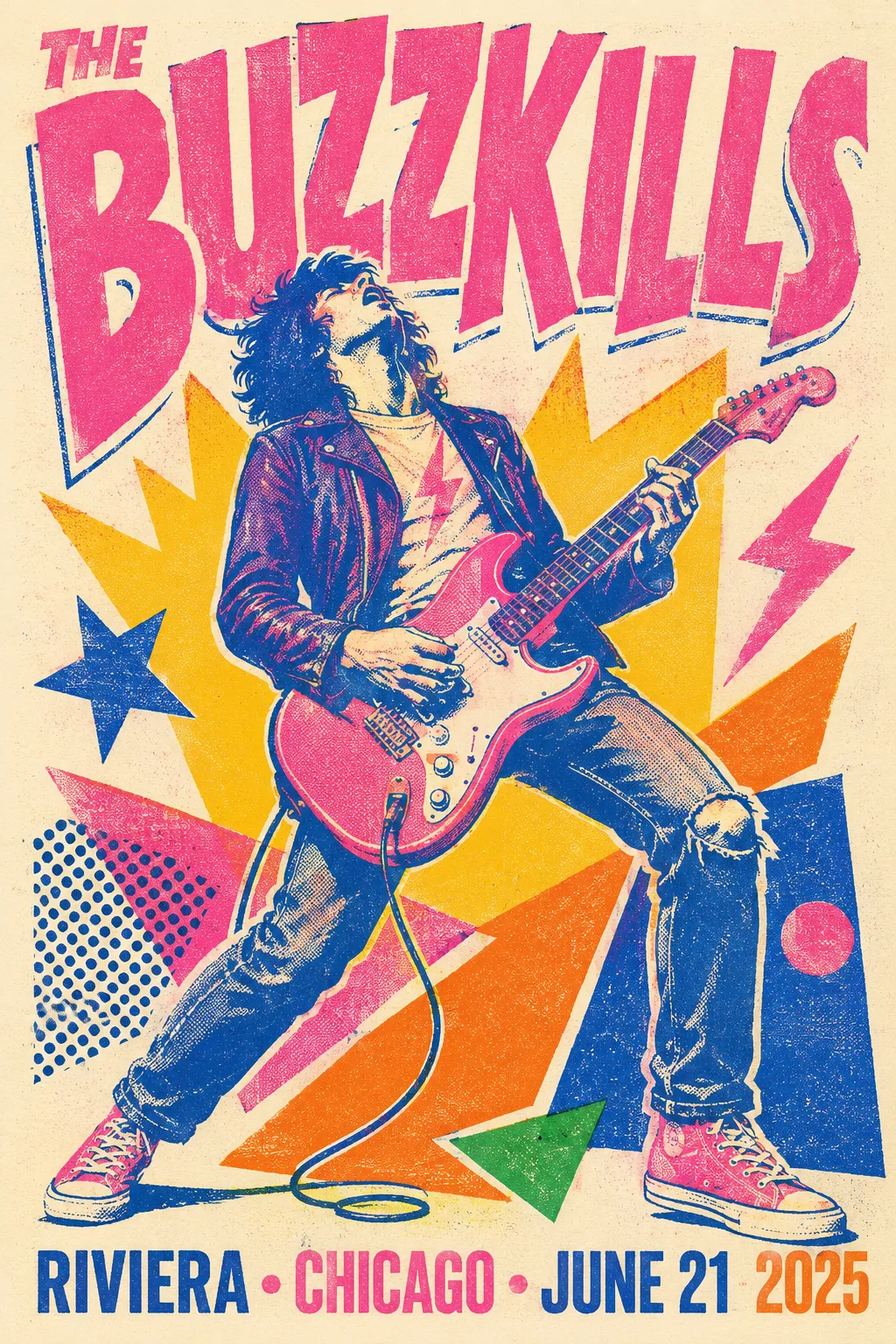
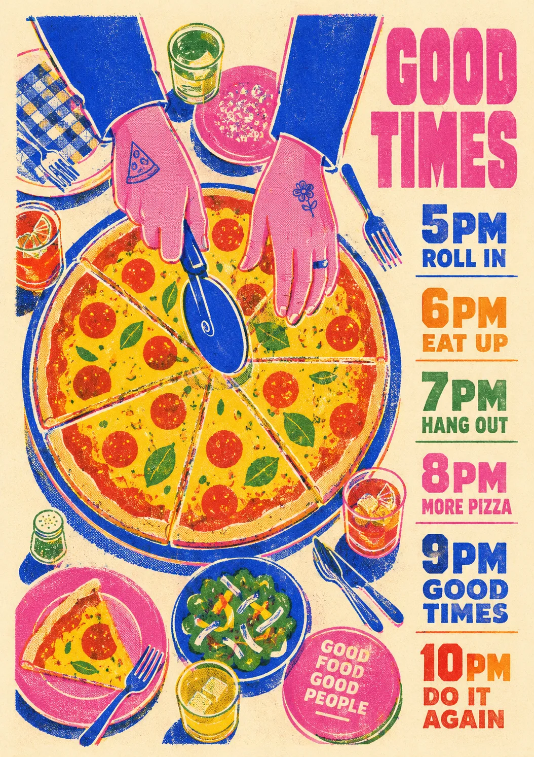
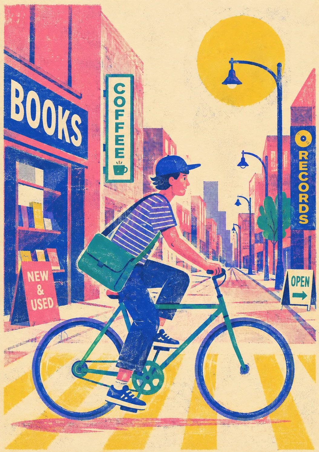
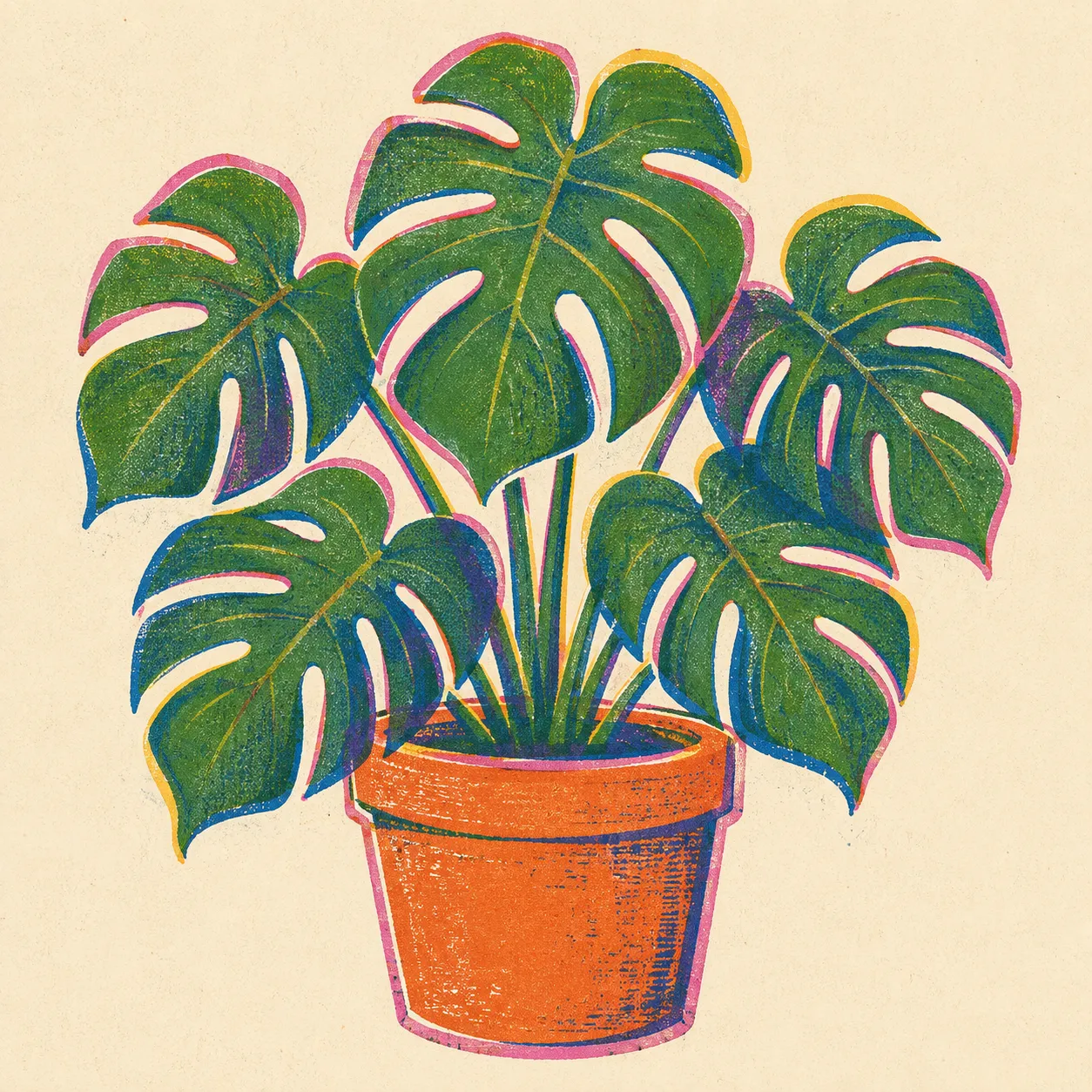
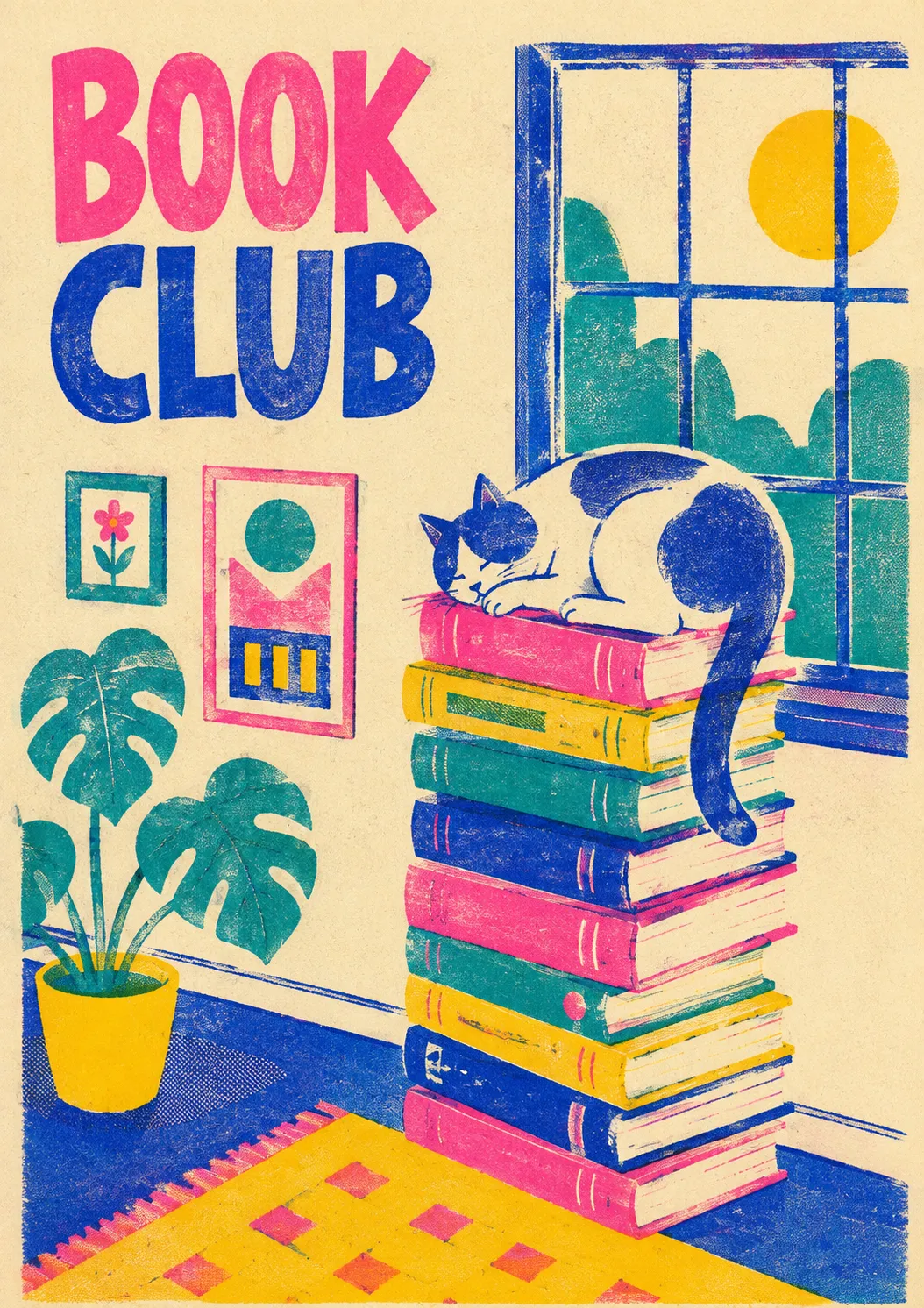
Risograph Print is the look of a two-ink zine duplicator: a small set of bright soy-ink spot colors — most often Fluorescent Pink and Federal Blue — printed one layer at a time and left slightly out of register, so edges double up and the overlaps mix into purple. Tone comes from visible halftone dots and a soft grain instead of smooth blends, all sitting on matte uncoated paper. It suits gig posters, zines, album art, and editorial illustration that want a handmade, lo-fi feel.

Colors

#F5EEDC35%Usage: Paper background
#F15BA615%Usage: Spot-ink pink
#2455B815%Usage: Spot-ink blue
#F6C92810%Usage: Spot-ink yellow
#EF8A1F8%Usage: Spot-ink orange
#E342347%Usage: Spot-ink red
#4B842B5%Usage: Spot-ink green
#6D3E995%Usage: Overprint areas
Color Temperature
Mixed
Saturation Range
Vivid
Contrast Strategy
Hue contrast
Hue Relationships
Arbitrary
Gradient Policy
No gradients
Color Dominance
Balanced

Shape Language

Shape Basis
Hybrid
Primitive Dominance
Circles, Rectangles, Polygons, Freeform curves
Edge Sharpness
Mostly crisp stencil-cut silhouettes with intentional 2–3mm doubled, offset contours
Silhouette Clarity
Iconic
Negative Space Usage
Balanced
Angle Usage
Frequent

Line & Stroke System

Stroke Usage
Structural outlines
Stroke Weight
Medium
Stroke Consistency
Slightly imperfect, offset color-layer contours
Stroke Color
Derived from fill
Stroke Joins
Round

Background & Environment

Background Type
Solid color
Background–Subject Relationship
Contrasting
Background Complexity
Minimal

Typography

Bold, Aa, Bb, Typography
Font FamilyDisplay / Decorative
Line HeightTight
Font WeightsBold, Extra Bold
Letter SpacingTight
Text Case
ALL CAPS
Font Pairing Strategy
Single family
Hierarchy
Strong contrast
Text Presence
Optional
Text Visual Role
Primary visual driver
Text Integration
Embedded in shapes
typography
Chunky sans, hand-set display, or hand-drawn lettering; print large in one ink or knock out from solid fields.

Mood & Personality

Mood & Personality
Playful, Bold, Raw, Nostalgic, Everyday authenticity
Energy Level
Vibrant
Real-world Accuracy
Stylized
Narrative Allowance
Full scene
Characters
Allowed (detailed)

Surface, Material & Detail

Material Simulation
Paper
Surface Treatment
Matte
Surface Texture Style
Grain, Halftone, mottled ink coverage, faint roller streaks
Texture Usage
Subtle noise
Imperfection Level
Organic
Age of Surface
Timeless
Pattern / Motif Usage
Geometric pattern

Artistic Mediums & Techniques

Physical Medium
Risograph print on absorbent uncoated stock
Illustrative Technique
Risograph layer separation, halftone dots, grain-touch diffusion dither, translucent spot-ink overprint

Post-processing & Render Style

Grain Character
Stylized
Image Treatment
Halftone

Output Format

Creative Discipline
Graphic design
Medium
Print
Delivery Mode
Still
Scaling Expectation
Poster-scale

Spatial Structure & Hierarchy

Perspective Style
Flat
Focal Structure
Single
Hierarchy Clarity
Strong
Symmetry
Asymmetrical balance
Layout Axis
Gridless
Grid System
Free-form
Visual Density
Balanced

References

Cultural References
Risograph Print, independent publishing, DIY zines, gig posters
Temporal Reference
Contemporary

Guardrails

Common Artifacts to Avoid
AI Gloss / Plastic Smoothing, HDR over-processing, Over-saturation, Studio Post-processing, Stylistic filters
Avoided Visuals
smooth digital gradients; airbrushed blends; crisp CMYK photo realism; perfectly registered edges; glossy finishes; slick vector-flat rendering; muddy full-color ink builds; tiny overprinted text
Allowed Visuals
visible halftone dots; soft print grain; uncoated cream paper; translucent spot-ink overlaps; large flat shapes; bold type; intentional registration shifts; uneven ink coverage

Custom Style Items

Layer Registration
Shift color separations up to 2–3mm; embrace split contours and doubled edges rather than correcting alignment.
Overprint Logic
Build artwork as individual spot-color layers; overlaps physically multiply into secondary colors.
Tone Construction
Create shading with visible halftone screens and diffusion grain, never smooth tonal blending.
Ink Behavior
Preserve subtle mottling, roller streaks, smudges, and uneven absorbency in solid ink areas.
Typography Constraint
Favor oversized, robust lettering; avoid small reversed or overprinted copy that becomes muddy under misregistration.
© 2026 StyleRef. All rights reserved.