E-Ink Reader Interface

StyleRef·@styleref·
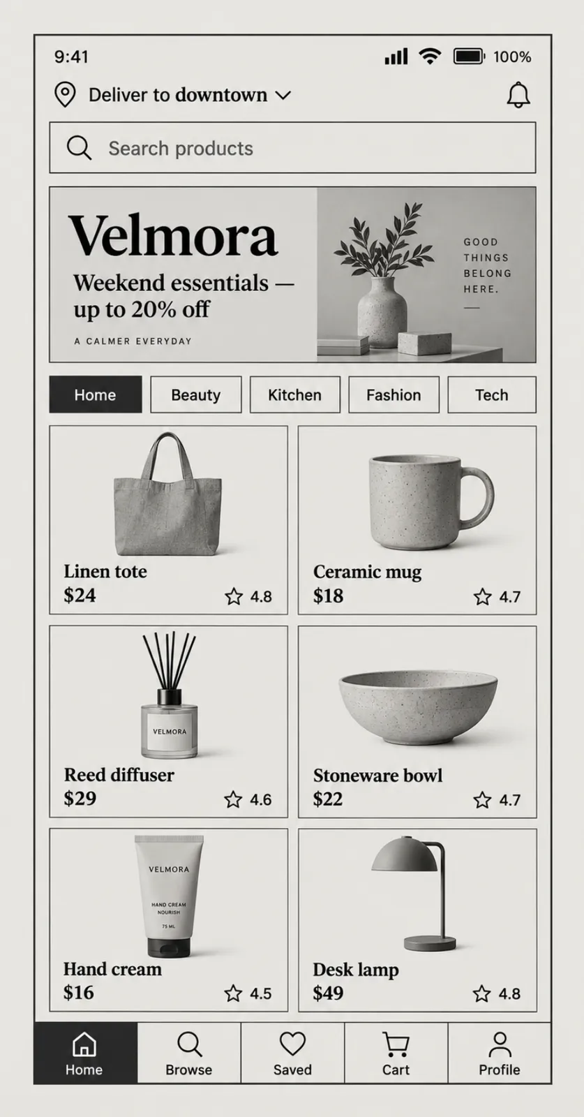
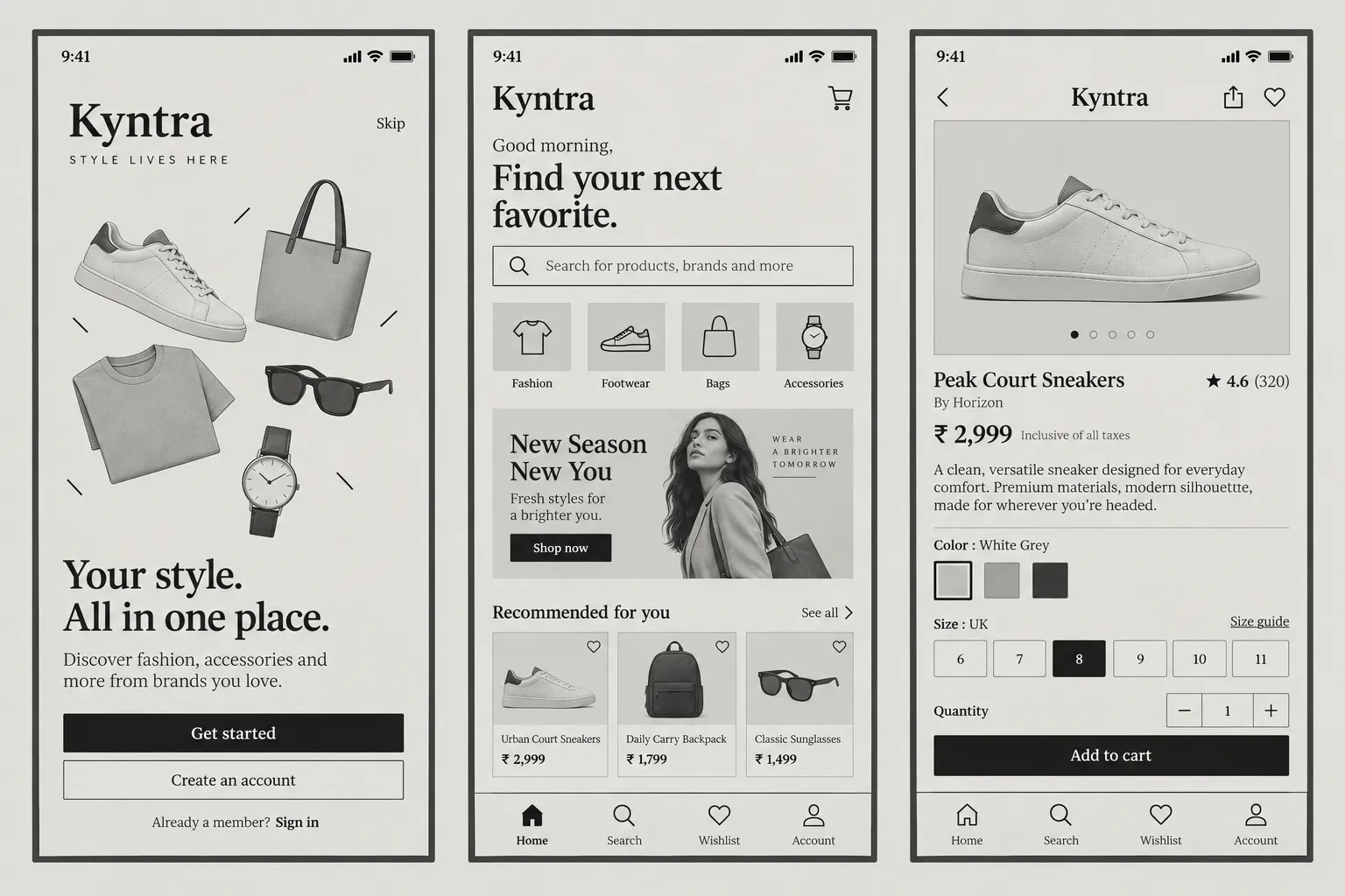
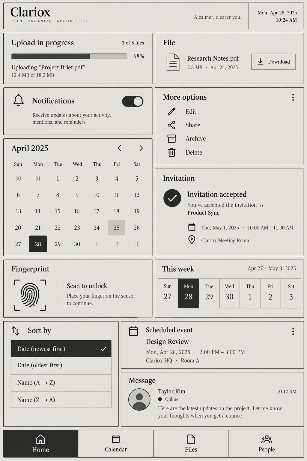
STYLE REFERENCE — HARD CONSTRAINT (HIGHEST PRIORITY) This style must be applied to ALL generated content (text, image, video). If any part of the request conflicts with this style, the style OVERRIDES the request. STYLE DEFINITION (to be operationally enforced): E-Ink Reader Interface • Output Format: Creative discipline: UI/UX; Digital; Delivery mode: Interactive; Mobile; Canvas Behavior: Strict frame (nothing escapes). • Container / Boundary: Container: Explicit (shape mask); Container shape: Card; Sharp Corners; Container Dominance: Visual element; Edge Behavior: Content fully contained. • Mood & Personality: Minimalist, Clean, Calm, Serious; Energy: Dormant; Emotional bias: Neutral. • Colors: Palette: Solid Colors: [ #E9E7E2 55% (Background), #111111 20% (Typography and selected fills), #5A5854 10% (Borders and dark secondary UI), #9C9A95 8% (Secondary fills), #C8C6C1 7% (Tertiary fills)]; 3–5 colors; Neutral temperature; Saturation: Achromatic; High contrast; No gradients; Color dominance: Background-dominant; Black/White point: Pure black + Rolled-off highlights; Accessibility: AAA. • Typography: Serif; Regular, Medium, Bold; Text case: Sentence case; Font pairing: Serif + Sans; Hierarchy: Clear typographic scale; Type scale: Modular; Relaxed (1.6); Letter spacing: Normal; Text presence: Required. • Light & Shadow: Shadow type: None; Lighting presence: None (flat). • Spatial Structure & Hierarchy: Flat perspective; Hierarchy: Moderate; Symmetry: Near symmetry; Layout axis: Vertical; Grid system: Manuscript grid; Visual density: Comfortable. • Surface, Material & Detail: Surface treatment: Flat; Texture: Smooth; Texture usage: None; Imperfection level: Flawless. • Shape Language: Geometric; Primitive dominance: Rectangles; Edge sharpness: Razor-sharp; Negative space usage: Balanced; Angle usage: None. • Line & Stroke System: Structural outlines; Solid 1px; Uniform consistency; Stroke Color: Neutral. • UI & Web: Color theme: Light; Background tone: Mid gray; Accent strategy: No accent color; selection uses black-on-grey inversion; Semantic colors: None; Layout archetype: Reader with persistent bottom controls; Content width: Centered reading column; Density: Comfortable; Spacing scale: Strict vertical rhythm; Surface layers: Flat (one background); Elevation: Flat — no elevation; Shadow technique: No shadows; Borders: Visible solid border; Corner radius scale: Sharp (0px); Card style: Bordered; Button shape: Sharp rectangle; Button hierarchy: Primary + Secondary; Icon style: Outline / Stroke; Icon weight: Medium (2px); Navigation: Bottom tab bar; Nav style: Static solid; Hover: None; Focus ring: Inset border; Animation: None (instant); Transition speed: Instant; Scroll behavior: Static. • Guardrails: Avoid: Heavy Bokeh / Blur, Lens Flare, Film Grain / Noise, HDR over-processing, Over-saturation, Studio Post-processing, Stylistic filters; Avoid Visuals: color accents; gradients; shadows; hover effects; animated transitions; thin typography; reflowing layouts; Allowed Visuals: achromatic fills; full inversion; solid 1px borders; hard-edged rectangles; outline icons; static bottom controls. • Type Roles: Generous serif reading text; grotesque sans-serif controls; hierarchy limited to size and weight., Reading Structure: Wide reading measure, strict vertical rhythm, and a persistent bottom control row., State Signalling: Communicate state through fill inversion, icon, and label; never color, hover, or elevation., Interaction Stability: No reflow on interaction; preserve fixed layout to minimize expensive screen repaints.. ENFORCEMENT RULE: Before finalizing the output, internally verify that ALL elements comply with the style definition above. If compliance is uncertain, simplify or soften the output until it fully matches the style. Generated by StyleRef.io

Description

Designed for a screen that cannot animate: achromatic, no shadows, no hover, hard edges, high contrast and instant state changes. Constraint-driven, and unusually pleasant on a normal display too.

Typography

Regular, Medium, Aa, Bb, Typography
Font FamilySerif
Line HeightRelaxed
Font WeightsRegular, Medium, Bold
Letter SpacingNormal
Type ScaleModular
Text Case
Sentence case
Font Pairing Strategy
Serif + Sans
Hierarchy
Clear typographic scale
Text Presence
Required

Output Format

Creative Discipline
UI/UX
Medium
Digital
Delivery Mode
Interactive
Platform
Mobile
Canvas Behavior
Strict frame (nothing escapes)

Light & Shadow

Shadow Type
None
Lighting Presence
None (flat)

Shape Language

Shape Basis
Geometric
Primitive Dominance
Rectangles
Edge Sharpness
Razor-sharp
Negative Space Usage
Balanced
Angle Usage
None

Guardrails

Common Artifacts to Avoid
Heavy Bokeh / Blur, Lens Flare, Film Grain / Noise, HDR over-processing, Over-saturation, Studio Post-processing, Stylistic filters
Avoided Visuals
color accents; gradients; shadows; hover effects; animated transitions; thin typography; reflowing layouts
Allowed Visuals
achromatic fills; full inversion; solid 1px borders; hard-edged rectangles; outline icons; static bottom controls

UI & Web

Color Theme
Light
Background Tone
Mid gray
Accent Strategy
No accent color; selection uses black-on-grey inversion
Semantic Colors
None
Layout Archetype
Reader with persistent bottom controls
Content Width
Centered reading column
Density
Comfortable
Spacing Scale
Strict vertical rhythm
Surface Layers
Flat (one background)
Elevation Approach
Flat — no elevation
Shadow Technique
No shadows
Border Philosophy
Visible solid border
Corner Radius Scale
Sharp (0px)
Card Style
Bordered
Button Shape
Sharp rectangle
Button Hierarchy
Primary + Secondary
Icon Style
Outline / Stroke
Icon Weight
Medium (2px)
Navigation Pattern
Bottom tab bar
Navigation Style
Static solid
Hover Treatment
None
Focus Ring Style
Inset border
Animation Philosophy
None (instant)
Transition Speed
Instant
Scroll Behavior
Static

Mood & Personality

Mood & Personality
Minimalist, Clean, Calm, Serious
Energy Level
Dormant
Emotional Bias
Neutral

Surface, Material & Detail

Surface Treatment
Flat
Surface Texture Style
Smooth
Texture Usage
None
Imperfection Level
Flawless

Colors

#E9E7E255%Usage: Background
#11111120%Usage: Typography and selected fills
#5A585410%Usage: Borders and dark secondary UI
#9C9A958%Usage: Secondary fills
#C8C6C17%Usage: Tertiary fills
Palette Size
3–5 colors
Color Temperature
Neutral
Saturation Range
Achromatic
Contrast Strategy
High contrast
Gradient Policy
No gradients
Color Dominance
Background-dominant
Black & White Point
Pure black + Rolled-off highlights
Accessibility Level
AAA

Container / Boundary

Container presence
Explicit (shape mask)
Container shape
Card
Corner treatment
Sharp
Container Dominance
Visual element
Edge behavior
Content fully contained

Spatial Structure & Hierarchy

Perspective Style
Flat
Hierarchy Clarity
Moderate
Symmetry
Near symmetry
Layout Axis
Vertical
Grid System
Manuscript grid
Visual Density
Comfortable

Line & Stroke System

Stroke Usage
Structural outlines
Stroke Weight
Solid 1px
Stroke Consistency
Uniform
Stroke Color
Neutral

Custom Style Items

Type Roles
Generous serif reading text; grotesque sans-serif controls; hierarchy limited to size and weight.
Reading Structure
Wide reading measure, strict vertical rhythm, and a persistent bottom control row.
State Signalling
Communicate state through fill inversion, icon, and label; never color, hover, or elevation.
Interaction Stability
No reflow on interaction; preserve fixed layout to minimize expensive screen repaints.
© 2026 StyleRef. All rights reserved.