Modular Kinetic Blocks

StyleRef·@styleref·
Extract your style to start building your Style Board.

Description

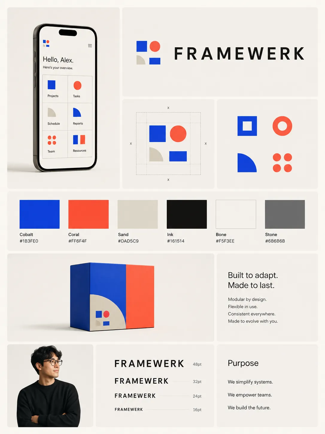
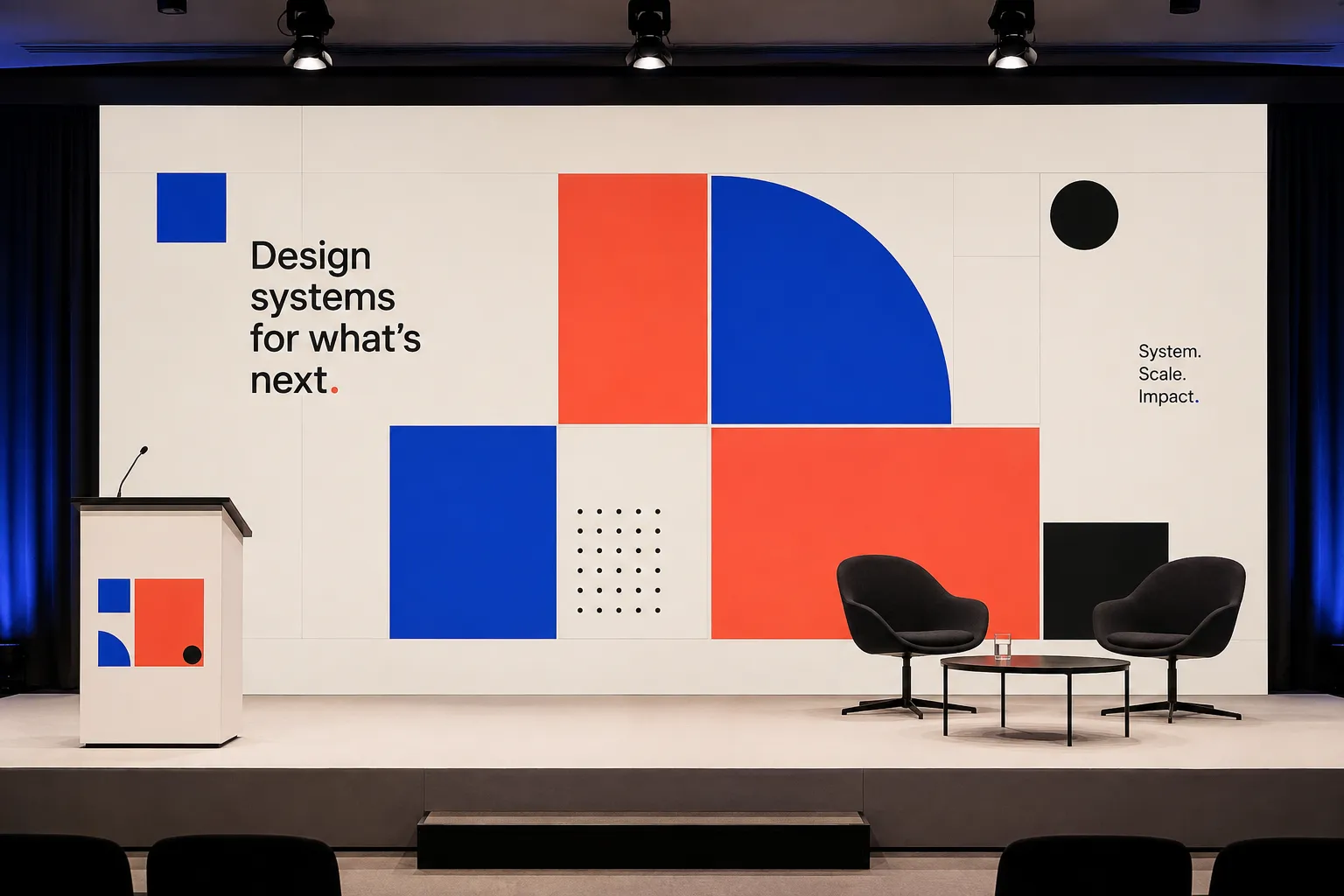
Modular Kinetic Blocks builds the mark from a small set of geometric pieces that recombine differently on every surface — tight and square on an app icon, spread wide across a banner, stacked for a favicon — instead of one fixed lockup scaled everywhere. The blocks stay the same; only their arrangement changes. It suits platforms, research institutions, multi-category products and anything too varied for a single static mark.

Typography

Light, Aa, Bb, Typography
Font FamilyGeometric sans
Line HeightNormal
Font WeightsLight, Medium
Type ScaleModular
Text Case
Sentence case
Font Pairing Strategy
Single family
Hierarchy
Subtle contrast
Text Visual Role
Secondary visual element
Text Integration
Separate

Output Format

Creative Discipline
Brand identity
Medium
Mixed
Scaling Expectation
UI-scale
Canvas Behavior
Soft frame (visual tension allowed)

Surface, Material & Detail

Material Simulation
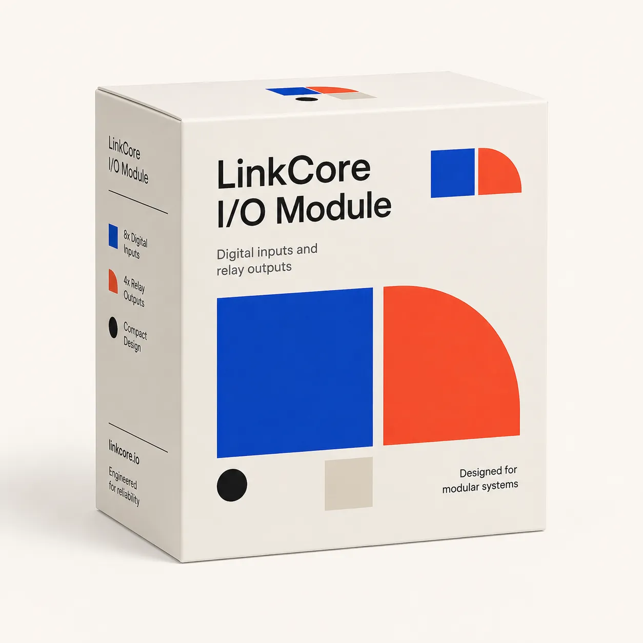
Powder-coated aluminium, screen-printed acrylic or glass, matte vinyl, and uncoated print stock
Surface Treatment
Matte
Surface Texture Style
Smooth
Texture Usage
None
Imperfection Level
Flawless
Pattern / Motif Usage
Geometric pattern

Background & Environment

Background Type
Solid color
Background–Subject Relationship
Isolated
Background Complexity
Minimal

Custom Style Items

Recombination Rule
Use four to six fixed primitives; alter position, count, spacing, and arrangement, never primitive proportions.
Configuration Ladder
Wide spread for large formats; tight square lock-up for avatars and app icons; two essential blocks for favicon-scale use.
Spacing Rule
Clear space equals the width of the smallest block; full configurations retain generous, consistent gaps.
Icon Grammar
Icons use no more than three logo primitives, recombined at icon scale with one flat color per shape.
Photography Role
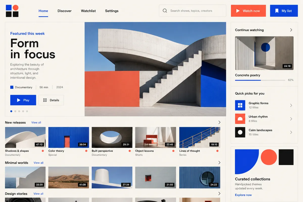
Functional photography only: isolated person or object on a flat system-color ground; always secondary to the block system.

UI & Web

Color Theme
Light
Background Tone
Warm off-white
Accent Strategy
Dual accent
Surface Layers
Two-layer (page + card)
Elevation Approach
Background contrast only
Border Philosophy
Hairline (0.5–1px, low opacity)
Button Shape
Sharp rectangle
Button Hierarchy
Primary + Secondary
Icon Style
Flat geometric
Icon Weight
Bold (2.5px+)
Navigation Pattern
Top bar
Hover Treatment
Color change
Focus Ring Style
Solid offset ring
Animation Philosophy
Expressive
Transition Speed
Standard (200–300ms)

Mood & Personality

Mood & Personality
Confident, Playful, Clean
Energy Level
Active
Emotional Bias
Neutral
Representation Mode
Symbolic
Real-world Accuracy
Stylized
Narrative Allowance
None
Characters
Forbidden

Voice & Language

Formality
Professional
Vocabulary Level
Conversational
Directness
Clear
Sentence Length
Short
Metaphor Density
Factual
Writing Perspective
Third person
Copy Pacing
Varied
Jargon / Technical Level
Light industry terms

Container / Boundary

Container presence
Explicit (shape mask)
Container shape
Square
Corner treatment
Sharp
Container Dominance
Visual element
Edge behavior
Content fully contained

Line & Stroke System

Stroke Usage
No stroke (fill-only)

Colors

#F5F3EE55%Usage: Background
#1B3FE015%Usage: Block cobalt
#FF6F4F15%Usage: Block coral
#16151412%Usage: Typography and structural lines
#DAD5C93%Usage: Grid hairlines
Palette Size
3–5 colors
Color Temperature
Cool
Saturation Range
Rich
Contrast Strategy
Hue contrast
Hue Relationships
Split-complementary
Gradient Policy
No gradients
Color Dominance
Balanced
Accessibility Level
WCAG AA

Spatial Structure & Hierarchy

Grid System
Modular grid
Focal Structure
Single
Hierarchy Clarity
Strong
Balance Type
Configuration-dependent: wide horizontal spread, tight square nesting, or minimal two-block reduction
Visual Density
Generous gaps in full arrangements; compact nesting only in compressed marks

Shape Language

Shape Basis
Geometric
Primitive Dominance
Rectangles, Circles, quarter-circles, small dots
Edge Sharpness
Razor-sharp
Silhouette Clarity
Recognizable
Curve Consistency
Uniform radius
Negative Space Usage
Balanced
Angle Usage
None

References

Cultural References
De Stijl, Pentagram's 2011 MIT Media Lab mark, City of Melbourne identity framework, generative identity systems
Temporal Reference
Contemporary

Guardrails

Avoided Visuals
redrawn block proportions; new block shapes; gradients on blocks; texture on blocks; overlapping blocks; full-spread-only logo use; wordmark without blocks
Allowed Visuals
fixed square, bar, quarter-circle, and dot primitives; flat single-color fills; non-overlapping modular arrangements; full, compressed, and minimal configurations
Avoided Words
all-in-one; unlock your potential; ultimate solution; indivisible brand; vague completeness claims
Conditional Logic
Use full spread where gaps remain legible; switch to compressed lock-up below that threshold; switch to the minimal two-block mark below the compressed threshold. Preserve primitive proportions and assigned hues at every size.
© 2026 StyleRef. All rights reserved.