Essential Whitespace Interface

StyleRef·@styleref·
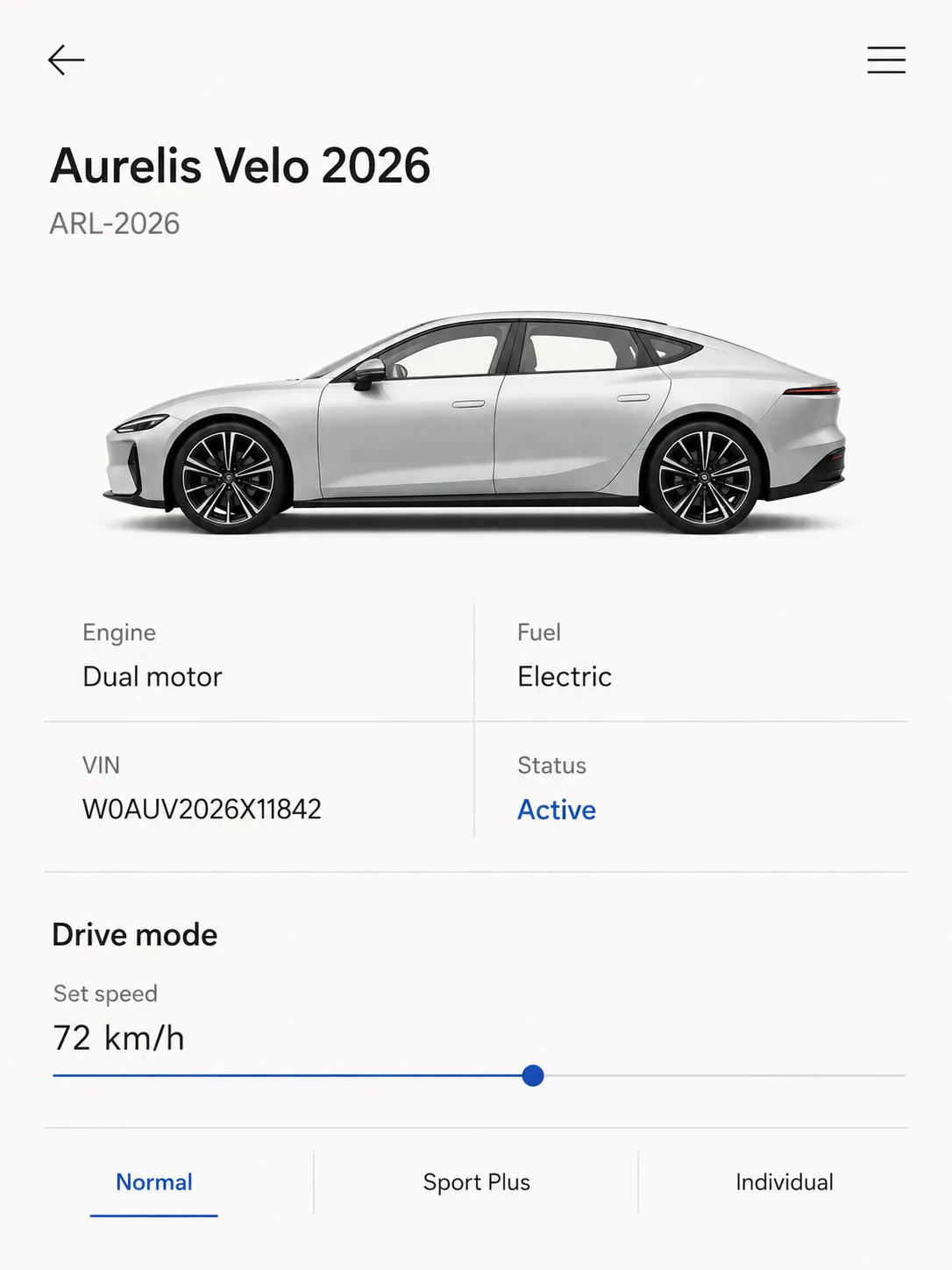
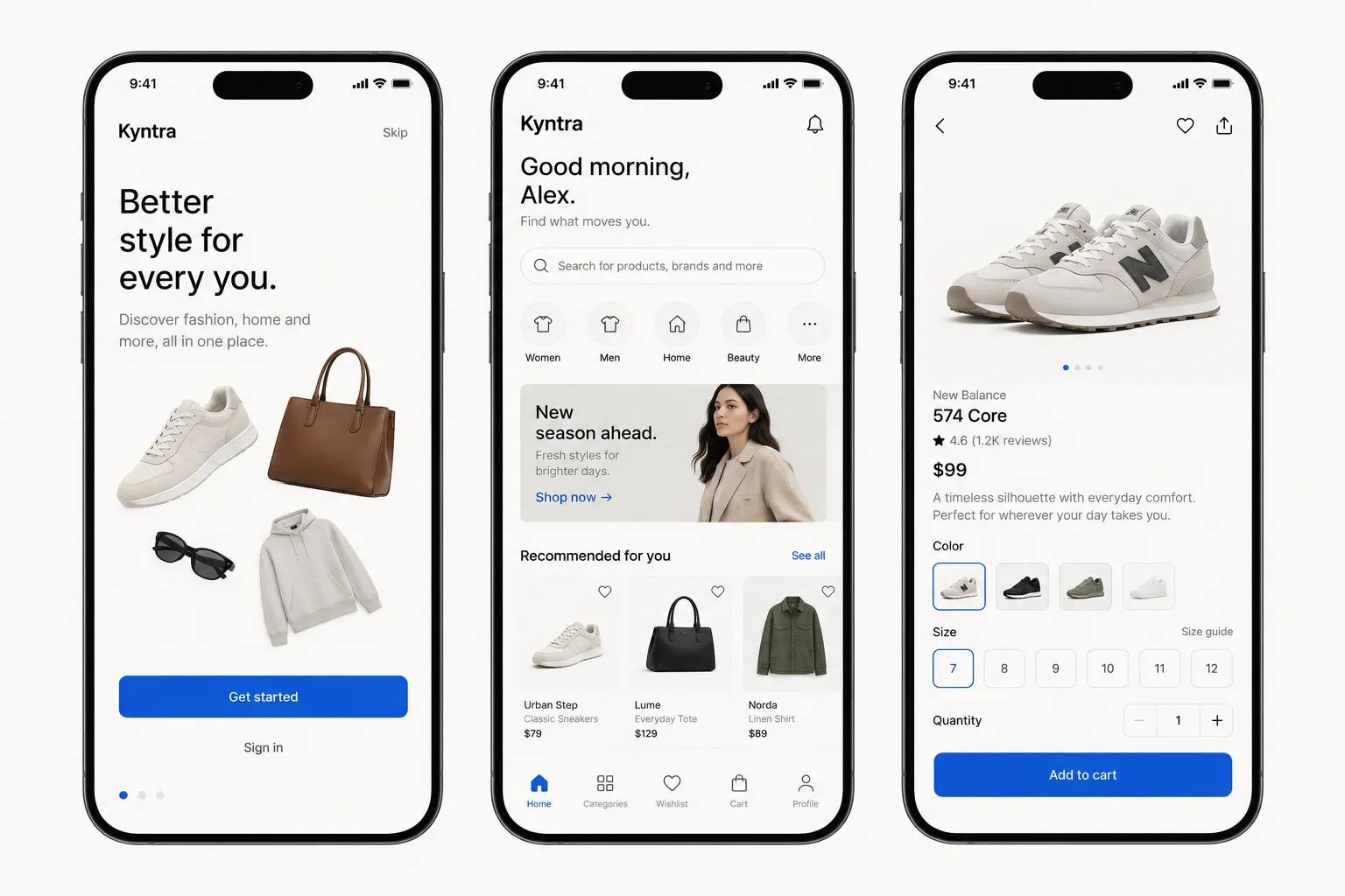
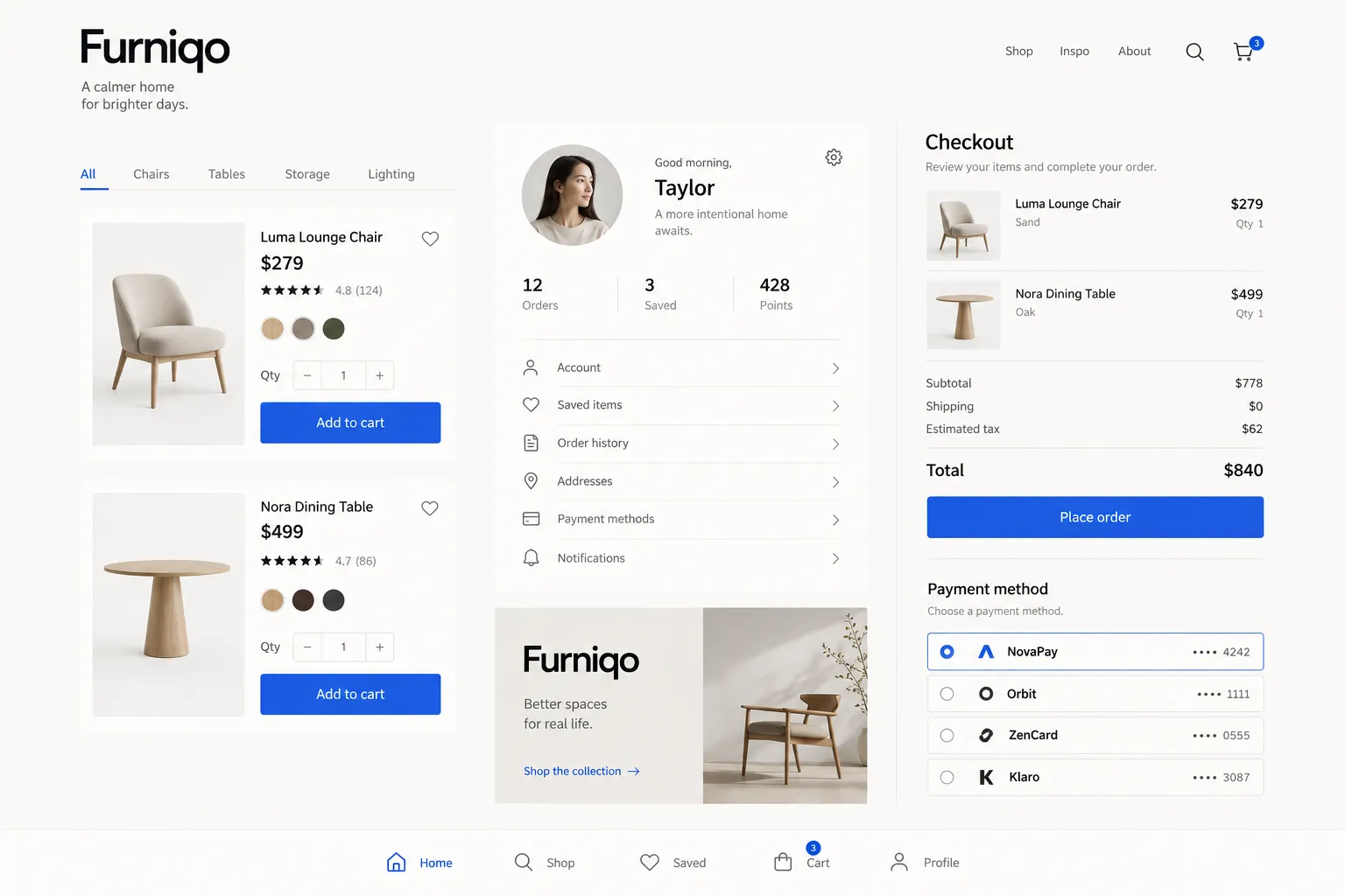
STYLE REFERENCE — HARD CONSTRAINT (HIGHEST PRIORITY) This style must be applied to ALL generated content (text, image, video). If any part of the request conflicts with this style, the style OVERRIDES the request. STYLE DEFINITION (to be operationally enforced): Essential Whitespace Interface • Output Format: Creative discipline: UI/UX; Digital; Delivery mode: Interactive; Web; Presentation: Raw UI. • Container / Boundary: Container: Implicit (visual edges only); Container Dominance: Invisible (purely functional); Padding: Generous. • Mood & Personality: Minimalist, Clean, Calm, Confident, Sophisticated; Energy: Mellow; Emotional bias: Neutral; Representation mode: Literal; Real-world accuracy: Precise. • Colors: Palette: Solid Colors: [ #FBFAF8 55% (Background), #FFFFFF 15% (Surface), #1A1A18 18% (Typography), #6B6B66 6% (Secondary text), #E5E3DE 3% (Rules), #1F4FD8 2% (Primary action and current state), #B4241F 1% (Error state)]; 6–8 colors; Value contrast; No gradients; Color dominance: Background-dominant; Accessibility: WCAG AA. • Typography: Humanist sans; Regular, Medium, Semibold; Text case: Sentence case; Font pairing: Single family; Hierarchy: Clear typographic scale; Relaxed (1.6); Text visual role: Primary visual driver. • Spatial Structure & Hierarchy: Grid system: Column grid; Hierarchy: Strong; Layout axis: Vertical; Symmetry: Asymmetrical balance; Balance: Edge-weighted; Visual density: Sparse. • Surface, Material & Detail: Surface treatment: Flat; Texture usage: None. • Shape Language: Negative space usage: Dominant. • Voice & Language: Formality: Professional; Simple vocabulary; Directness: Straightforward; Short sentences; Metaphors: Literal; Perspective: Second person (you); Pacing: Punchy; Jargon level: None. • References: Minimalism, Dieter Rams, Japanese ma; Temporal reference: Timeless. • UI & Web: Color theme: Light; Background tone: Warm off-white; Accent strategy: Single functional accent; Semantic colors: Error only; Layout archetype: Marketing page; Content width: Centered reading column; Density: Spacious; Spacing scale: 8pt grid; Surface layers: Flat (one background); Elevation: Flat — no elevation; Borders: Hairline (0.5–1px, low opacity); Card style: No cards (flat sections); Icon style: Outline / Stroke; Icon weight: Regular (1.5px); Empty state: Text only; Hover: Background shift; Animation: Functional only; Transition speed: Fast (80–150ms); Focus ring: Solid offset ring. • Guardrails: Avoid: Heavy Bokeh / Blur, Over-saturation; Avoid Visuals: soft shadows; rounded cards; second accent colors; centered body text; illustrated empty states; thin light-weight type; decorative image masks; texture; gradients; noise; Allowed Visuals: warm off-white ground; near-black text; one blue functional accent; left-aligned reading column; large empty regions; 0.5px low-opacity rules; sparse full-bleed photography; thin outline icons. • Whitespace Hierarchy: Grade vertical space into large section intervals, medium group intervals, and small line intervals; spacing creates hierarchy., Accent Budget: Use the single accent only for primary actions and current states, approximately four or five appearances per screen., Optical Discipline: Keep only elements that justify their presence; use obsessive optical alignment and deliberately preserve empty regions.. ENFORCEMENT RULE: Before finalizing the output, internally verify that ALL elements comply with the style definition above. If compliance is uncertain, simplify or soften the output until it fully matches the style. Generated by StyleRef.io

Description

An interface stripped to what the task needs: one accent, one type family, and a lot of empty space doing the work borders used to do. Space is the layout system, not the leftover after everything else is placed.

Typography

Regular, Medium, Aa, Bb, Typography
Font FamilyHumanist sans
Line HeightRelaxed
Font WeightsRegular, Medium, Semibold
Text Case
Sentence case
Font Pairing Strategy
Single family
Hierarchy
Clear typographic scale
Text Visual Role
Primary visual driver

Container / Boundary

Container presence
Implicit (visual edges only)
Container Dominance
Invisible (purely functional)
Padding rules
Generous

Spatial Structure & Hierarchy

Grid System
Column grid
Hierarchy Clarity
Strong
Layout Axis
Vertical
Symmetry
Asymmetrical balance
Balance Type
Edge-weighted
Visual Density
Sparse

Surface, Material & Detail

Surface Treatment
Flat
Texture Usage
None

Custom Style Items

Whitespace Hierarchy
Grade vertical space into large section intervals, medium group intervals, and small line intervals; spacing creates hierarchy.
Accent Budget
Use the single accent only for primary actions and current states, approximately four or five appearances per screen.
Optical Discipline
Keep only elements that justify their presence; use obsessive optical alignment and deliberately preserve empty regions.

UI & Web

Color Theme
Light
Background Tone
Warm off-white
Accent Strategy
Single functional accent
Semantic Colors
Error only
Layout Archetype
Marketing page
Content Width
Centered reading column
Density
Spacious
Spacing Scale
8pt grid
Surface Layers
Flat (one background)
Elevation Approach
Flat — no elevation
Border Philosophy
Hairline (0.5–1px, low opacity)
Card Style
No cards (flat sections)
Icon Style
Outline / Stroke
Icon Weight
Regular (1.5px)
Empty State Style
Text only
Hover Treatment
Background shift
Animation Philosophy
Functional only
Transition Speed
Fast (80–150ms)
Focus Ring Style
Solid offset ring

Mood & Personality

Mood & Personality
Minimalist, Clean, Calm, Confident, Sophisticated
Energy Level
Mellow
Emotional Bias
Neutral
Representation Mode
Literal
Real-world Accuracy
Precise

References

Cultural References
Minimalism, Dieter Rams, Japanese ma
Temporal Reference
Timeless

Colors

#FBFAF855%Usage: Background
#FFFFFF15%Usage: Surface
#1A1A1818%Usage: Typography
#6B6B666%Usage: Secondary text
#E5E3DE3%Usage: Rules
#1F4FD82%Usage: Primary action and current state
#B4241F1%Usage: Error state
Palette Size
6–8 colors
Contrast Strategy
Value contrast
Gradient Policy
No gradients
Color Dominance
Background-dominant
Accessibility Level
WCAG AA

Output Format

Creative Discipline
UI/UX
Medium
Digital
Delivery Mode
Interactive
Platform
Web
Presentation Context
Raw UI

Voice & Language

Formality
Professional
Vocabulary Level
Simple
Directness
Straightforward
Sentence Length
Short
Metaphor Density
Literal
Writing Perspective
Second person (you)
Copy Pacing
Punchy
Jargon / Technical Level
None

Shape Language

Negative Space Usage
Dominant

Guardrails

Common Artifacts to Avoid
Heavy Bokeh / Blur, Over-saturation
Avoided Visuals
soft shadows; rounded cards; second accent colors; centered body text; illustrated empty states; thin light-weight type; decorative image masks; texture; gradients; noise
Allowed Visuals
warm off-white ground; near-black text; one blue functional accent; left-aligned reading column; large empty regions; 0.5px low-opacity rules; sparse full-bleed photography; thin outline icons
© 2026 StyleRef. All rights reserved.