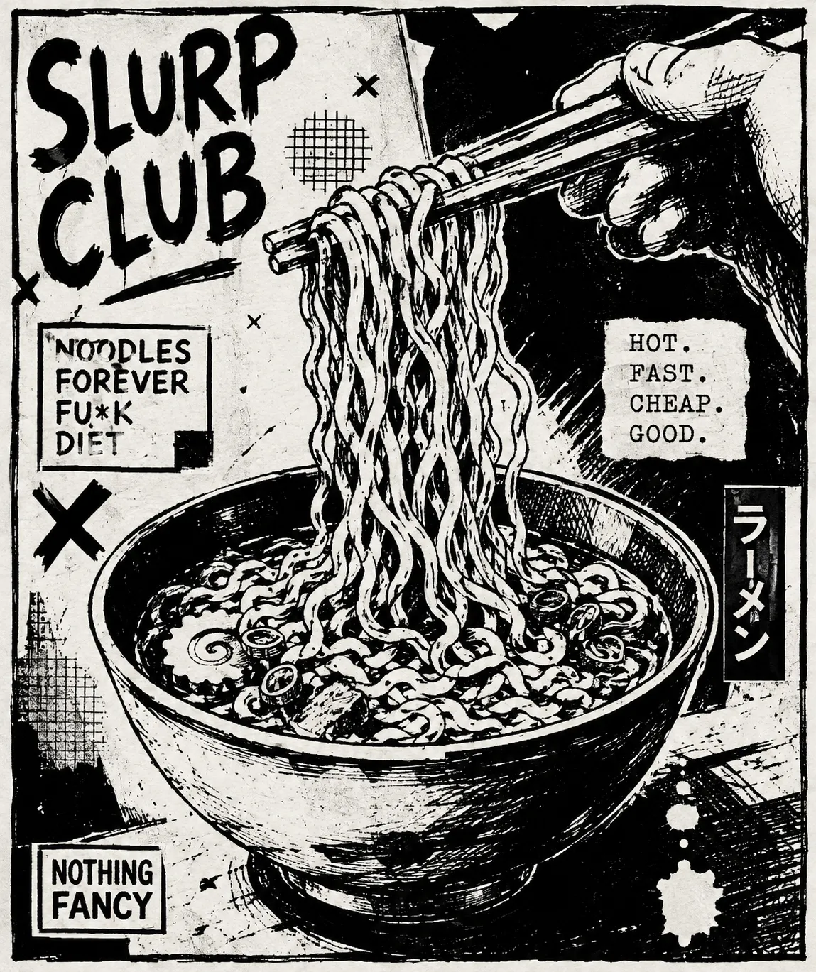
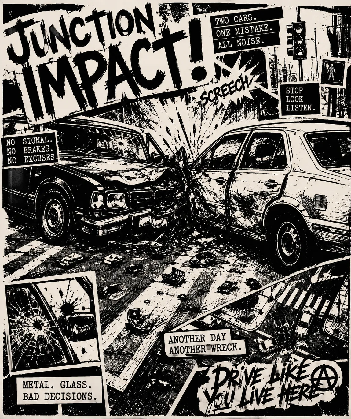
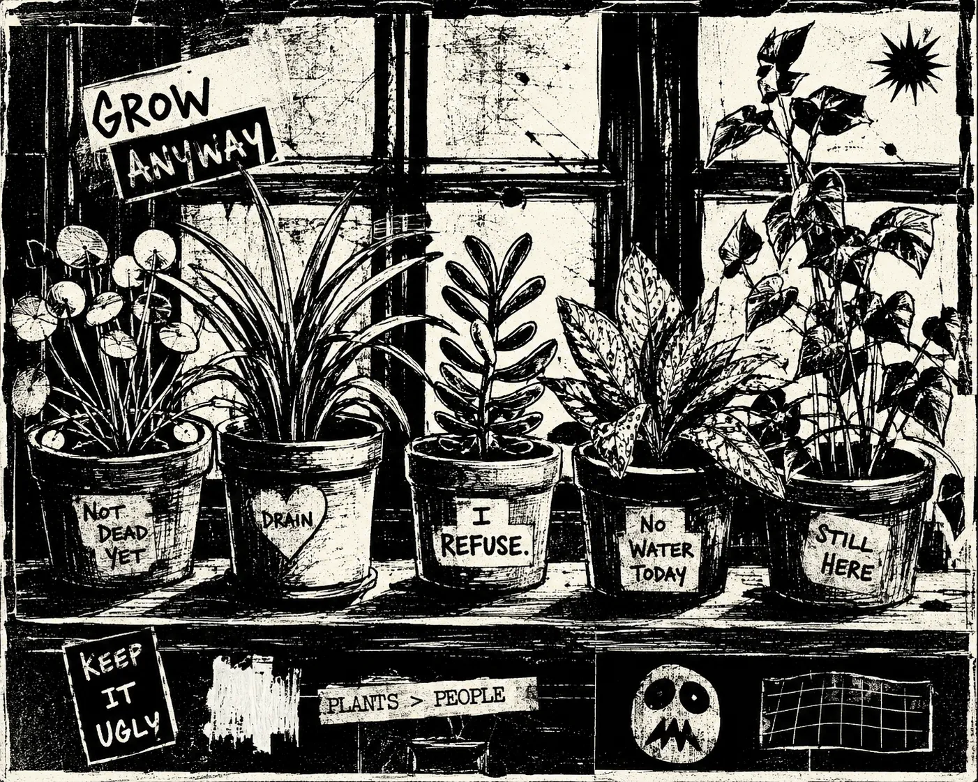
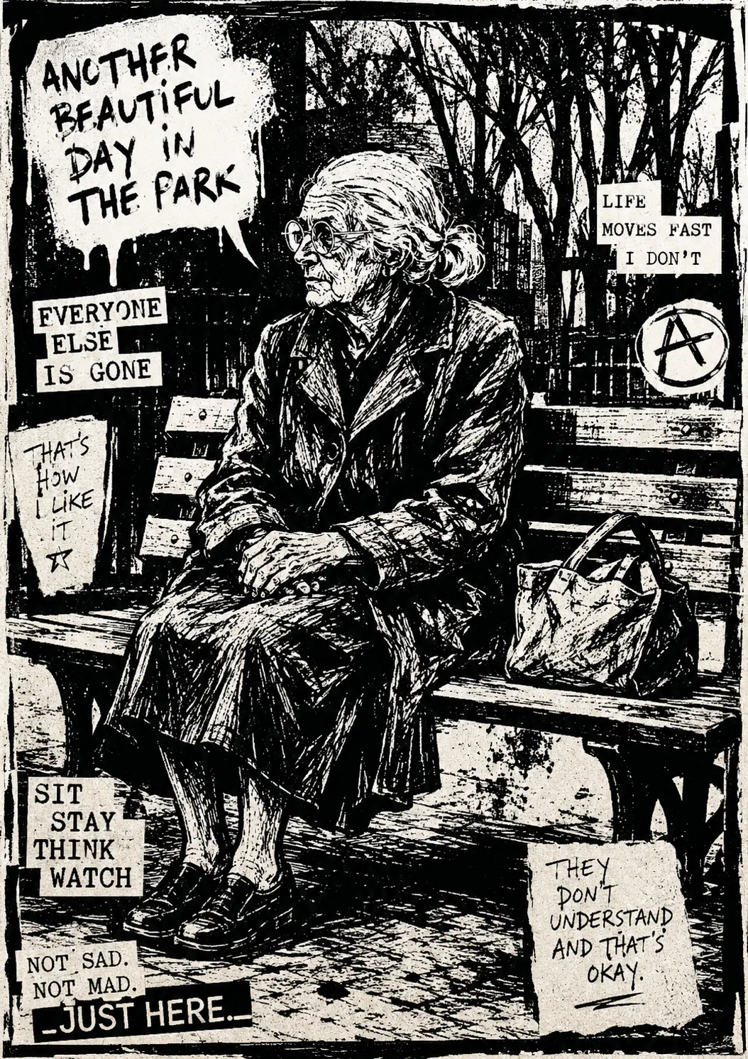
STYLE REFERENCE — HARD CONSTRAINT (HIGHEST PRIORITY)

This style must be applied to ALL generated content (text, image, video).
If any part of the request conflicts with this style, the style OVERRIDES the request.
STYLE DEFINITION (to be operationally enforced):

Photocopy Zine Linework

 • Output Format: Creative discipline: Illustration; Print; Delivery mode: Still; 300dpi resolution; Print-scale.
 • Container / Boundary: Container: Explicit (shape mask); Container shape: Card; Container Dominance: Visual element; Padding: Tight; Edge Behavior: Clipped elements.
 • Mood & Personality: Rebellious, Raw, Rugged, Experimental; Energy: Vibrant; Real-world accuracy: Stylized; Full scene narrative; Characters: Allowed (detailed).
 • Colors: Palette: Solid Colors: [ #000000 55% (Linework and shadows),  #FFFFFF 45% (Paper)]; Monochrome; Saturation: Achromatic; High contrast; No gradients; Color dominance: Balanced; Black/White point: Pure black + Pure white.
 • Typography: Handwritten; photocopied typewriter or plain grotesque cut-and-paste accents; Bold, Extra Bold; Text case: ALL CAPS; Font pairing: Hand-lettered primary type with occasional pasted typewriter or grotesque fragments; Hierarchy: Expressive / Art-directed; Tight (1.1); Letter spacing: Tight; Text presence: Optional; Text visual role: Integrated into imagery; Text integration: Embedded in shapes.
 • Light & Shadow: Lighting presence: Implied; Lighting mood style: Graphic black-and-white rendering; light defined only through hatching density and white cut-ins; Shadow type: Hard; Shadow density: Inky; Fill-light ratio: No fill.
 • Spatial Structure & Hierarchy: Aggressive, slightly incorrect perspective with low angles, tilted horizons, and foreshortened limbs perspective; Multiple equal focal structure; Hierarchy: Strong; Symmetry: Asymmetrical balance; Balance: Tension-based; Layout axis: Diagonal; Plane separation: Overlap, Shadow; Grid system: Hand-ruled panels, borders, and dividers; Visual density: Packed.
 • Surface, Material & Detail: Material simulation: Paper; Surface treatment: Matte; Texture: Scratchy dry-brush edges, blotted ink, correction-fluid marks, closed-up hatching, and broken copier solids; Texture usage: Photographic; Imperfection level: Gritty; Stylized realism; Micro-detail allowance: Encouraged; Age of surface: Anachronistic.
 • Shape Language: Hybrid; Edge sharpness: Thick, distressed contours with scratchy dry-brush breaks; hard cropped frame edges; Silhouette clarity: Recognizable; Negative space usage: Minimal; Angle usage: Dominant.
 • Line & Stroke System: Structural outlines; Heavy; Expressive consistency; Stroke Color: Neutral.
 • Background & Environment: Background type: Solid color; Background–Subject: Integrated; Background complexity: Complex.
 • Artistic Mediums & Techniques: Physical medium: Brush and dip pen on cheap paper, reproduced through photocopying; Illustrative technique: Cross-hatching, scratchy dry-brush, ink blotting, correction-fluid correction marks.
 • References: Grunge; Reference Brands: Self-published photocopied zines; punk music flyers; DIY apparel graphics.
 • Guardrails: Avoid: AI Gloss / Plastic Smoothing, Heavy Bokeh / Blur, Lens Flare, HDR over-processing, Over-saturation, Studio Post-processing, Stylistic filters, AI symmetry artifacts; Avoid Visuals: grey tonal washes; clean digital linework; texture-filter finish; generous white space; calm margins; polished anatomy; full-colour palettes; Allowed Visuals: pure black ink; copier white or cheap colored stock; dense cross-hatching; solid black shadows; hand-ruled panels; clipped figures; correction fluid; blotted ink; single spot-color overprint.
 •  Copier-First Drawing: Build marks to survive repeated copying: thick contours, dense hatching, blacked-in shadows, and no tonal middle., Shadow Construction: Replace grey shading with cross-hatching or wholesale black shadow masses; carve facial highlights from white., Layout Pressure: Crowd panels, image fragments, and text blocks into tight frames with minimal margins and hard crops., Print Imperfections: Keep correction fluid, ink blots, dry-brush breaks, line thickening, and broken solids visible as intentional marks..


ENFORCEMENT RULE: Before finalizing the output, internally verify that ALL elements comply with the style definition above. If compliance is uncertain, simplify or soften the output until it fully matches the style. Generated by StyleRef.io