Near-Black Premium Signal

StyleRef·@styleref·
Extract your style to start building your Style Board.

Description

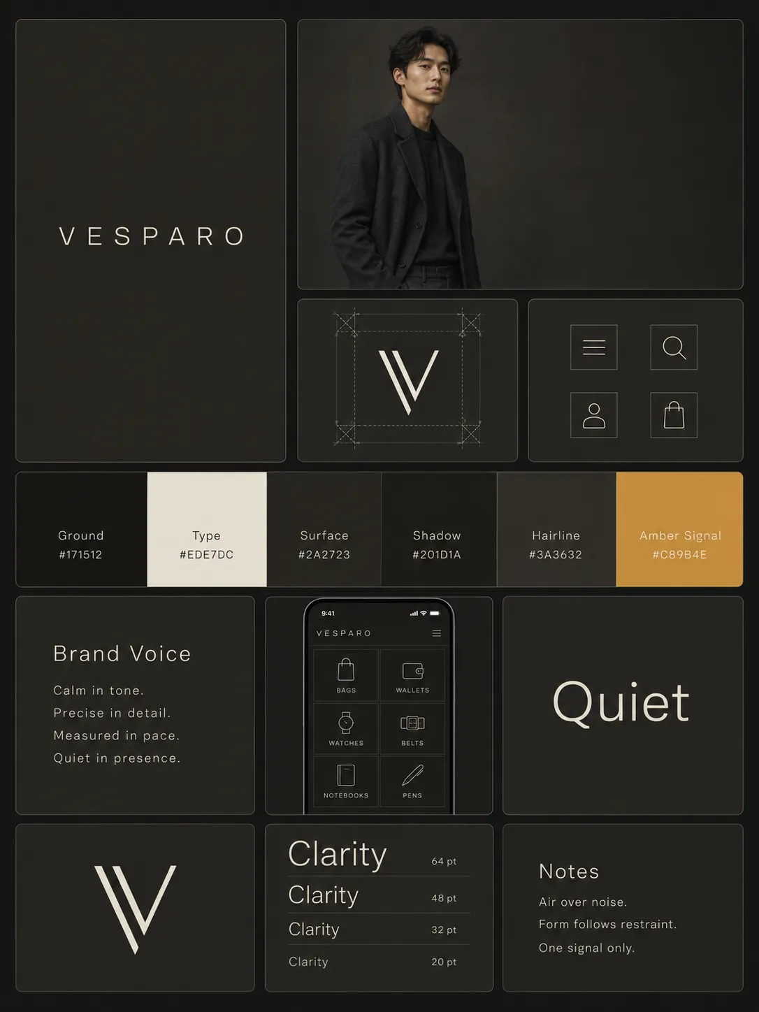
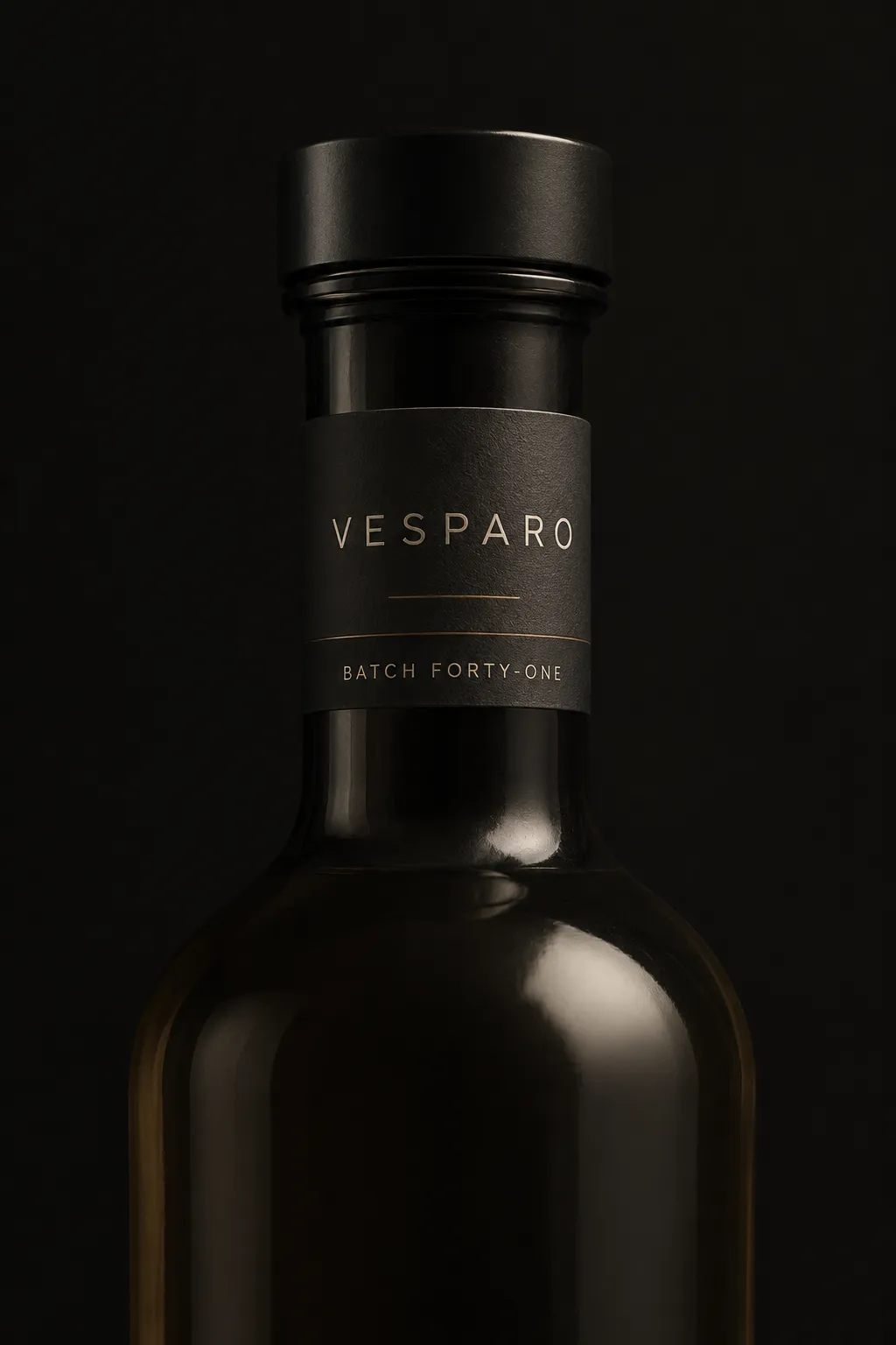
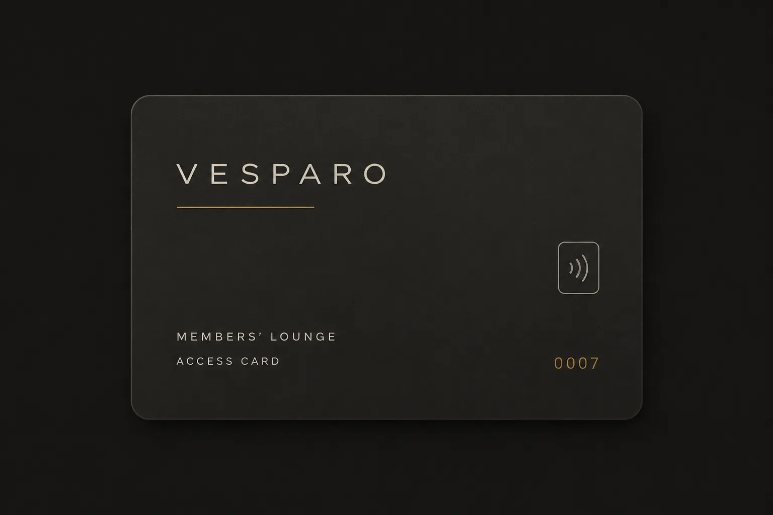
Near-Black Premium Signal runs a charcoal ground under quiet type, with one saturated colour allowed to appear once per view and nowhere else. The restraint is the luxury — nothing competes for attention, so the one thing that lights up actually reads as a signal. It suits high-end tech, private members' services, spirits and anything selling exclusivity rather than volume.

Typography

Light, Aa, Bb, Typography
Font FamilyGrotesque
Line HeightRelaxed
Font WeightsLight, Regular
Letter SpacingWide
Font Pairing Strategy
Single family
Hierarchy
Subtle contrast
Text Presence
Required
Text Visual Role
Secondary visual element
Text Integration
Separate

Mood & Personality

Mood & Personality
Sophisticated, Authoritative, Calm, Confident, Minimalist, Luxurious
Energy Level
Mellow
Emotional Bias
Neutral
Tone Register
Detached
Representation Mode
Literal
Real-world Accuracy
Precise
Narrative Allowance
None

Surface, Material & Detail

Material Simulation
Matte graphite metal, smoked glass, soft-touch uncoated card, and rare unlacquered brushed-brass hardware.
Surface Treatment
Matte
Surface Texture Style
Subtle light-absorbing matte texture; dense plain-weave charcoal fabric where used.
Imperfection Level
Polished
Optical Finishes
Slight metallic sheen permitted only on the single accent element.

Line & Stroke System

Stroke Usage
Structural outlines
Stroke Weight
Hairline
Stroke Consistency
Uniform
Stroke Color
Neutral
Stroke Joins
Miter

Background & Environment

Background Type
Solid color
Background–Subject Relationship
Isolated
Background Complexity
Minimal

Output Format

Creative Discipline
Brand identity
Medium
Digital
Scaling Expectation
UI-scale
Canvas Behavior
Strict frame (nothing escapes)

UI & Web

Color Theme
Dark
Background Tone
Warm near-black charcoal, never true black.
Accent Strategy
Single functional accent
Surface Layers
Two-layer (page + card)
Elevation Approach
Background contrast only
Border Philosophy
Hairline (0.5–1px, low opacity)
Button Shape
Sharp rectangle
Button Hierarchy
Primary + Secondary
Icon Style
Outline / Stroke
Icon Weight
Thin (1px)
Hover Treatment
Opacity change
Focus Ring Style
Colored outline
Animation Philosophy
Functional only
Transition Speed
Deliberate (350–500ms)

Voice & Language

Formality
Proper
Vocabulary Level
Advanced
Directness
Straightforward
Sentence Length
Short
Metaphor Density
Literal
Writing Perspective
Third person
Copy Pacing
Punchy
Jargon / Technical Level
None
Emoji Usage
None
Hashtag Usage
None

Spatial Structure & Hierarchy

Perspective Style
Flat
Focal Structure
Single
Hierarchy Clarity
Strong
Symmetry
Asymmetrical balance
Balance Type
Tension-based
Grid System
Column grid
Visual Density
Airy

References

Cultural References
Minimalism
Temporal Reference
Contemporary

Colors

#17151262%Usage: Background
#EDE7DC20%Usage: Typography
#2A272310%Usage: Raised surfaces
#C89B4E4%Usage: Amber signal
#5E86B03%Usage: Digital-state signal
#3A36321%Usage: Hairlines
Palette Size
6–8 colors
Color Temperature
Warm
Saturation Range
Subdued
Contrast Strategy
Value contrast
Gradient Policy
No gradients
Color Dominance
Background-dominant
Black & White Point
Lifted blacks + Rolled-off highlights
Accessibility Level
WCAG AA

Container / Boundary

Container presence
Implicit (visual edges only)
Container Dominance
Neutral frame
Padding rules
Generous
Edge behavior
Content fully contained

Shape Language

Negative Space Usage
Dominant
Shape Basis
Geometric
Primitive Dominance
Rectangles
Edge Sharpness
Soft
Curve Consistency
Uniform radius

Guardrails

Common Artifacts to Avoid
AI Gloss / Plastic Smoothing, Over-saturation, AI symmetry artifacts
Avoided Visuals
true black; pure white type; fully saturated accents; two signal colors in one view; bold wordmarks; bold headlines; dense layouts; crowded grids; glossy surfaces; mirrored finishes
Avoided Words
exclusive community; amazing; excited to connect; exclamation-marked claims; vague reassurance
Allowed Visuals
warm charcoal fields; warm off-white type; one off-centre signal element; thin-line icons; hairline underline beneath wordmark; generous margins; quiet asymmetric grid
Conditional Logic
Use amber once per composition; use muted blue only for digital states; never show amber and blue together. At constrained sizes, remove the accent before reducing wordmark tracking.

Custom Style Items

Signal Discipline
One saturated accent appears exactly once per view: one word, line, control, or factual numeral.
Composition Logic
Position the lone lit element off-centre within a broad dark field; let negative space read as depth.
Wordmark Rule
Light grotesque, widened tracking, warm off-white; cap-height clear space on all sides.
Mark Exception
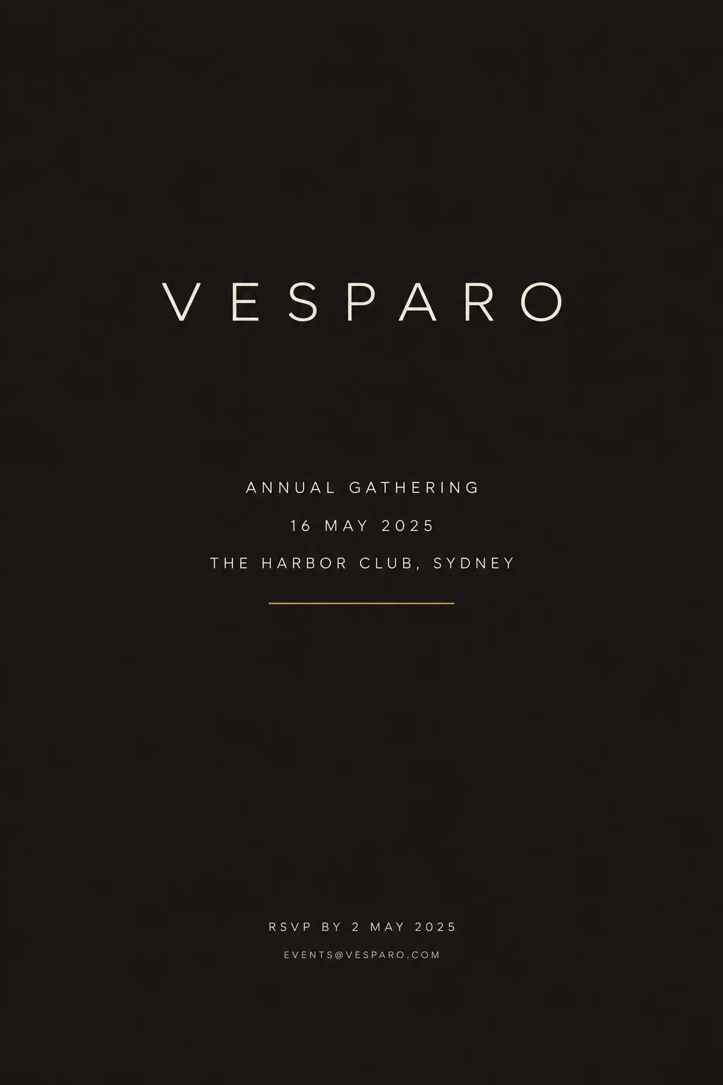
A single amber hairline underline may sit directly beneath the wordmark only on title screens or covers.
© 2026 StyleRef. All rights reserved.