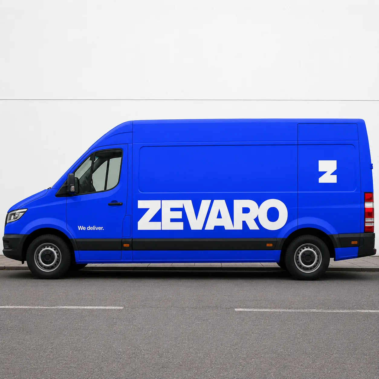
Flooded Colour Field Identity

StyleRef·@styleref·
Extract your style to start building your Style Board.

Description

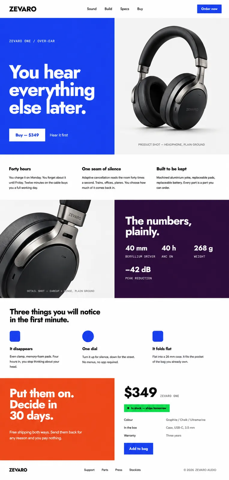
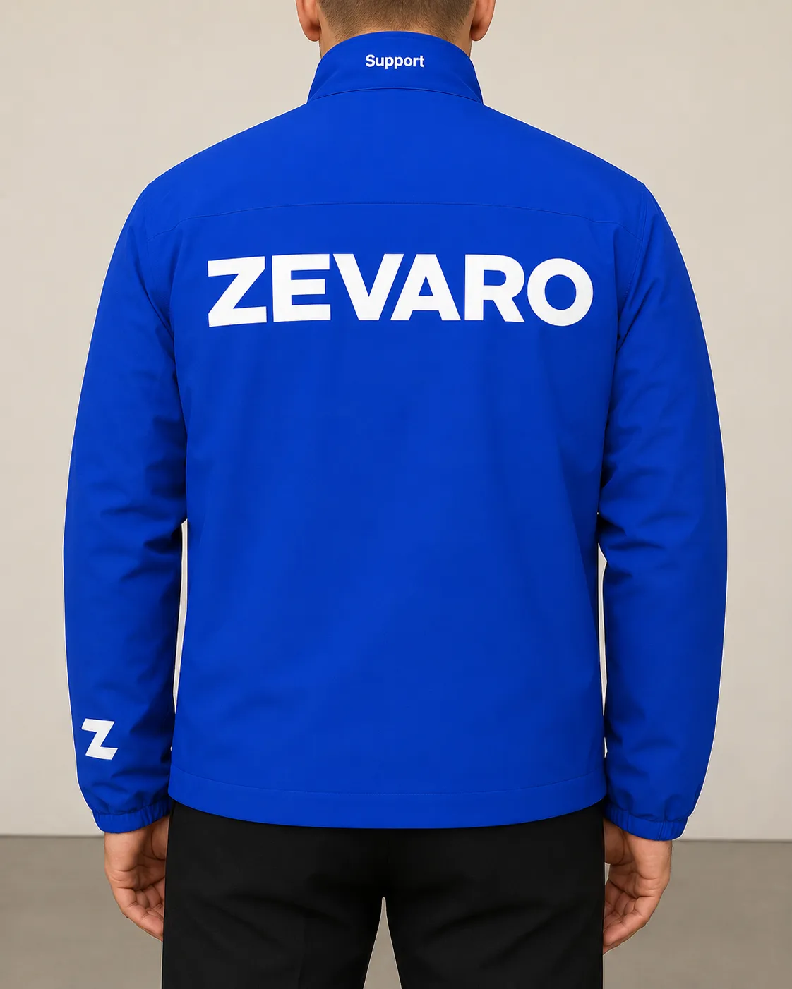
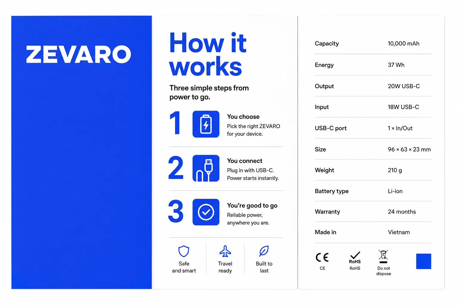
Flooded Colour Field Identity gives one saturated hue the whole surface — edge to edge, no margin, no white showing — and knocks the mark, the headline and the icons out of it in white. Information that has to be read sits on a separate white panel, so the colour never has to compromise to stay legible. It suits mobility and energy brands, delivery and logistics, fintech, sports clubs and anything that has to be recognised from across a street before the name is readable.

Typography

Regular, Aa, Bb, Typography
Font FamilyGeometric sans
Line HeightTight headlines; normal body text on white panels
Font WeightsRegular, Extra Bold
Letter SpacingTight
Text Case
Sentence case
Hierarchy
Strong contrast
Text Integration
Large white knockout headlines in flooded fields; body copy only on separate white panels

Container / Boundary

Container presence
Flooded rectangular fields tiled against separate white information panels
Padding rules
Generous
Edge behavior
Intentional bleed

Spatial Structure & Hierarchy

Focal Structure
Single
Grid System
Column grid
Visual Density
Sparse

References

Cultural References
Color-field painting, monolithic corporate identity from the 1960s onward, contemporary color blocking

Colors

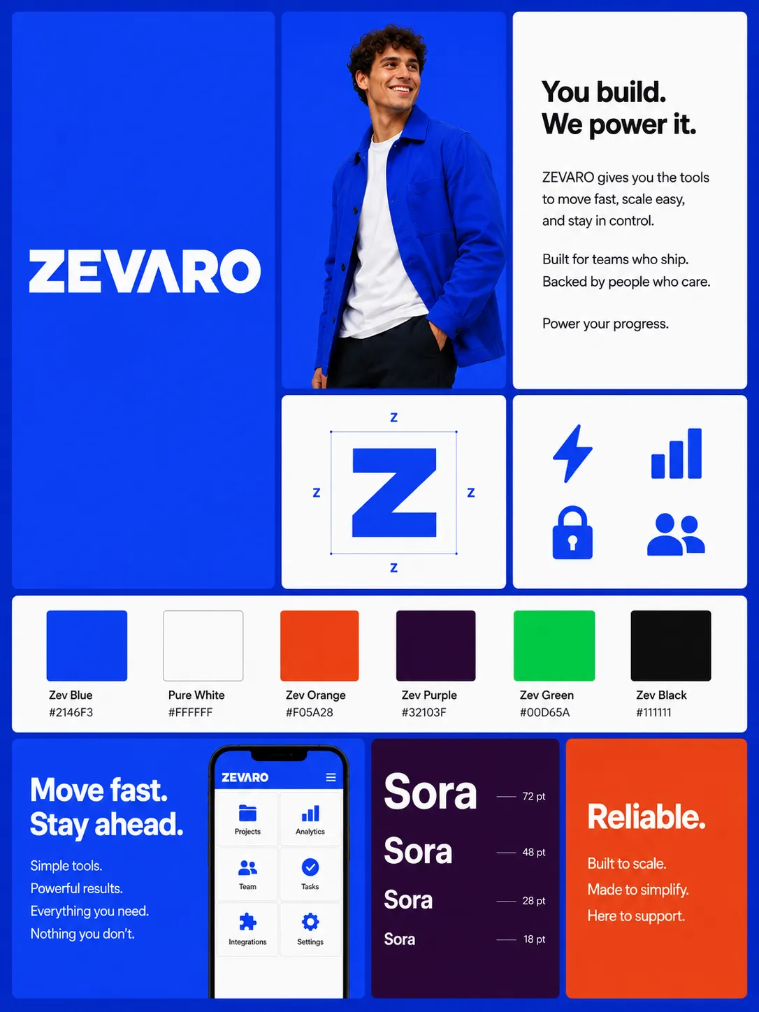
#2146F360%Usage: Primary flooded field
#FFFFFF20%Usage: White knockouts and information panels
#F05A287%Usage: Secondary flooded field
#32103F7%Usage: Text-heavy flooded field
#00D65A1%Usage: Confirmation states
#1111115%Usage: Body text
Saturation Range
Electric
Contrast Strategy
High contrast
Gradient Policy
No gradients
Color Dominance
Single dominant color

Output Format

Creative Discipline
Brand identity
Medium
Mixed

UI & Web

Elevation Approach
Background contrast only
Icon Style
Flat geometric
Color Theme
Light
Background Tone
Pure white
Accent Strategy
Workflow / contextual accents
Semantic Colors
Full set (error / warning / success / info)
Border Philosophy
Borderless
Button Shape
Softly rounded (4–8px)
Surface Layers
Two-layer (page + card)
Shadow Technique
No shadows
Hover Treatment
Color change

Surface, Material & Detail

Surface Treatment
Matte throughout: dense flat ink, uncoated stock, matte laminate, powder coating, matte vinyl and moulded plastic
Surface Texture Style
Smooth

Mood & Personality

Mood & Personality
Bold, Confident, warm rather than aggressive, Clean
Humor Usage
Occasional

Voice & Language

Vocabulary Level
Simple
Directness
Straightforward
Sentence Length
Short
Writing Perspective
Second person (you)
Copy Pacing
Punchy
Jargon / Technical Level
None

Shape Language

Shape Basis
Geometric
Primitive Dominance
Rectangles, Polygons
Edge Sharpness
Razor-sharp field seams; medium-radius icon corners

Line & Stroke System

Stroke Usage
No stroke (fill-only)

Guardrails

Avoided Visuals
gradients; meshes; glows; tinted primary hue; screened primary hue; photographic overlays; type over photography; mark directly on photography; two flooded fields touching; shadows; gaps between colour fields and white panels
Allowed Visuals
edge-to-edge saturated rectangular fields; pure-white knockouts; near-black text on white panels; straight hard seams; isolated filled geometric icons; plain-ground photography in separate tiles
Conditional Logic
Use electric green only for confirmation states. Keep one flooded hue dominant per surface; place any secondary flood on a separate, non-adjacent panel. If space is constrained, remove headline, then symbol, then wordmark; retain the white information panel.
© 2026 StyleRef. All rights reserved.