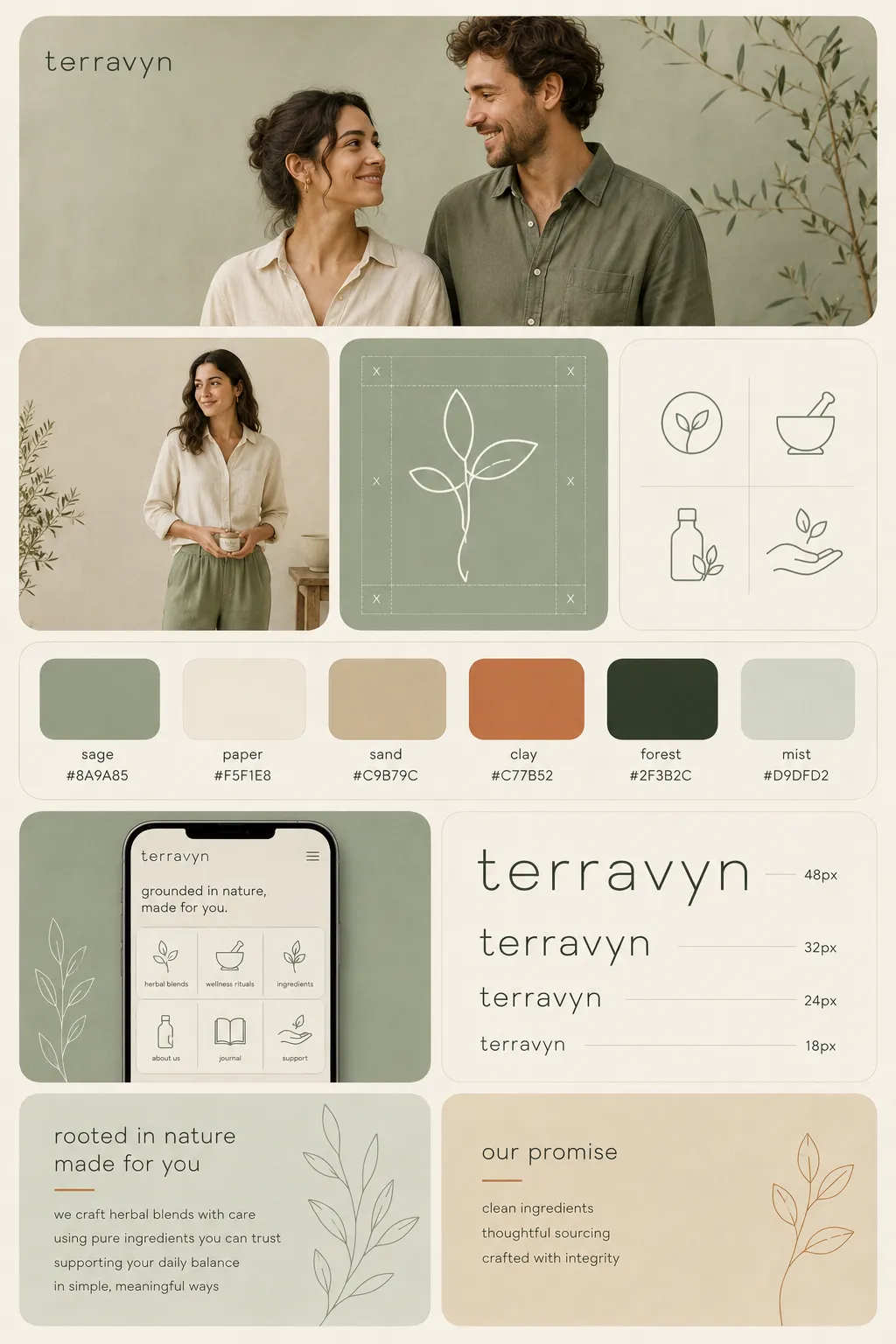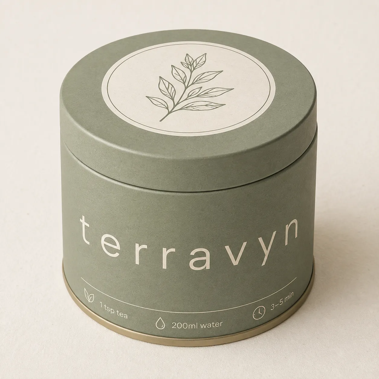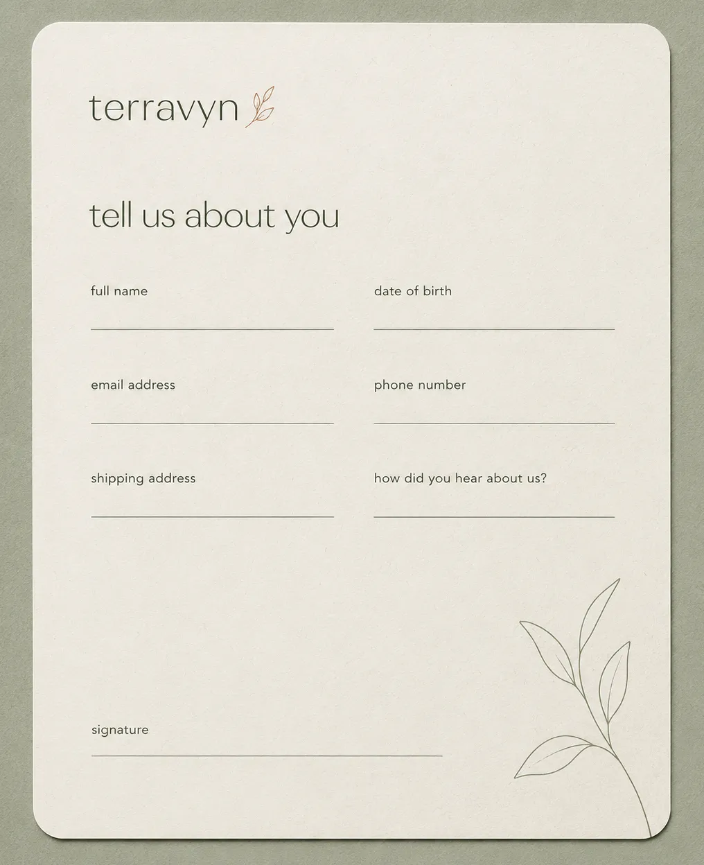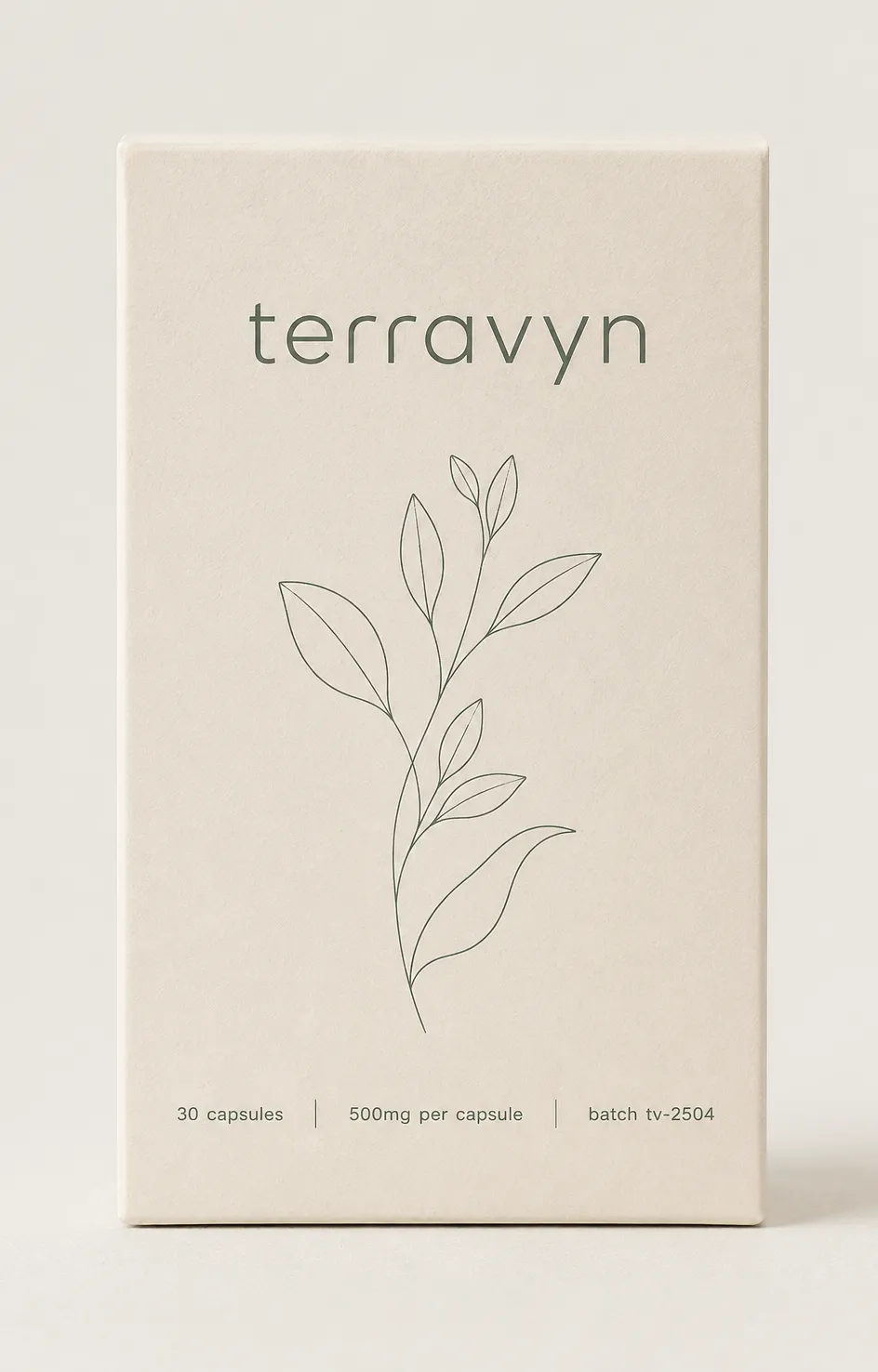
Sage Wellness Botanical

StyleRef·@styleref·
Extract your style to start building your Style Board.

Description

Sage Wellness Botanical pairs a muted grey-green palette with thin single-line botanical drawings and generous white space, aiming for calm rather than the clipboard chill of clinical minimalism. Warmth comes from paper texture and rounded letterforms, not from colour intensity. It suits supplements, skincare, therapy and studio practices, and slow-living consumer goods.

Output Format

Creative Discipline
Brand identity
Medium
Mixed
Scaling Expectation
Print-scale
Canvas Behavior
Strict frame (nothing escapes)

Voice & Language

Formality
Approachable
Vocabulary Level
Conversational
Directness
Clear
Sentence Length
Medium
Metaphor Density
Descriptive
Writing Perspective
Second person (you)
Copy Pacing
Flowing
Jargon / Technical Level
Light industry terms

Container / Boundary

Container presence
Explicit (shape mask)
Container shape
Rounded square
Corner treatment
Fully rounded
Container Dominance
Neutral frame
Padding rules
Generous
Edge behavior
Content fully contained

Line & Stroke System

Stroke Usage
Structural outlines
Stroke Weight
Thin
Stroke Consistency
Uniform
Stroke Joins
Round

Guardrails

Common Artifacts to Avoid
AI Gloss / Plastic Smoothing, Over-saturation, Studio Post-processing
Avoided Visuals
bright kelly green; emerald green; clinical blue; medical cross iconography; all-caps type; glossy surfaces; mirrored surfaces; drop shadows; filled botanical marks; two-weight botanical marks; busy patterns; crowded layouts
Avoided Words
unlock; journey; miracle; ancient power; urgency language; superlatives; loosely used spiritual vocabulary; exclamation-marked claims
Allowed Visuals
muted grey-green fields; unbleached paper white; soft clay accents; thin unfilled botanical contour drawings; rounded containers; generous empty fields; soft window-lit hands, textures, and single objects

UI & Web

Color Theme
Light
Background Tone
Warm off-white
Accent Strategy
Single functional accent
Surface Layers
Two-layer (page + card)
Elevation Approach
Background contrast only
Border Philosophy
Hairline (0.5–1px, low opacity)
Button Shape
Full pill
Icon Style
Outline / Stroke
Icon Weight
Thin (1px)
Animation Philosophy
Functional only
Transition Speed
Standard (200–300ms)
Focus Ring Style
Colored outline

Mood & Personality

Mood & Personality
Calm, Sophisticated, Friendly, Minimalist, Clean, Confident
Energy Level
Gentle
Emotional Bias
Positive
Tone Register
Intimate
Representation Mode
Literal

Surface, Material & Detail

Material Simulation
Paper
Surface Treatment
Matte
Surface Texture Style
Visible paper fibre, cotton/recycled stock, subtle natural fabric slub
Texture Usage
Subtle noise
Imperfection Level
Organic
Optical Finishes
None

Background & Environment

Background Type
Solid color
Environment Mood
Natural
Background Complexity
Minimal
Prop / Set Styling
Minimal

Custom Style Items

Botanical Mark Construction
One continuous unbroken contour stroke: stem and leaves, no fill, no cross-hatching, no cropped mark.
Specimen Composition
One dominant element and one corner- or edge-anchored specimen drawing; empty space occupies at least one-third of the frame.
Material Finish
Uncoated fibre paper, soft-touch matte cartons, frosted/matte glass, kraft shipping stock, and brushed or unlacquered brass; never high-shine.
Photography Direction
Soft, even window light; warm-neutral skin; real depth of field; hands, tactile materials, and single objects over posed lifestyle scenes.

Colors

#8A9A8550%Usage: Primary surfaces
#F5F1E825%Usage: Paper backgrounds
#C9B79C12%Usage: Secondary surfaces
#C77B526%Usage: Accent details
#2F3B2C7%Usage: Small text
Palette Size
3–5 colors
Color Temperature
Warm
Saturation Range
Muted
Contrast Strategy
Value contrast
Hue Relationships
Analogous
Gradient Policy
No gradients
Color Dominance
Single dominant color
Accessibility Level
WCAG AA

Typography

Light, Aa, Bb, Typography
Font FamilyHumanist sans
Line HeightRelaxed
Font WeightsLight, Regular
Letter SpacingNormal
Text Case
lowercase
Font Pairing Strategy
Single family
Hierarchy
Subtle contrast
Text Presence
Required
Text Visual Role
Secondary visual element
Hierarchy
Spacing and modest weight shifts lead hierarchy; dosage numerals increase in weight.

Spatial Structure & Hierarchy

Focal Structure
Single
Hierarchy Clarity
Strong
Symmetry
Asymmetrical balance
Layout Axis
Gridless
Grid System
Free-form
Visual Density
Airy

Shape Language

Shape Basis
Organic
Primitive Dominance
Freeform curves
Edge Sharpness
Soft
Silhouette Clarity
Recognizable
Curve Consistency
Expressive curves
Negative Space Usage
Dominant
Angle Usage
None

References

Cultural References
Scandinavian
Temporal Reference
Contemporary
© 2026 StyleRef. All rights reserved.