Swiss International Wordmark

StyleRef·@styleref·
STYLE REFERENCE — HARD CONSTRAINT (HIGHEST PRIORITY) This style must be applied to ALL generated content (text, image, video). If any part of the request conflicts with this style, the style OVERRIDES the request. STYLE DEFINITION (to be operationally enforced): Swiss International Wordmark • Output Format: Creative discipline: Brand identity; Mixed; Web. • Container / Boundary: Container: None; Sharp Corners; Padding: Generous. • Mood & Personality: Authoritative, Clean, Minimalist, Confident; Energy: Steady; Representation mode: Literal. • Colors: Palette: Solid Colors: [ #FFFFFF 70% (Background), #111111 20% (Primary typography), #B3B3B3 4% (Rules), #666666 4% (Secondary typography), #E30613 2% (Functional signal)]; 3–5 colors; Neutral temperature; Saturation: Achromatic system with one saturated red signal; High contrast; Hue relationships: Arbitrary; No gradients; Color dominance: Background-dominant; Black/White point: Pure black + Pure white; Accessibility: WCAG AA. • Typography: Grotesque; Regular, Medium, Bold; Text case: Sentence case; Font pairing: Single family; Hierarchy: Clear typographic scale; Type scale: Modular; Tight (1.1) headings; Normal (1.4) body text; Letter spacing: Normal; slightly tight at largest sizes; Text presence: Required; Text visual role: Primary visual driver; Text integration: Separate. • Light & Shadow: Lighting presence: None (flat); Shadow type: None; Shadow density: Transparent. • Spatial Structure & Hierarchy: Flat perspective; Single focal structure; Hierarchy: Strong; Symmetry: Asymmetrical balance; Balance: Edge-weighted; Layout axis: Vertical; Grid system: Column grid; Visual density: Comfortable. • Surface, Material & Detail: Surface treatment: Flat; Texture usage: None; Imperfection level: Flawless. • Shape Language: Geometric; Primitive dominance: Rectangles; Edge sharpness: Razor-sharp; Negative space usage: Balanced; Angle usage: None. • Line & Stroke System: Structural outlines; Hairline; Uniform consistency; Stroke Color: Neutral. • References: Swiss/International Style; Temporal reference: 1950s; Reference Brands: Basel and Zurich school corporate manuals; airline, bank, and transit identity systems.. • UI & Web: Color theme: Light; Background tone: Pure white; Accent strategy: Single functional accent; Semantic colors: Error + Warning; Surface layers: Flat (one background); Elevation: Flat — no elevation; Shadow technique: No shadows; Borders: Hairline (0.5–1px, low opacity); Button shape: Sharp rectangle; Icon style: Outline / Stroke; Focus ring: Solid offset ring. • Guardrails: Avoid: Lens Flare, Studio Post-processing, Stylistic filters; Avoid Visuals: centred layouts; drop shadows; rounded corners; decorative typography; display typography; red background washes; material metaphors; Avoid Colors: multiple accent colours; chromatic background washes; Avoid Layouts: centred composition; optical placement; boxed card layouts; Allowed Visuals: strict column grid; visible baseline grid; flush-left ragged-right text; hairline rules; white space; one red signal element. • Accent Rule: Use saturated red once per view, solely for a findable functional signal; never decorative or atmospheric., Alignment Rule: All text flush-left and ragged-right; never centre-aligned., Baseline Discipline: Expose a baseline grid and seat all typographic elements on it., Hierarchy Method: Establish hierarchy through grid position and scale, never ornament.. ENFORCEMENT RULE: Before finalizing the output, internally verify that ALL elements comply with the style definition above. If compliance is uncertain, simplify or soften the output until it fully matches the style. Generated by StyleRef.io

Description

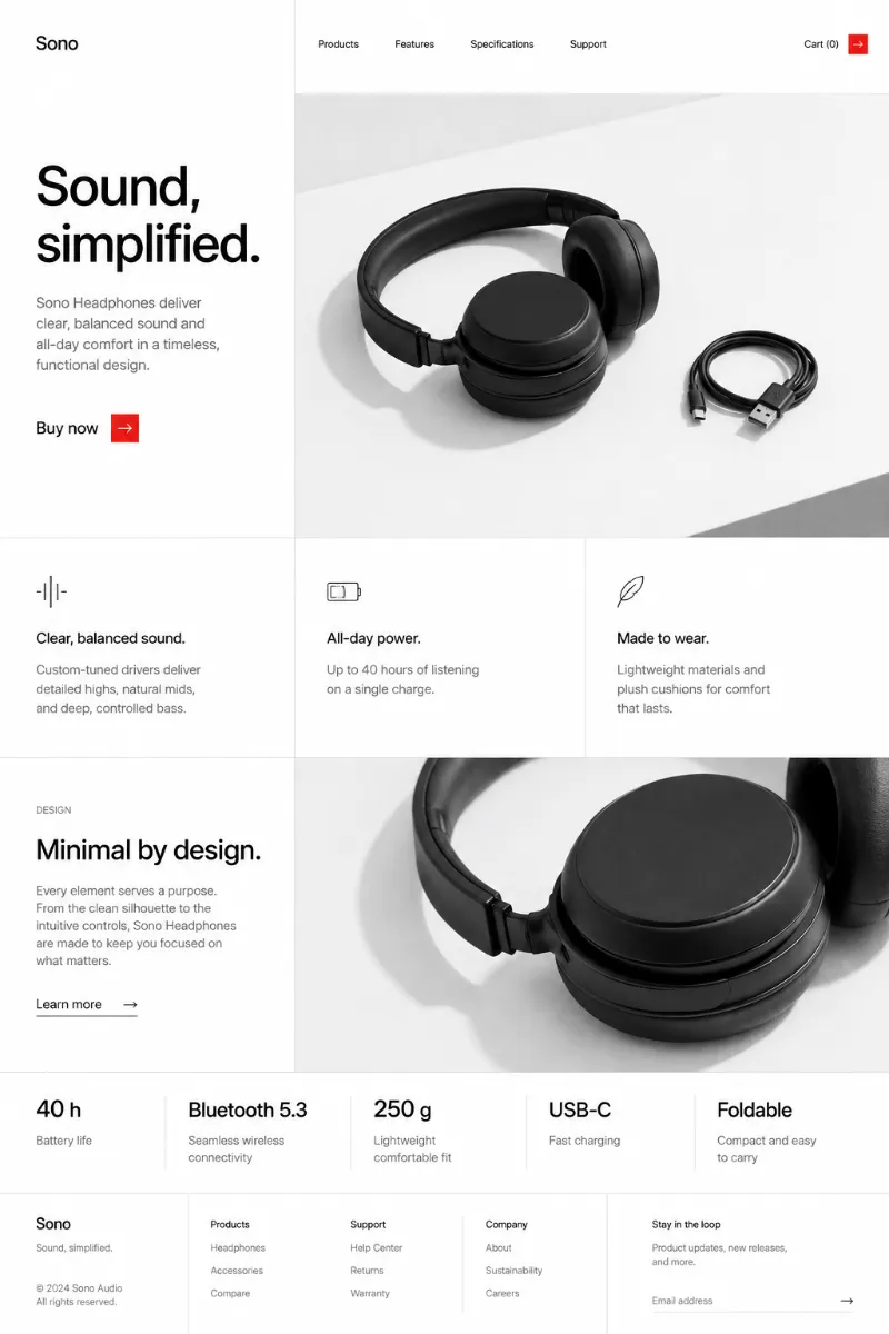
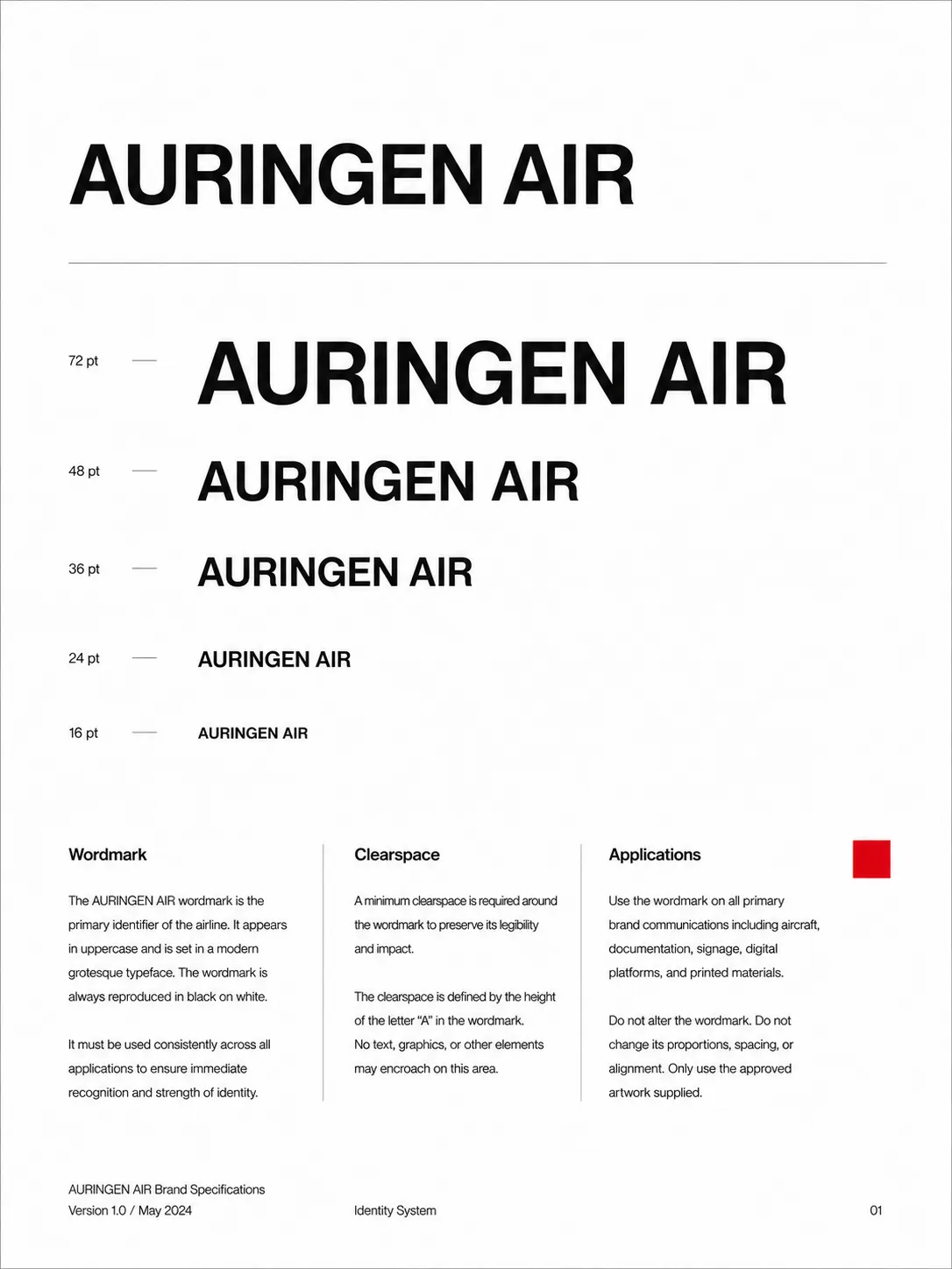
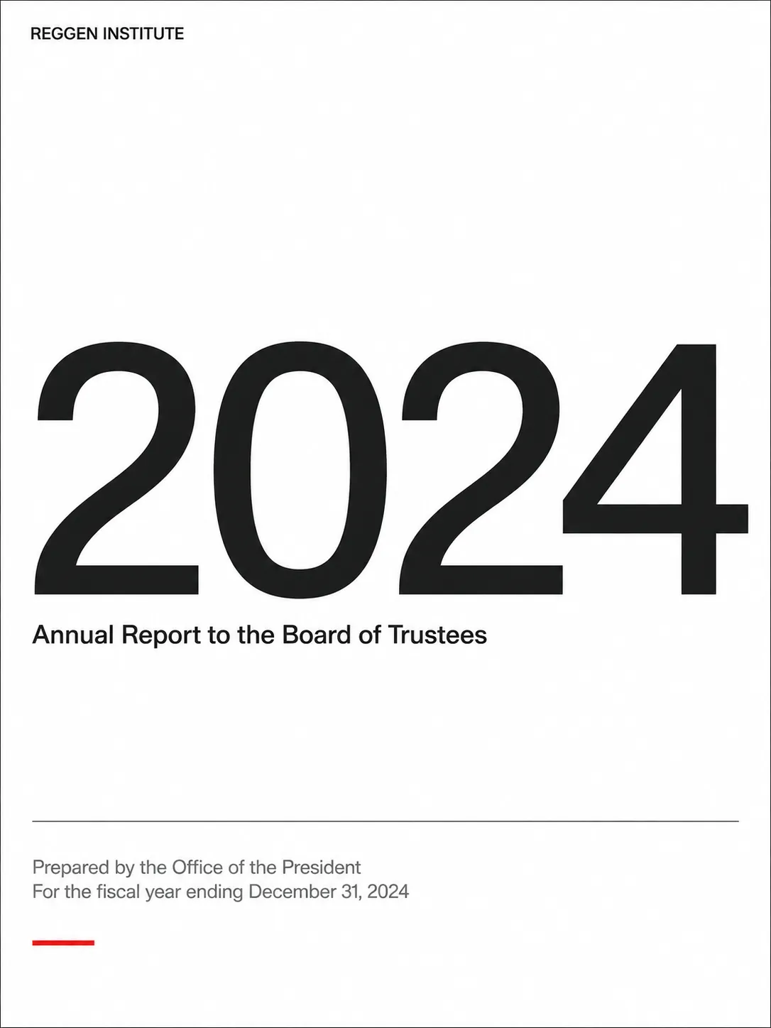
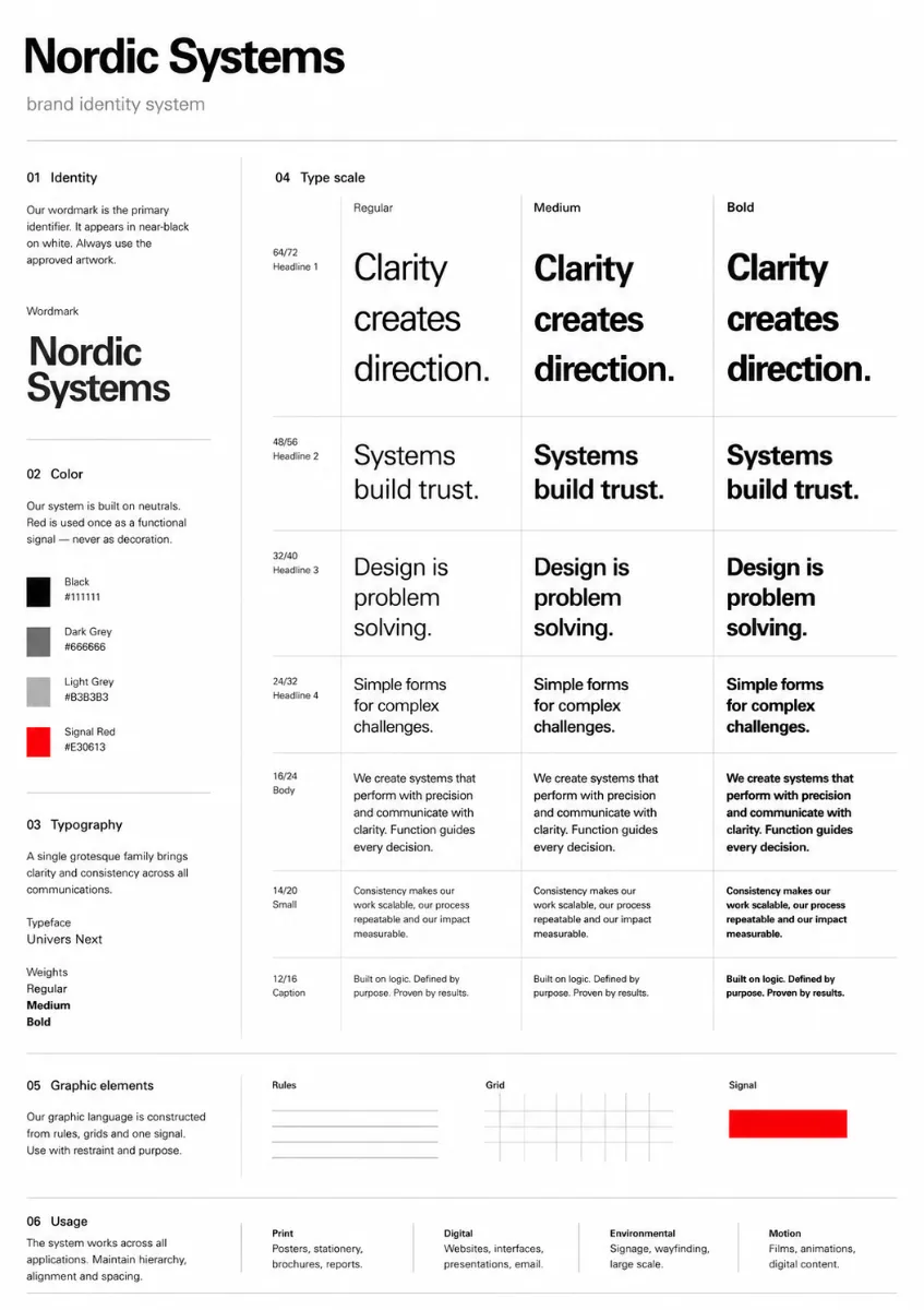
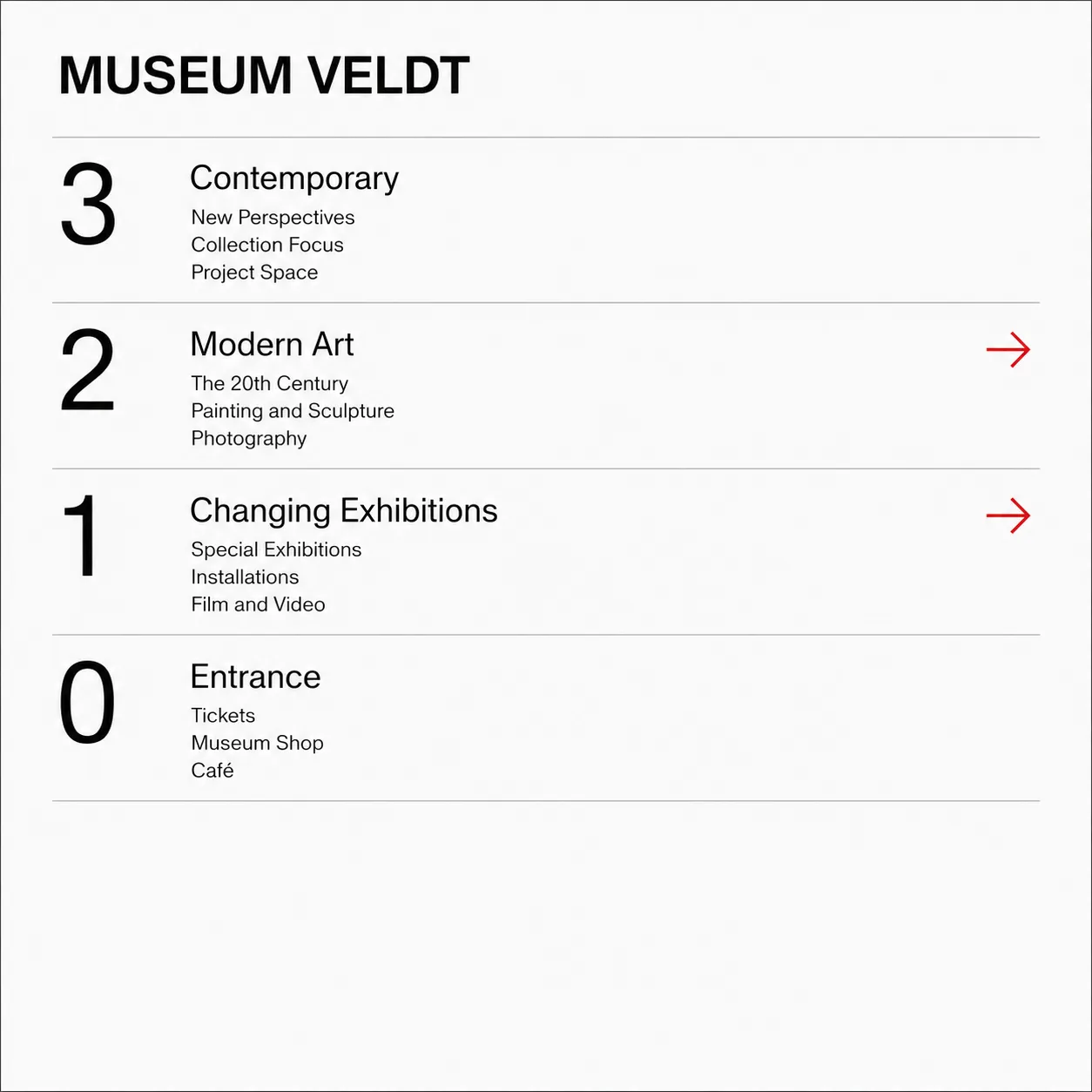
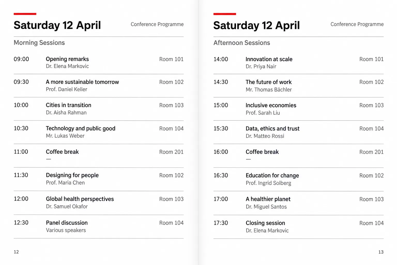
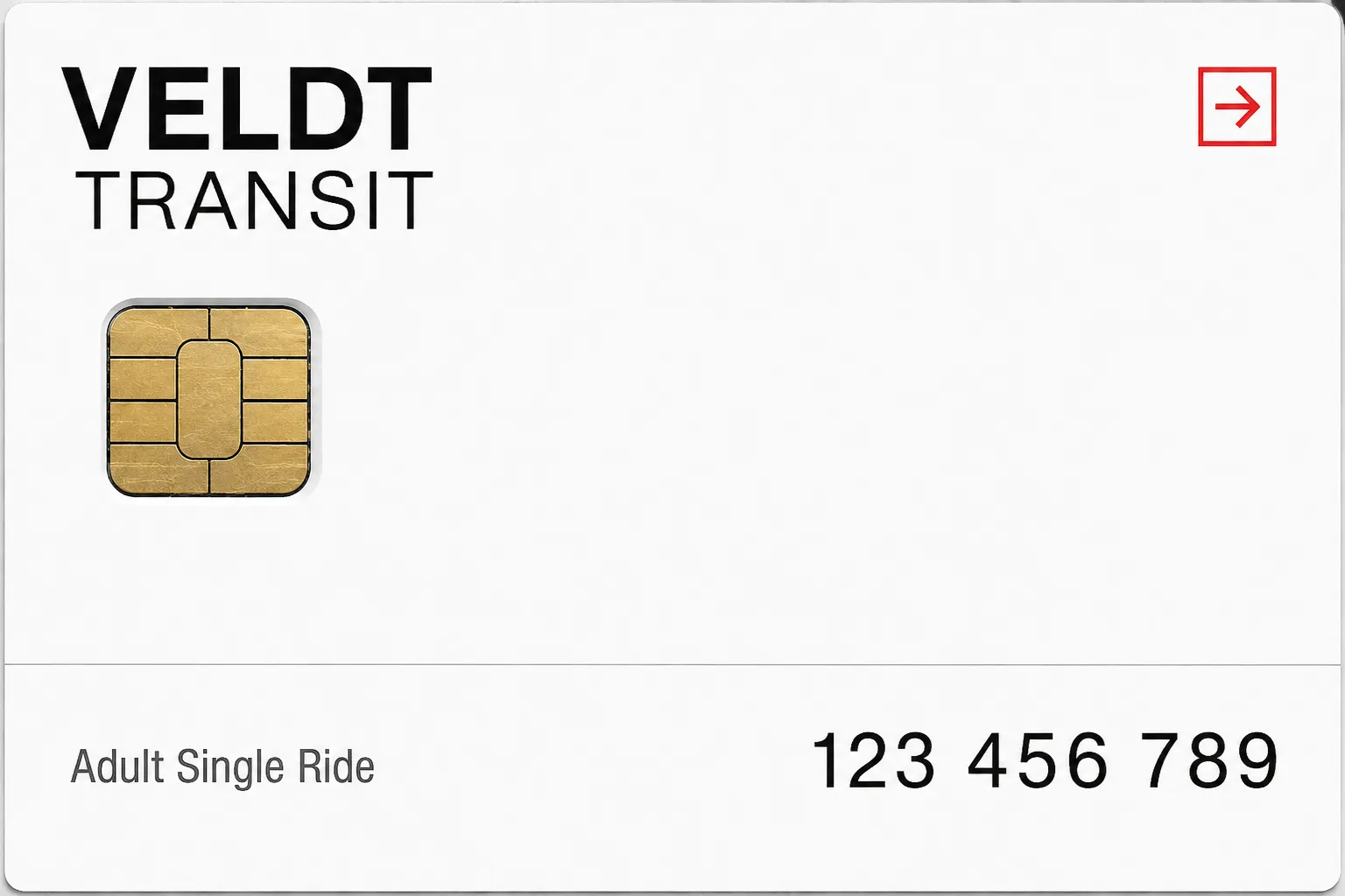
The International Typographic Style as a working brand system: one grotesque, a strict column grid, flush-left ranged-right setting, and a single red accent used only where something must be found. Everything else is black on white.

Colors

#FFFFFF70%Usage: Background
#11111120%Usage: Primary typography
#B3B3B34%Usage: Rules
#6666664%Usage: Secondary typography
#E306132%Usage: Functional signal
Palette Size
3–5 colors
Color Temperature
Neutral
Saturation Range
Achromatic system with one saturated red signal
Contrast Strategy
High contrast
Hue Relationships
Arbitrary
Gradient Policy
No gradients
Color Dominance
Background-dominant
Black & White Point
Pure black + Pure white
Accessibility Level
WCAG AA

Output Format

Creative Discipline
Brand identity
Medium
Mixed
Platform
Web

Container / Boundary

Container presence
None
Corner treatment
Sharp
Padding rules
Generous

Line & Stroke System

Stroke Usage
Structural outlines
Stroke Weight
Hairline
Stroke Consistency
Uniform
Stroke Color
Neutral

Custom Style Items

Accent Rule
Use saturated red once per view, solely for a findable functional signal; never decorative or atmospheric.
Alignment Rule
All text flush-left and ragged-right; never centre-aligned.
Baseline Discipline
Expose a baseline grid and seat all typographic elements on it.
Hierarchy Method
Establish hierarchy through grid position and scale, never ornament.

Typography

Regular, Medium, Aa, Bb, Typography
Font FamilyGrotesque
Line HeightTight headings; Normal (1.4) body text
Font WeightsRegular, Medium, Bold
Letter SpacingNormal; slightly tight at largest sizes
Type ScaleModular
Text Case
Sentence case
Font Pairing Strategy
Single family
Hierarchy
Clear typographic scale
Text Presence
Required
Text Visual Role
Primary visual driver
Text Integration
Separate

Mood & Personality

Mood & Personality
Authoritative, Clean, Minimalist, Confident
Energy Level
Steady
Representation Mode
Literal

Spatial Structure & Hierarchy

Perspective Style
Flat
Focal Structure
Single
Hierarchy Clarity
Strong
Symmetry
Asymmetrical balance
Balance Type
Edge-weighted
Layout Axis
Vertical
Grid System
Column grid
Visual Density
Comfortable

Surface, Material & Detail

Surface Treatment
Flat
Texture Usage
None
Imperfection Level
Flawless

References

Cultural References
Swiss/International Style
Temporal Reference
1950s
Reference Brands
Basel and Zurich school corporate manuals; airline, bank, and transit identity systems.

UI & Web

Color Theme
Light
Background Tone
Pure white
Accent Strategy
Single functional accent
Semantic Colors
Error + Warning
Surface Layers
Flat (one background)
Elevation Approach
Flat — no elevation
Shadow Technique
No shadows
Border Philosophy
Hairline (0.5–1px, low opacity)
Button Shape
Sharp rectangle
Icon Style
Outline / Stroke
Focus Ring Style
Solid offset ring

Light & Shadow

Lighting Presence
None (flat)
Shadow Type
None
Shadow Density
Transparent

Shape Language

Shape Basis
Geometric
Primitive Dominance
Rectangles
Edge Sharpness
Razor-sharp
Negative Space Usage
Balanced
Angle Usage
None

Guardrails

Common Artifacts to Avoid
Lens Flare, Studio Post-processing, Stylistic filters
Avoided Visuals
centred layouts; drop shadows; rounded corners; decorative typography; display typography; red background washes; material metaphors
Avoided Colors
multiple accent colours; chromatic background washes
Avoided Layouts
centred composition; optical placement; boxed card layouts
Allowed Visuals
strict column grid; visible baseline grid; flush-left ragged-right text; hairline rules; white space; one red signal element
© 2026 StyleRef. All rights reserved.