Clinical Signal Minimal

StyleRef·@styleref·
Extract your style to start building your Style Board.

Description

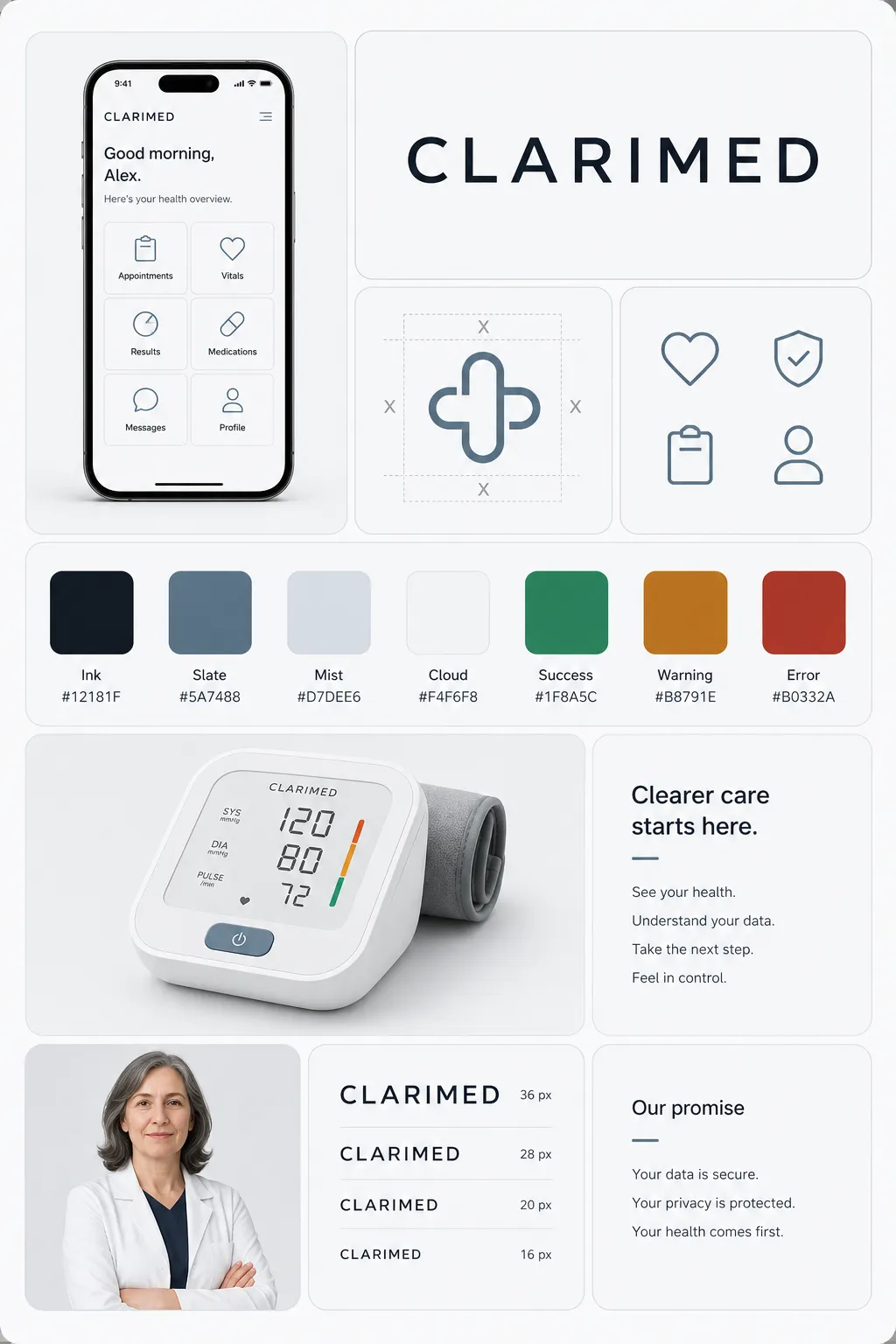
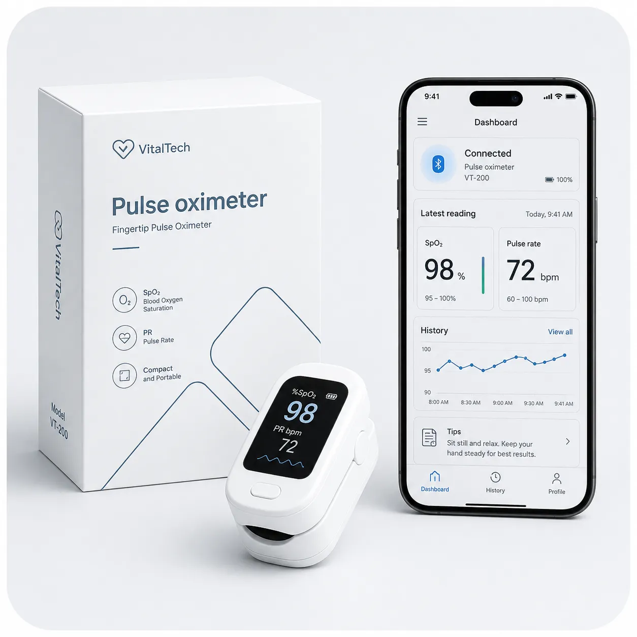
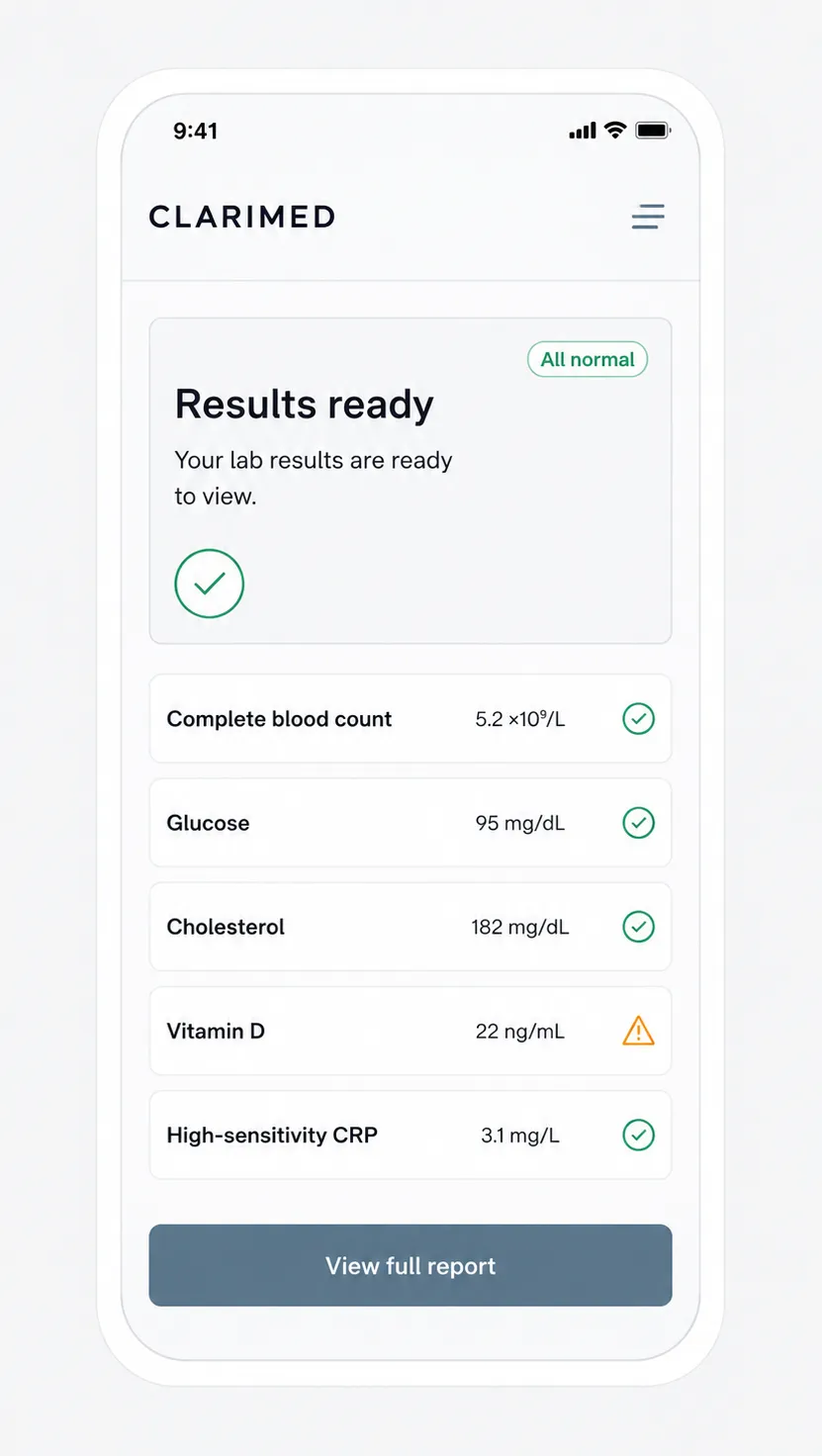
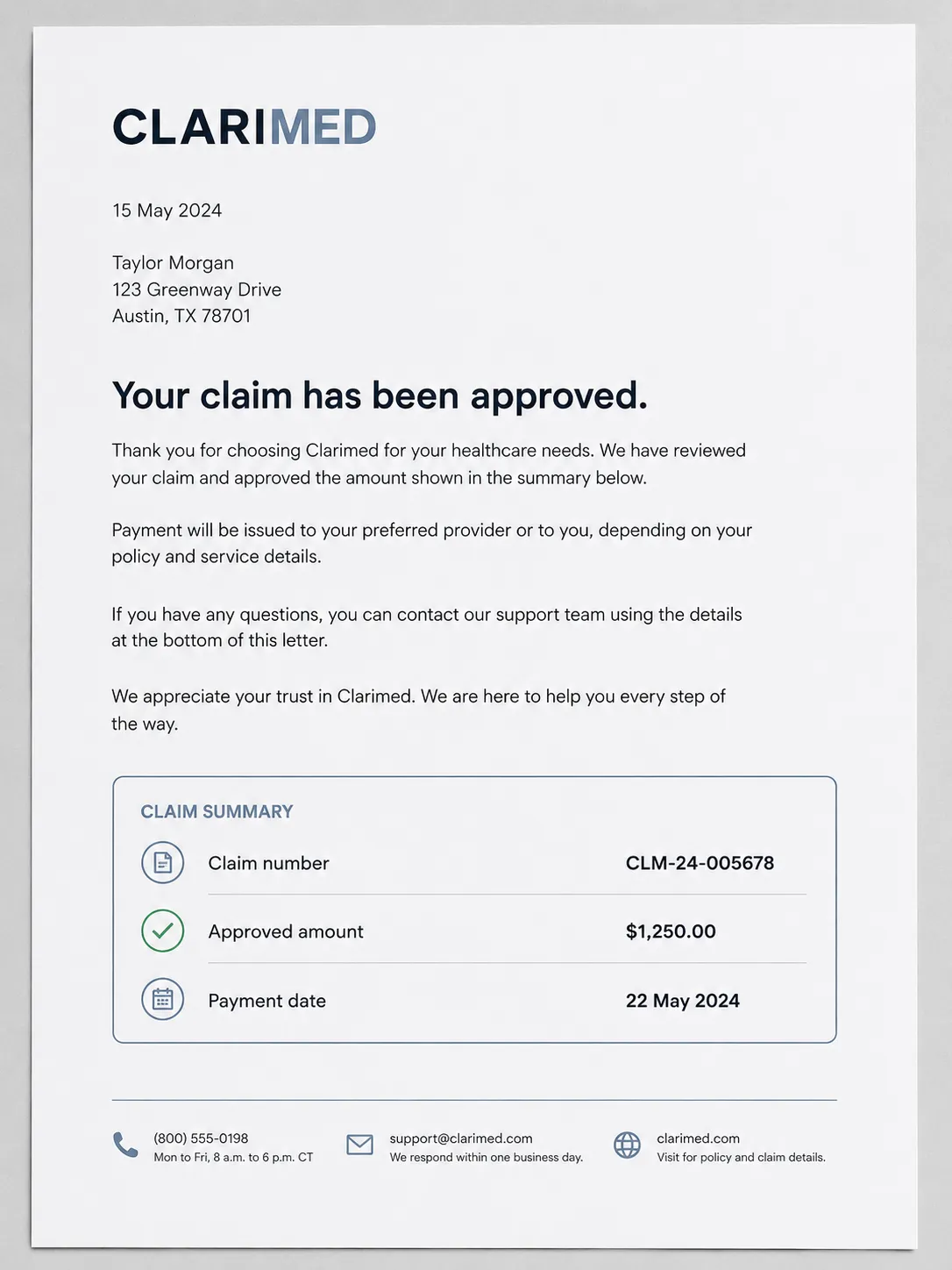
Clinical Signal Minimal runs on a cool near-white ground with ultra-legible type and holds colour back entirely for status — nothing is decorated, everything that's coloured is telling you something. It's built to pass AAA contrast and stay legible at app-icon size, not just to look calm. It suits healthtech, banking, insurance and any product where getting the information wrong has real consequences.

Typography

Regular, Medium, Aa, Bb, Typography
Font FamilyHumanist sans or grotesque sans, tested for small-size legibility
Line HeightRelaxed
Font WeightsRegular, Medium, Bold
Letter SpacingNormal
Text Case
Sentence case
Font Pairing Strategy
Single family
Hierarchy
Clear typographic scale
Text Presence
Required
Text Visual Role
Secondary visual element
Text Integration
Separate

Mood & Personality

Mood & Personality
Clean, Serious, Confident, Authoritative, Minimalist
Emotional Bias
Neutral
Representation Mode
Literal
Real-world Accuracy
Precise
Narrative Allowance
None
Humor Usage
None

Voice & Language

Formality
Professional
Vocabulary Level
Simple
Directness
Explicit
Sentence Length
Short
Metaphor Density
Clinical
Writing Perspective
Second person (you)
Copy Pacing
Punchy
Jargon / Technical Level
None

Container / Boundary

Container shape
Rounded square
Corner treatment
Slight radius
Container Dominance
Neutral frame
Padding rules
Generous
Edge behavior
Content fully contained

References

Temporal Reference
Contemporary

UI & Web

Color Theme
Light
Background Tone
Cool light gray
Accent Strategy
Workflow / contextual accents
Semantic Colors
Full set (error / warning / success / info)
Surface Layers
Two-layer (page + card)
Elevation Approach
Background contrast only
Shadow Technique
No shadows
Border Philosophy
Hairline (0.5–1px, low opacity)
Button Shape
Softly rounded (4–8px)
Button Hierarchy
Full system (+ Destructive)
Icon Style
Outline / Stroke
Icon Weight
Medium (2px)
Navigation Pattern
Top bar
Focus Ring Style
Solid offset ring
Animation Philosophy
Functional only
Transition Speed
Fast (80–150ms)

Spatial Structure & Hierarchy

Perspective Style
Flat
Focal Structure
Primary + secondary
Hierarchy Clarity
Strong
Symmetry
Asymmetrical balance
Layout Axis
Gridless
Grid System
Plain generous grid with wide margins and consistent spacing
Visual Density
Airy

Shape Language

Primitive Dominance
Circles, Rectangles
Edge Sharpness
Soft
Silhouette Clarity
Iconic
Curve Consistency
Uniform radius
Negative Space Usage
Balanced
Angle Usage
None

Line & Stroke System

Stroke Usage
Structural outlines
Stroke Weight
Medium
Stroke Consistency
Uniform
Stroke Color
Neutral
Stroke Joins
Round

Background & Environment

Background Complexity
Minimal

Colors

#F4F6F855%Usage: Background
#12181F25%Usage: Text
#5A748810%Usage: Structural UI
#1F8A5C4%Usage: Success status
#B8791E3%Usage: Warning status
#B0332A3%Usage: Error status
Palette Size
6–8 colors
Color Temperature
Cool
Saturation Range
Subdued
Contrast Strategy
Value contrast
Gradient Policy
No gradients
Color Dominance
Background-dominant
Accessibility Level
AAA

Output Format

Creative Discipline
Brand identity
Medium
Digital
Scaling Expectation
UI-scale
Canvas Behavior
Strict frame (nothing escapes)

Surface, Material & Detail

Surface Treatment
Matte
Texture Usage
None
Optical Finishes
None
Transparency / Opacity
Opaque
Imperfection Level
Flawless
Pattern / Motif Usage
None

Guardrails

Common Artifacts to Avoid
AI Gloss / Plastic Smoothing, Lens Flare, Film Grain / Noise, Studio Post-processing, Stylistic filters
Avoided Visuals
decorative status colour; pure white with pure black; tightened letter spacing; reduced line height; decorative gradients; drop shadows; optical finishes; fine icon detail; untested icon-scale marks
Allowed Visuals
cool near-white ground; near-black AAA text; geometric symbol; wide margins; clear zones; semantic success, warning, and error states; matte glare-free surfaces
Avoided Words
We're excited to share; health journey; oops; something went a little wrong; vague reassurance
Conditional Logic
Below the tested full-lockup minimum, use the symbol alone at its tested minimum pixel size; remove secondary content before reducing contrast or legibility.

Custom Style Items

Numeral Clarity
Use unambiguous numeral forms; distinguish 1 from l and 0 from O.
Information Zoning
Separate status, action, and detail into clearly bounded, non-overlapping zones.
Physical Finish
Use matte, glare-free laminate, uncoated card, or satin badges; retain identical digital status hues in physical indicators.
Message Pattern
State what happened, then the exact next action; spell out dates and numbers without ambiguous abbreviations.
© 2026 StyleRef. All rights reserved.